Ponteo dental marketplace platform mobile and web application interface design
7 min readingJun 19, 2026
Overview
Ponteo is a workforce-driven dental marketplace connecting freelance dental specialists with dental practices across the United States. The platform addresses a real operational gap in the dental industry — finding verified, available specialists on short notice is time-consuming, trust-dependent, and largely handled through informal networks.
Spaceberry designed the full product ecosystem from scratch: a mobile app for freelance dental specialists, a web application for dental practices, and a comprehensive admin panel for platform management. Each product serves a distinct user type, yet all three are unified through a shared design system and operational logic.
- Location
- United States
- Duration
- Ongoing
- Industry
- HealthCare
Platform Ecosystem
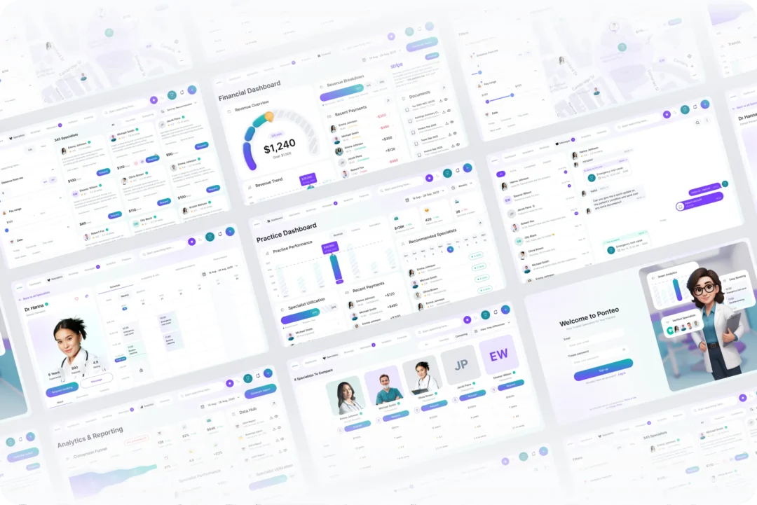
The platform was designed as three interconnected products, each purpose-built for its audience while sharing a common infrastructure of bookings, payments, and compliance.
Specialist Mobile App
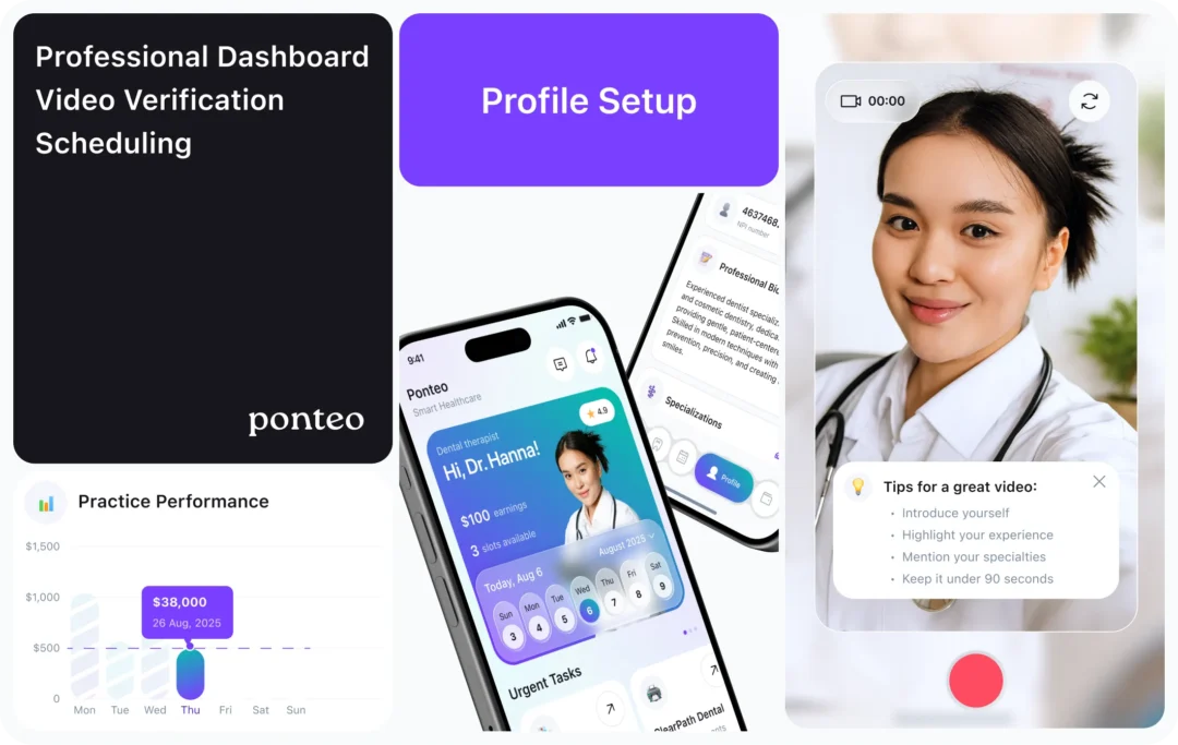
iOS app for freelance dental professionals. Specialists browse jobs by list or map, manage their calendar, track earnings, and communicate with clinics — all in one place.
Practice Web App
Browser-based dashboard for dental clinics. Practices find and compare verified specialists, manage bookings in Board/List/Calendar views, monitor performance, and handle finances through Stripe integration.
Admin Panel
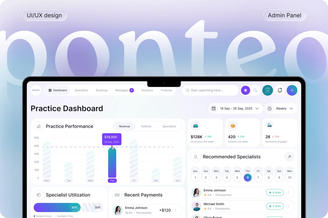
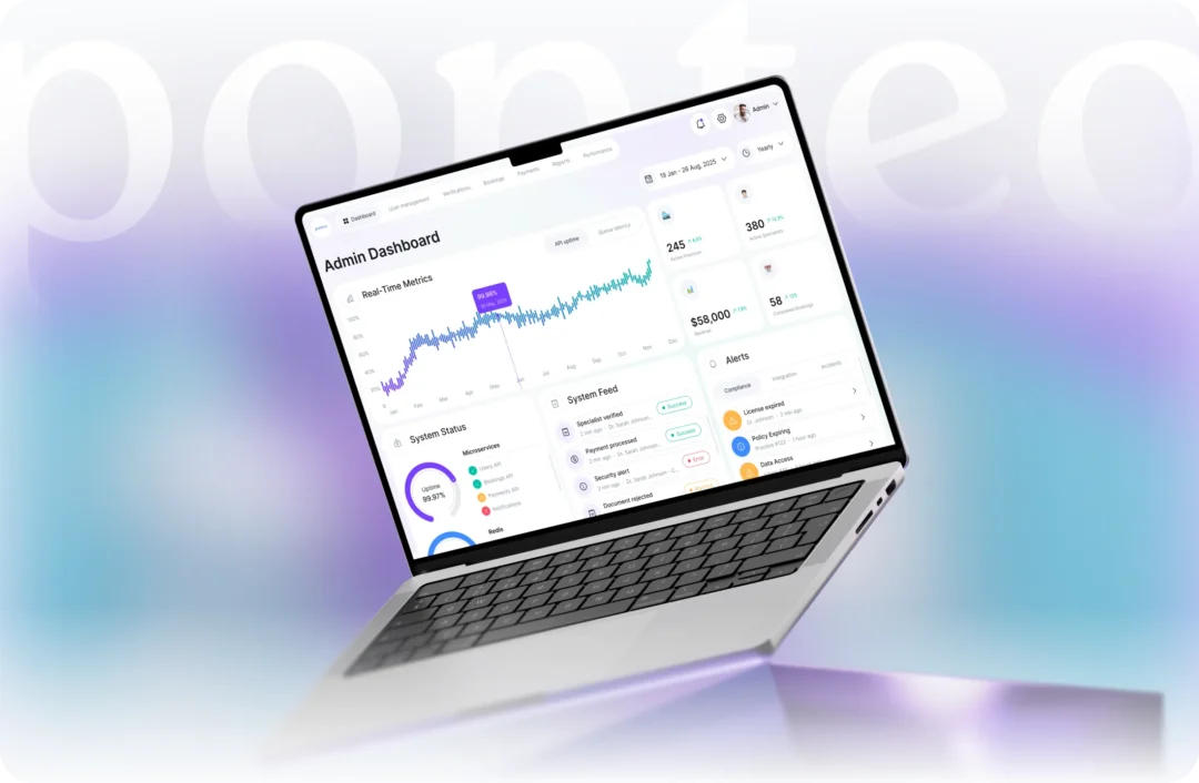
Full-featured control center for Ponteo administrators. Covers user management, verification queues, global bookings oversight, financial flows, reports, and real-time platform performance monitoring.
Challenge
Designing a marketplace in a regulated healthcare context means solving trust, compliance, and operational complexity — all at once, for three completely different user types. The challenge was not just UI design, but product architecture:
- Building onboarding that feels manageable despite covering specialty selection, equipment, professional info, credential uploads, background check consent, video bio, availability, rates, and banking setup
- Designing a trust layer that works in both directions – practices need to trust specialists, and specialists need to trust that payment and scheduling is reliable
- Creating a job discovery experience (list + map views, filters by distance, pay range, date, specialty) that surfaces the right opportunities in seconds
- Handling complex real-time states: in-progress appointments, paused sessions, job acceptance flows with navigation handoff to Apple Maps / Google Maps / Waze
- Building an admin system at enterprise scale – verification queues, global booking oversight, Stripe commission settings, CI/CD pipeline monitoring, error log console
User Experience & Core Product Flows
Problem
Healthcare staffing workflows are inherently complex. Clinics need to quickly find qualified specialists, while specialists need clear and reliable opportunities. At the same time, the process includes multiple friction points: verification, availability matching, booking coordination, and payment expectations.
Without a structured system, users face cognitive overload, unclear trust signals, and slow decision-making — especially in time-sensitive scenarios.
Solution
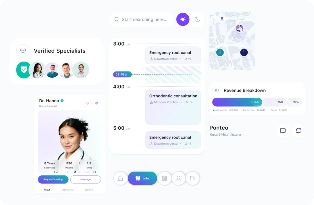
We designed a streamlined user experience that simplifies complex workflows into clear, manageable steps:
- Structured verification with visible progress and status
- Simplified job discovery with filters and clear job cards
- A smart scheduling system with calendar-based interaction
- Transparent financial dashboards with clear earnings logic
Result
The experience becomes faster, clearer, and more predictable.
Users can evaluate opportunities and complete bookings quickly, while trust increases due to transparency in verification and payments. Overall cognitive load is reduced, enabling confident decision-making across both specialists and clinics.
System Design & Platform Operations
Problem
As Ponteo scales, operational complexity increases. The platform must manage specialist verification, booking lifecycle, financial operations, and real-time monitoring. Without a structured backend, these processes become fragmented and hard to control.
Solution
We designed a centralized system architecture with a strong admin layer acting as the operational core of the platform. The platform is structured into role-based experiences, separating specialists, clinics, and administrators into focused environments.
Result
The platform is scalable and efficient. Administrative processes are transparent, reducing overhead and enabling faster decisions. This allows Ponteo to grow without sacrificing usability.
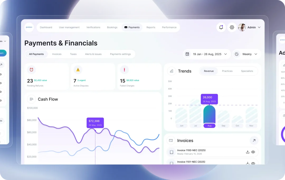
The admin system includes:
- Verification workflows with approval queues and audit trails
- Booking monitoring and incident management tools
- Financial control systems with full transaction visibility
- Analytics and system monitoring dashboards
Specialist Mobile App
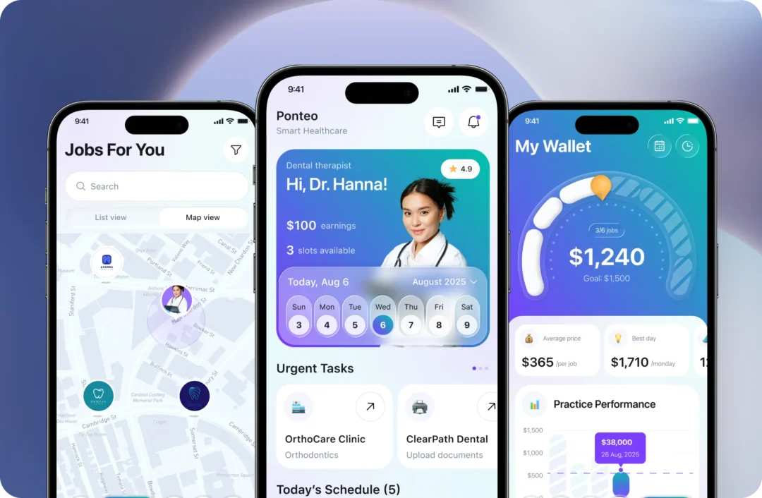
The mobile app is designed around the specialist’s real-world workflow — from getting verified to completing jobs and receiving payments.
Finding & Booking Work:
- A structured multi-step onboarding guides specialists through verification, profile setup, availability, and banking, while keeping the process manageable through clear progress and step segmentation.ners to ensure authenticity.
- Specialists can quickly find relevant jobs using list and map views with filters for distance, pay, date, and specialty, making opportunity evaluation fast and intuitive.
- Each job includes detailed information, and the acceptance flow smoothly transitions from decision to navigation, reducing friction between booking and execution.
- Clear verification status tracking across all stages reduces uncertainty and helps users understand their progress and required actions.
Outcome
Faster access to relevant opportunities and quicker decision-making, with reduced friction during onboarding and booking, leading to a more confident and efficient start of work.
Managing Work & Earnings:
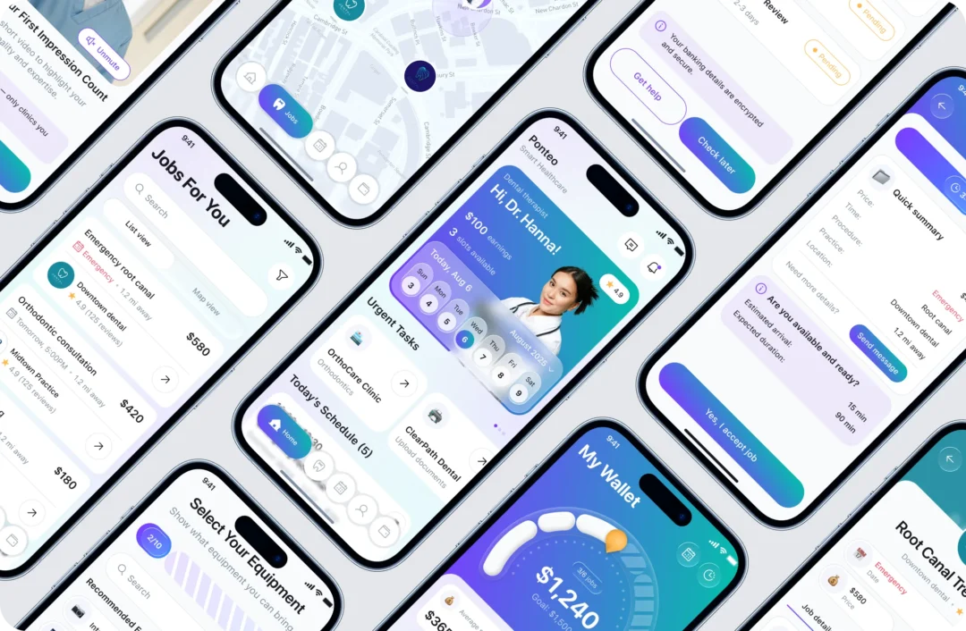
- During appointments, all essential information such as notes, files, and checklists is available in one workspace that supports a continuous workflow.
- A visual calendar system helps manage availability and track past, current, and upcoming jobs through clear and structured views.
- The earnings dashboard provides full transparency into income, completed jobs, and performance trends, helping specialists understand their financial activity.
- Built-in chat allows real-time communication between clinics and specialists, enabling coordination and document sharing within each booking.
Outcome
Improved execution of daily tasks with better visibility, coordination, and financial clarity, reducing cognitive load and enabling specialists to focus on their work.
Developer-Ready Design System
Problem
Building Ponteo from scratch required designing a system that could support multiple user roles, complex workflows, and data-heavy interfaces from the very beginning.
Without a structured design system, the product risked becoming inconsistent as new features, flows, and platform layers (mobile, web, admin) were introduced.
Solution
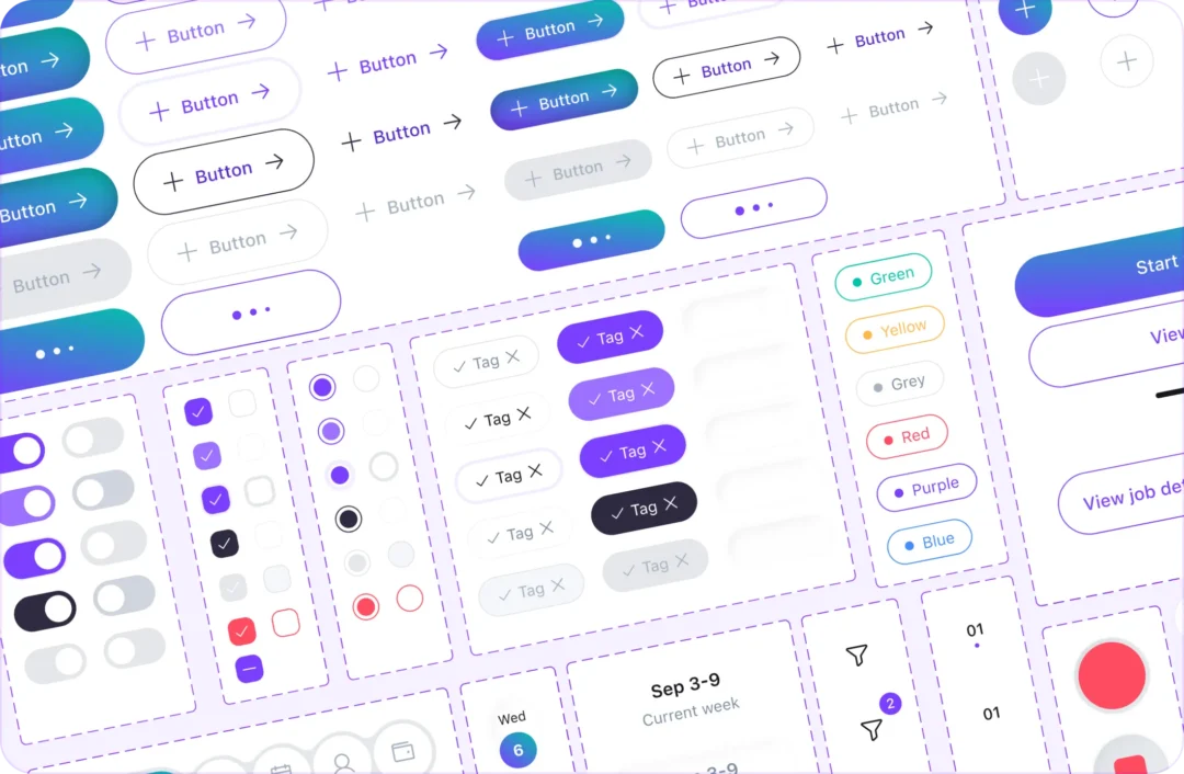
We created a scalable design system for the Ponteo ecosystem. It features reusable components for booking, verification, scheduling, and admin tasks. Built for mobile and web, it ensures consistency across products while managing complex interfaces. By establishing clear patterns and logic early, we aligned design and development for predictable growth.
Result
- Consistent UI across mobile app, web platform, and admin system from the initial release
- Faster feature development without breaking visual or interaction patterns
- Scalable foundation for adding complex workflows and new product areas
- Reduced risk of inconsistencies as the platform grows
Crafting a Visual Identity
Problem
Ponteo combines multiple high-density interfaces — from job discovery and scheduling to verification and admin workflows.
Without a clear visual system, these screens risk becoming hard to scan and navigate. The challenge was to create a cohesive visual language that supports fast perception while handling large amounts of structured data.
Solution
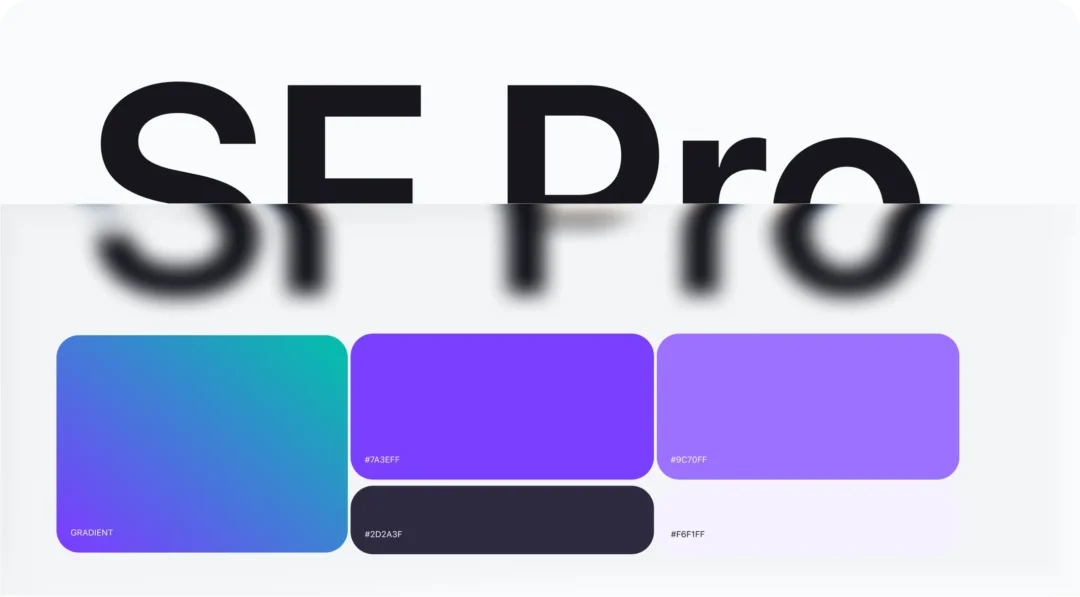
We created a visual system prioritizing readability and efficient scanning. SF Pro ensures legibility on mobile and web, especially in data-heavy layouts. Typography and spacing organize content and guide attention. A calm color palette with purple and blue highlights key actions and elements. Consistent UI patterns support faster navigation.
Result
- Clear and consistent visual language across all product surfaces from the initial version
- Efficient scanning of dense information and faster user orientation
- Strong visual hierarchy supporting complex workflows
- A cohesive foundation that scales with new features and system growth
Unified Brand & Product Communication
Problem
Ponteo needed a consistent look across all touchpoints — from product screens to presentations. The goal was to ensure everything feels clear, organized, and professional.
Solution
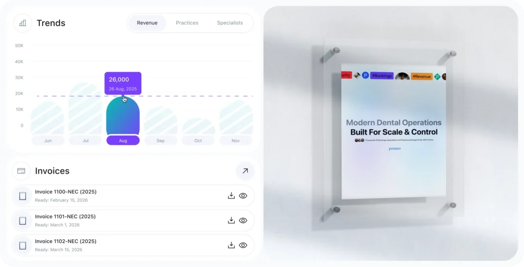
We extended the visual system to all communication layers. The same typography, color logic, and patterns were used in presentations and marketing materials, creating a unified language connecting product experience with external communication.
Result
- Consistent brand perception across product and communication materials
- Stronger visual alignment between product, marketing, and investor assets
- More structured and clear presentation of the product vision
- A cohesive brand identity that reflects the product’s level of quality

Measured Growth & Product Readiness
Problem
Ponteo was designed to manage complex workflows like onboarding, booking, and financial interactions. The goal was to keep it clear and usable while scaling with new features and users.
Solution
We focused on structuring the product experience and system logic early on, aligning UX, UI, and technical foundations from the start.
Key flows such as onboarding, job discovery, scheduling, and payments were designed as connected systems rather than isolated features. Special attention was given to reducing friction in high-impact areas while maintaining the depth required for real-world workflows.
Result

- 8.1/10 UX Maturity
- 13 Onboarding Complexity (steps)
- 8.8/10 Performance & Accessibility
- 3–5 Information Density (blocks/screen)
Conclusion
Ponteo represents one of the most complex and rewarding projects in our portfolio – not because of visual ambition, but because of product depth. Three products, three user types, one ecosystem. Every screen had to earn its place. From onboarding that feels manageable to an admin panel that monitors API uptime and CI/CD pipelines, the design system held everything together. The result is a platform that is operationally powerful, visually consistent, and genuinely easy to use — for a dentist looking for work, a clinic manager filling a shift, or an admin keeping the marketplace running.
Explore more of our work.