Sandi+: Enterprise B2B Platform Modernization with +47% Conversion and NPS Up from 34 to 71
8 min readingOct 15, 2026
Overview

In short: Over 12 months, Spaceberry redesigned the B2B wholesale and dropshipping platform of Sandi+, one of Ukraine’s largest plumbing and heating suppliers, across desktop, mobile web, iOS, Android and the admin panel — lifting catalog conversion by 47% and average order value by 32%, and raising NPS from 34 to 71.
Sandi+ is one of Ukraine’s leading B2B suppliers in plumbing, heating, and water supply systems.
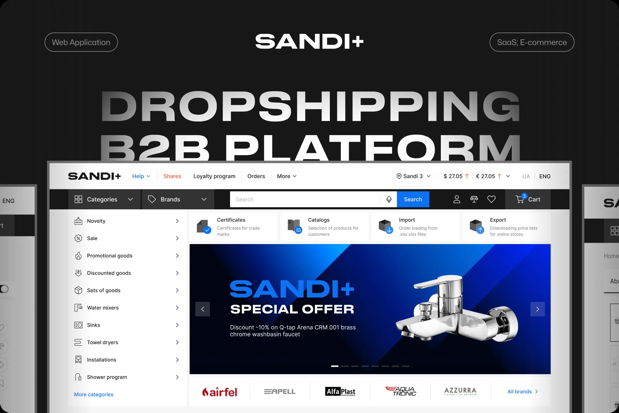
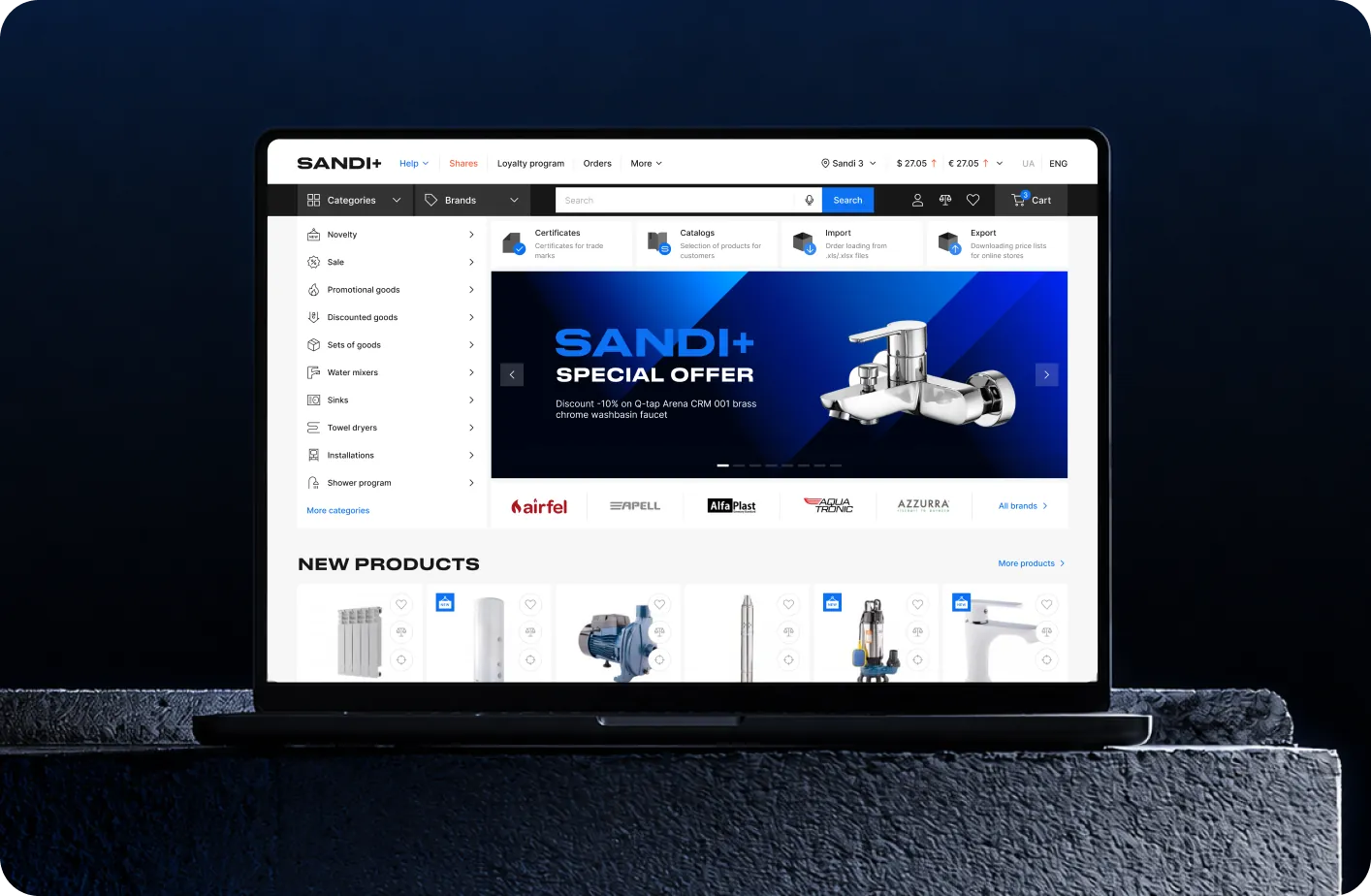
We redesigned the company’s wholesale e-commerce ecosystem to simplify ordering, improve product discovery, and create a faster, more scalable experience for professional buyers across web and mobile platforms.
The project included UX strategy, a complete UI redesign, native mobile applications, an admin system, and a scalable design system built to support long-term business growth.
The new platform helped increase conversion, grow partner acquisition, and strengthen Sandi+’s digital presence in the B2B market.
- Location
- Ukraine
- Duration
- 12 months
- Industry
- B2B Wholesale & Dropshipping
Product type: B2B E-commerce Platform, Web and Mobile App
Scope of work: Desktop web app, Mobile web, iOS, Android, Admin panel, Marketing site
At a Glance
When Ukraine's $100M+ market leader in plumbing and heating wholesale came to us, their B2B dropshipping platform was holding back the business it was meant to power.
Sandi+ runs its own manufacturing, employs thousands of people across Ukraine, and serves a national network of resellers, contractors, and online retailers — but their digital product looked and felt like it belonged to a much smaller company. The interface was chaotic, the flows were unintuitive, and the platform was bleeding revenue at every step of the funnel.
We rebuilt it end-to-end.
Headline outcomes after launch:
- +47% conversion rate on the wholesale catalog
- +32% increase in average order value
- +85% growth in monthly active buyers within 12 months
- 3.2x more new partner registrations in the first 6 months
- −55% time-to-order for repeat customers
- −41% drop in UX-related support tickets
- NPS raise from 34 to 71

The client
Sandi+ is one of the largest wholesalers and manufacturers in the Ukrainian plumbing, heating, and water-supply market.
- ~$100M in annual turnover
- Thousands of employees across Ukraine
- In-house manufacturing alongside distribution
- A nationwide reseller network — from large e-commerce retailers to small regional stores
Their B2B platform is the engine of that distribution network: a wholesale catalog, ordering system, and logistics command center that powers thousands of small businesses across the country. When it underperforms, every reseller downstream feels it.
Challenge
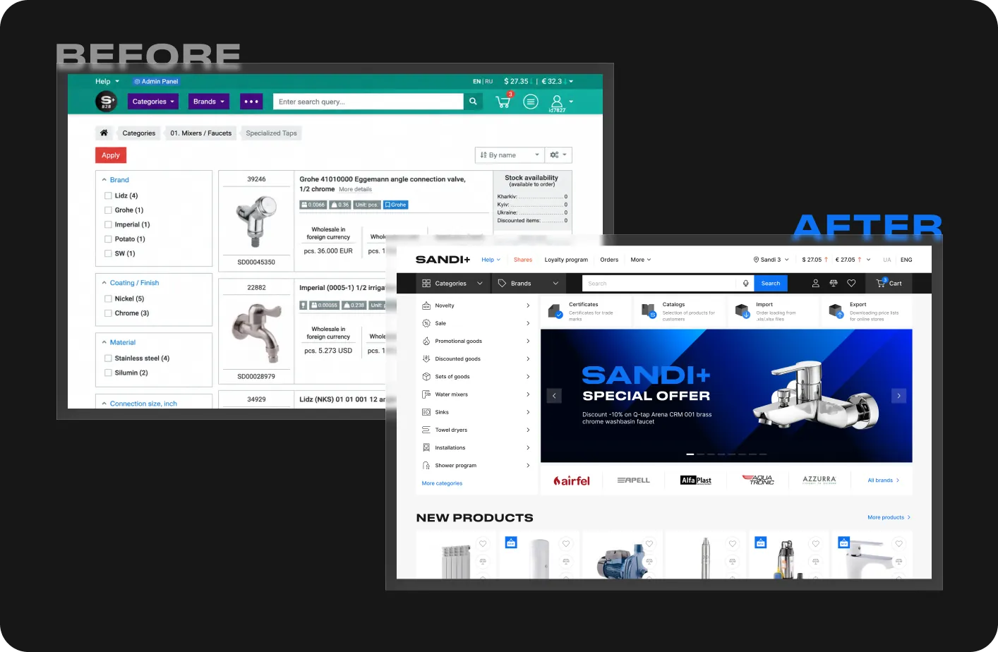
The existing platform had grown organically over years. It worked — but only just.
Navigation was tangled. Onboarding new partners required hours of hand-holding from the sales team. Resellers — many of them small business owners running stores in regional cities — were abandoning carts, missing promotions, and calling support for tasks that should have been self-service. Mobile usage, the channel growing fastest, was the weakest experience in the product.
Sandi+ asked us to:
- Modernize the visual identity of the platform and its marketing site
- Rebuild the user experience across desktop, mobile web, iOS, Android, and the admin panel
- Lift conversion and average order value
- Attract new B2B partners through a clearer, more trustworthy presentation
- Prepare the platform to absorb a large set of new features that the business needed
This wasn't a reskin. It was a full rethink of how a $100M wholesale operation goes to market digitally.
Our Approach
1. Usability audit before anything else
Before touching a single screen, we ran a deep usability audit of the existing platform. It served two purposes: it gave us a forensic map of every UX problem worth fixing, and it built immediate trust with the client — demonstrating senior-level competence in days rather than asking them to wait months for "finished" designs.
The audit also surfaced quick wins: fixes that didn't require deep backend or business-process changes and could be shipped to production immediately, while the larger redesign was still in motion. Sandi+ started seeing improvements within weeks.
Every issue and fix was tracked in Jira. We worked alongside the in-house development team — clarifying intent, reviewing builds, and protecting design quality all the way through to production.
2. Research grounded in real B2B users
A dedicated marketing team — working in lockstep with us — collected user feedback, ran interviews with resellers, and surfaced the friction points that B2B buyers were hitting daily. We layered that on top of a competitive analysis of local and international B2B dropshipping platforms.
The result: a redesign grounded in real pain points, not assumptions.
3. Architecture and roadmap
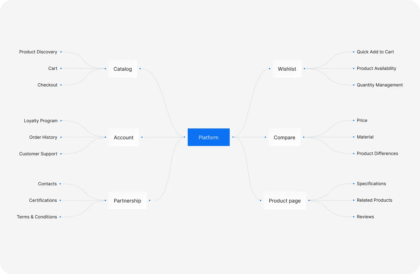
We built a new navigation map for the platform, drafted the roadmap that would carry it through launch and beyond, and defined the KPIs we'd track post-launch. We also worked with Sandi+ leadership to redesign internal business processes — because the new platform required the company itself to operate differently to support its expanded capabilities.
4. Design system first, screens second
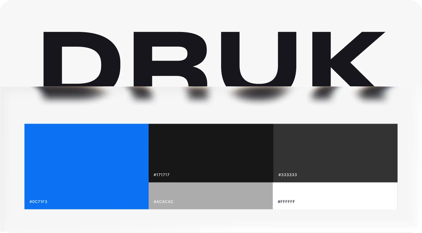
We started with foundations: color, accessibility, iconography, illustration, typography, grid, and a complete UI kit. Only once the system was approved did we begin designing pages — starting with the web app, then mobile, then native.
What We Built
A unified design system across every surface
- Desktop web app
- Mobile web app
- iOS and Android native apps
- Admin panel for internal Sandi+ teams
- Marketing site that presents the platform to new partners
The design system is scalable, accessible, and documented to a level that lets the in-house dev team extend it independently.
Reimagined core flows
Every workflow that touched revenue was rebuilt:
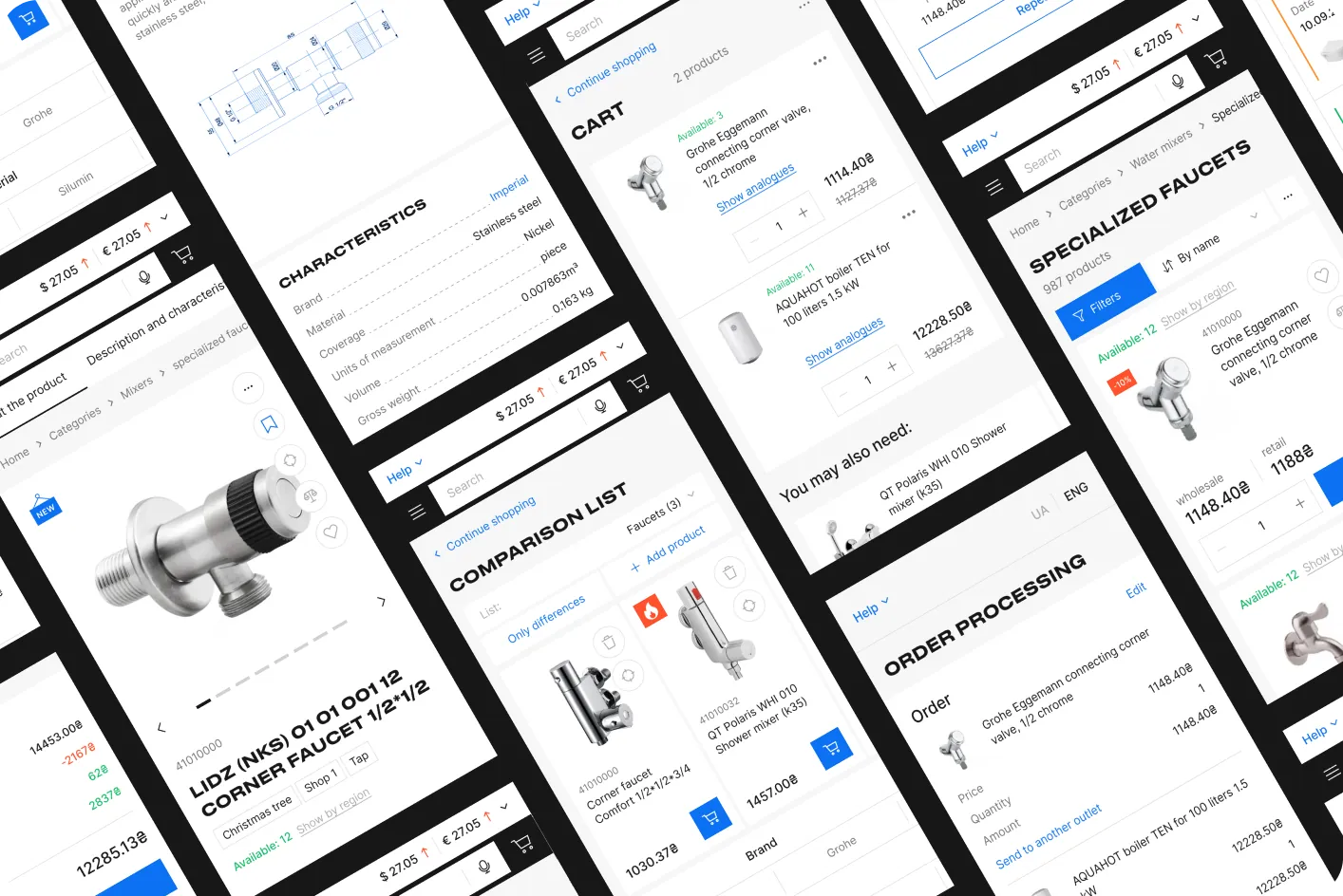
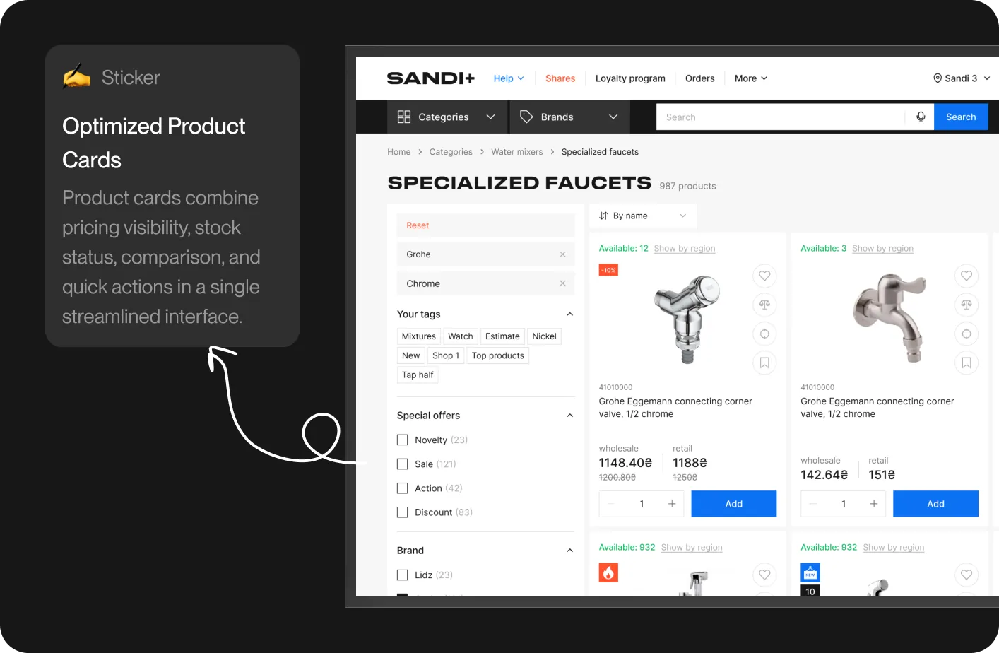
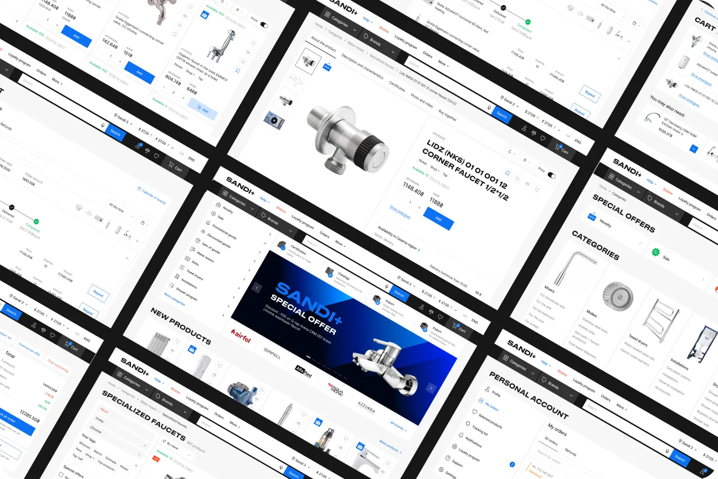
Catalog & product discovery. A restructured category tree. Faster, smarter filtering. Voice search. Product comparison. Favorites and saved lists. Cross-sell and upsell blocks embedded throughout the journey. Promotional banners, tags, and tracked-product alerts.
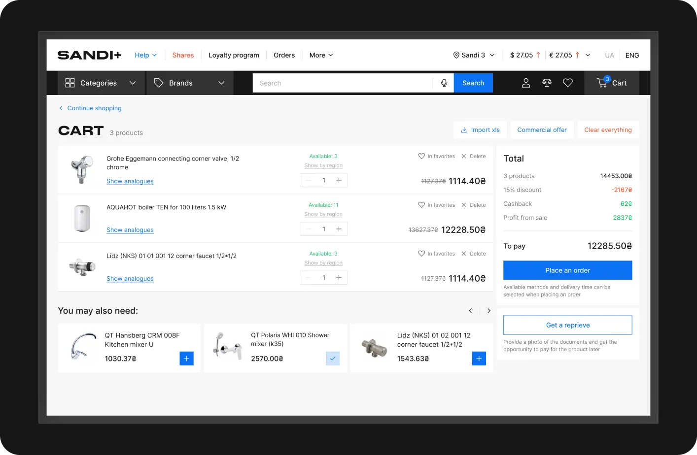
Cart. Bulk-add for wholesale workflows. Live stock availability per warehouse. Pre-checkout delivery prediction — cost, time, and method visible before the buyer commits. A mini-cart for fast review.
Checkout. Recipient selection — ship to the reseller's own store or direct to their end customer (true dropshipping). Split-order delivery — one cart, multiple destinations and dates. Saved delivery points. Logistics scheduling with date and time windows. Multiple payment methods, including new online payment.
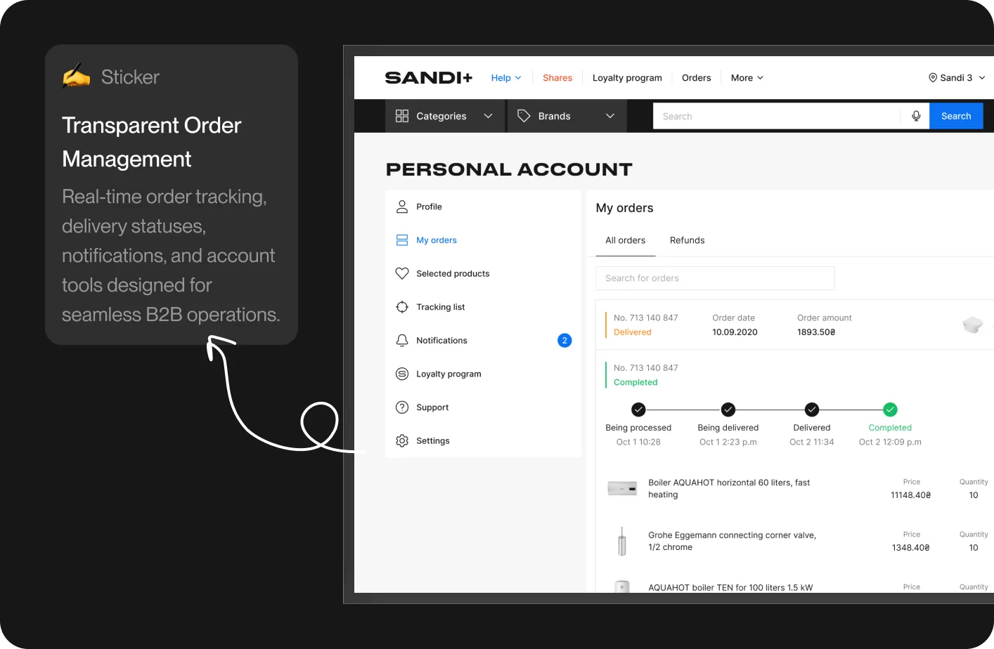
B2B account management. Real-time order tracking and status history. Team management with roles and permissions. Multi-store / multi-warehouse management. Excel import/export for instant order creation from price lists. Loyalty program with bonus accrual tied to volume. Cross-channel notifications. Returns tracking. Trust accounts for deferred payment terms.
New features that opened up new revenue
- Custom catalog builder — resellers can generate branded catalogs for their own customers
- One-click repeat orders
- Promotions module
- Self-service online registration
- Feedback collection system
- Chatbot
- Price-change tracking
- Beta channel for early adopters
B2B-specific sections
Sections that don't exist in consumer e-commerce but are critical here: product certificates, manufacturer catalogs, B2B promotions, currency rates, price control, video catalog, integrations with resellers' own online stores, commercial offers, and a "turnkey project" tool for contractors.
How We Worked Together
This was a large project with a lot of moving parts. It succeeded because of how the teams operated:
- Designers embedded with the client team, the development team, and the marketing team — not handing off, but co-creating
- Regular stakeholder meetings to align on the business processes shifting underneath the platform
- In-person sessions at key decision points to keep momentum and alignment high
- Active developer support throughout implementation — clarifying intent, reviewing builds, protecting design quality through to production
- A live presentation of the redesigned platform at a major industry conference, which we helped Sandi+ prepare for
Results
The new platform didn't just look better. It moved the business.
Conversion & revenue
- +47% increase in conversion rate from catalog visit to completed order
- +32% lift in average order value, driven by upsell modules, comparison, and improved cart UX
- +28% increase in repeat-order frequency, fueled by one-click reorder and the loyalty program
Acquisition & growth
- 3.2x more new B2B partner registrations in the first 6 months post-launch
- +85% growth in monthly active buyers within 12 months
- New self-service onboarding cut time-to-first-order for new partners from days to under 20 minutes
Operational efficiency
- −55% reduction in time required to place a typical wholesale order
- −41% drop in customer-support tickets related to interface confusion
- −38% reduction in cart abandonment
Experience quality
- NPS rose from 34 to 71
- +67% mobile conversion rate — critical for resellers operating from the field
- 4.7 / 5 average rating across iOS and Android app stores after launch

What The Client Said
Sandi+ leadership was, in their words, fully satisfied — calling out the team's professionalism and the speed of delivery.
The in-house development team — who often have a guarded relationship with external design partners — became one of our strongest advocates, not only because of the UI/UX decisions, but because of how the day-to-day collaboration was handled.
Why It Worked
Sandi+ wasn't a "draw us nicer buttons" project. Delivering it required:
- A design partner who could lead through ambiguity, not wait for specs
- Real changes to how the company operates internally to support the new feature set
- Tight integration with marketing, product, and engineering
- A design system robust enough to span web, native mobile, and admin tooling without fragmenting
- KPIs tracked from day one, not bolted on after launch
That's the bar this kind of work demands — and it's the bar we built to.
Project Links
- Marketing site: sandiplus.com.ua/en
- B2B platform: b2b-sandi.com.ua
If you're scaling a B2B platform, modernizing legacy software, or trying to turn an underperforming digital product into a growth engine, we'd love to talk.
Spaceberry Studio — Fast onboarding. Immediate design impact. Design for SaaS, B2B platforms, and mobile apps.
Explore more of our work.