Vera.io: UI/UX Design for Generative AI Platform
Make yourself comfortable, the story is about to begin…
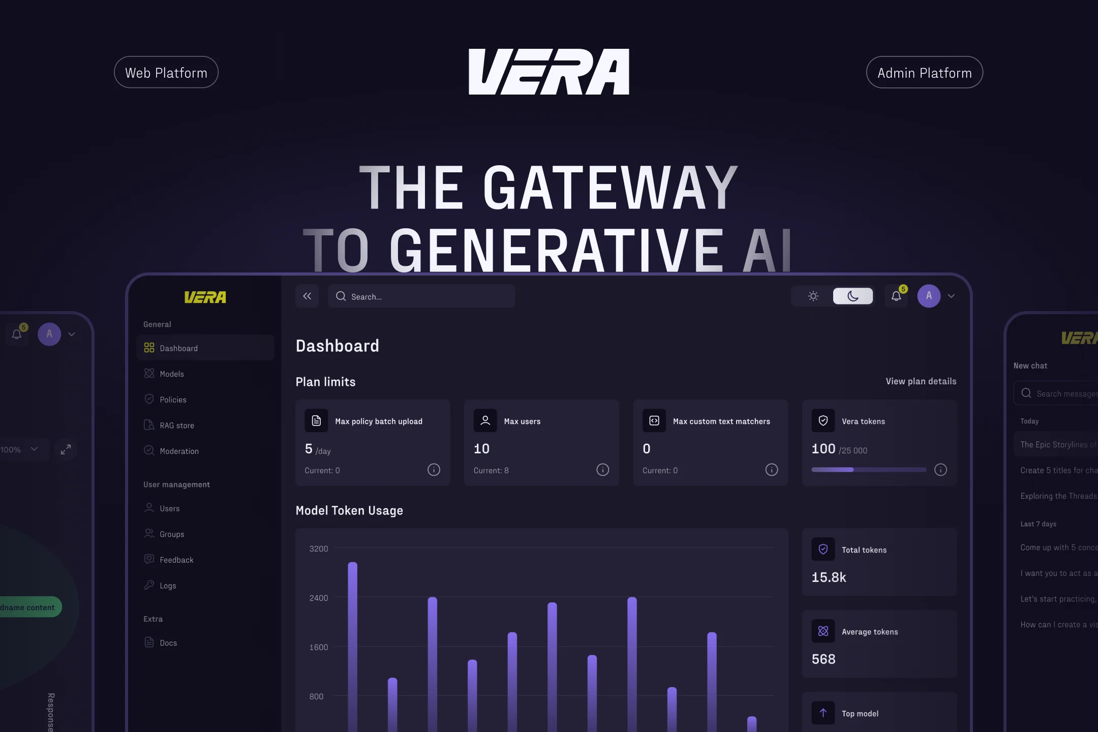
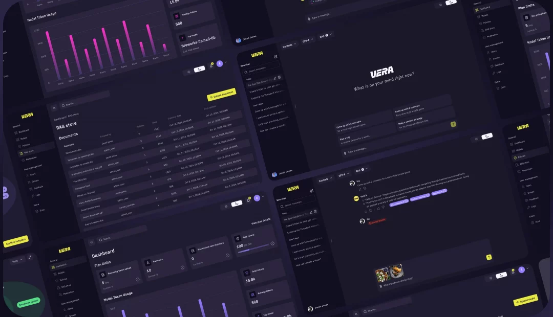
We will share our work on the design of the AI platform Vera. It all started when our US-based client came to us for our services with one clear vision to create an elegant design for their reliable and secure generative AI platform that companies and teams use to power AI in their workflows. This involved creating the design for a functional admin platform and an AI chat interface. Don’t stop reading because up next, we’ll dive deeper into our approach and the stages we went through.
LocationUSA
Duration8+ months
IndustryAI
What was doneWeb Design
Design Process
It is important for us to have a systematic approach to design and tailor our stages to the client’s needs. Our advantage lies in the fact that we don’t use a one-size-fits-all process for every client, as we understand that identical solutions are not feasible. Below, we will outline the key scope of work without focusing on each stage.
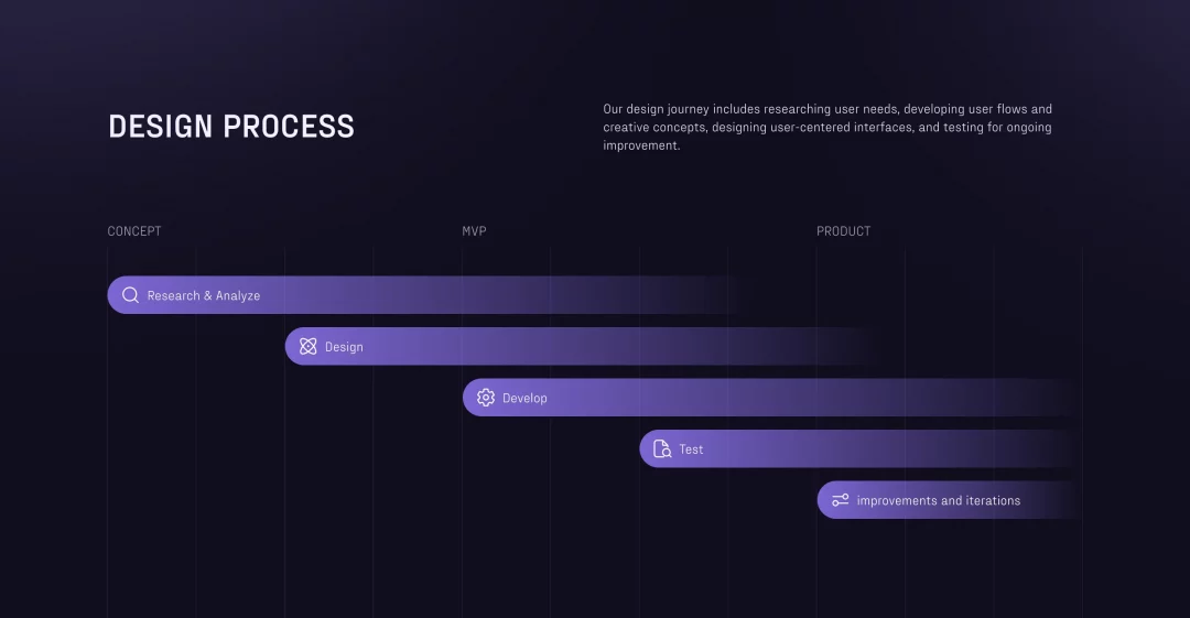
Research & Analysis:
At the start of our UI/UX work, we analyzed the admin platform to identify opportunities for enhancing existing functionality and introducing new features. This allowed us to improve and develop user and group management, create flexible policies tailored to specific needs, add models, implement content moderation, and design an intuitive onboarding process.
We designed a navigation map as well, ensuring the platform’s structure is intuitive and user-friendly. Users can effortlessly explore and access the data they need, while the thoughtfully designed user flows provide a seamless experience, guiding them smoothly through essential content and features.
Design:
As mentioned earlier, the client approached us to redesign an existing admin panel and to create an AI chat interface from scratch. For the MVP, the interface needed to be concise to allow for quick implementation yet modern and flexible, aligning with the latest trends in AI-driven services. Based on these requirements, we developed several interface concepts, exploring different perspectives on AI: modern and vibrant, trendy and minimalist, as well as refined and professional. The platform offers Light and Dark modes as well, following the trend of customizable themes for user comfort. This improves UX by reducing eye strain and letting users choose their preferred viewing style.
Next, we will describe each interface detail separately:
- Content and user moderation: The admin panel allows setting limits for the number of violations (text and/or images) and specifies the points for each violation. Based on these, users can be automatically timed out or blocked for infractions.
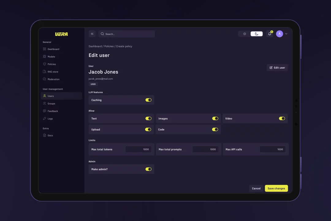
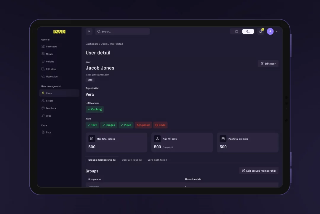
- User management includes editing user information, adjusting access to different chat functions, adding users to groups, moderating user behavior, and assigning model vendor API keys.
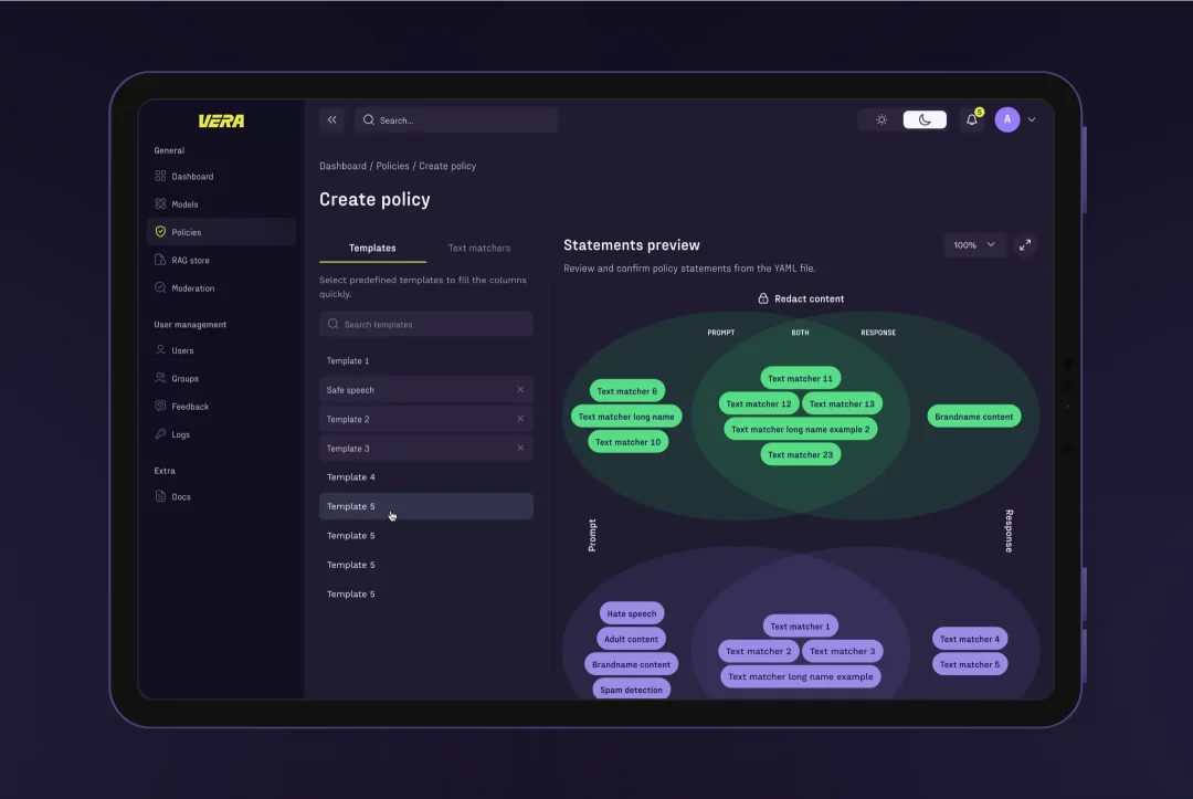
- Flexible policies are custom rules for managing chat conduct. Admins create these policies and assign them to specific user groups. The policies define which words, phrases, topics, and images are blocked or edited in the chat to ensure a secure and consistent environment.
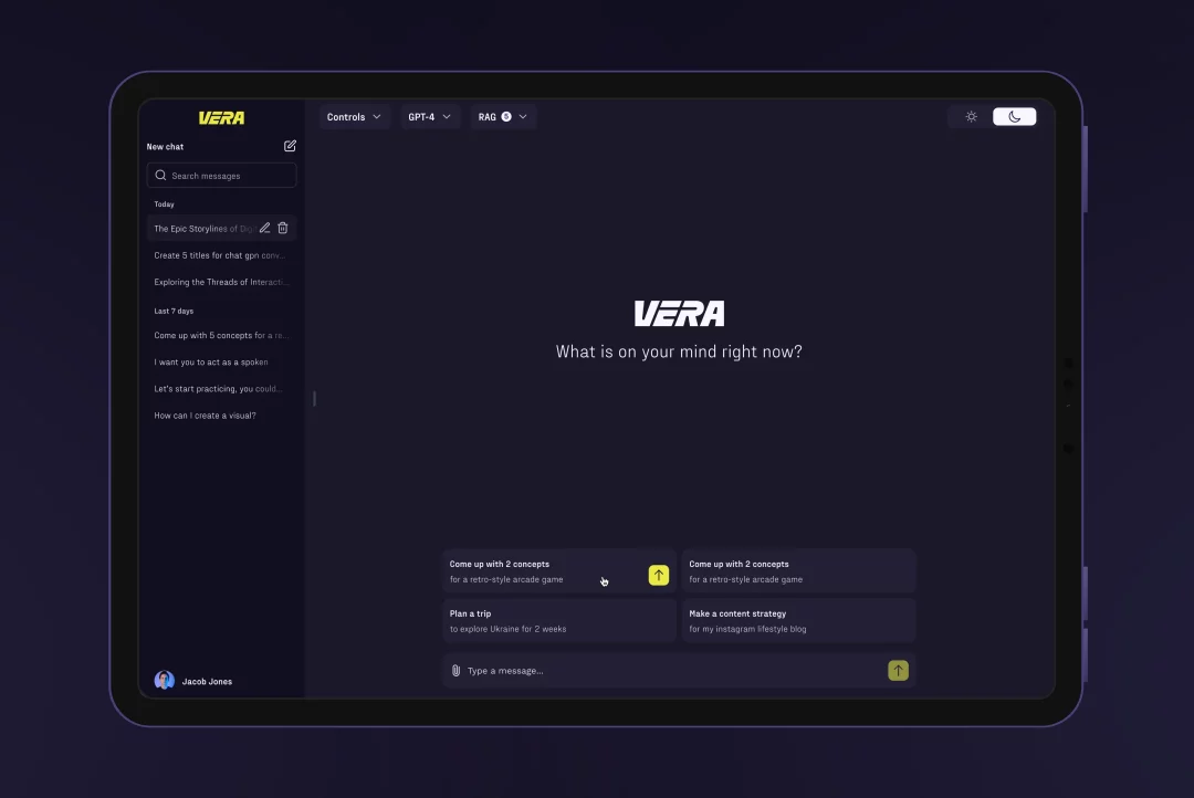
- AI chat interface needed to be simplified for quick implementation while staying modern and adaptable, reflecting the core trends in AI-driven services. It’s also worth mentioning that the chat supports text, photo, and document interactions, and a trial version was created to let users explore the features for free.
Implementation Review:
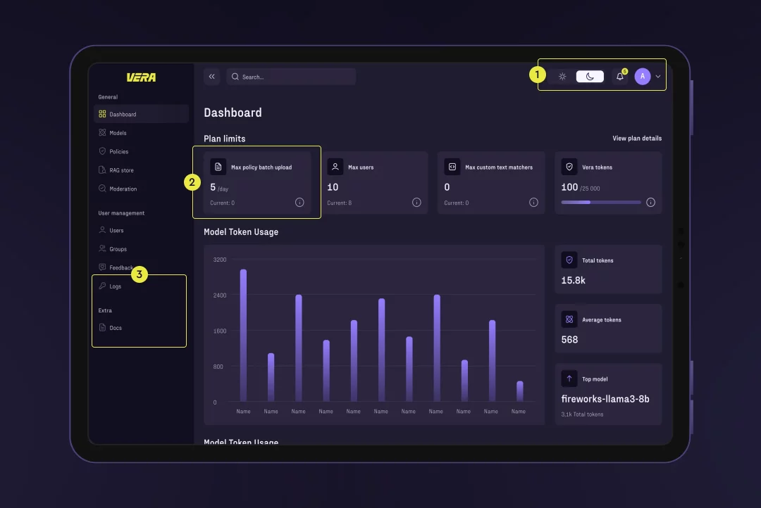
We aligned all interface elements to precise grids and margins, applying a 4-pixel system approach to simplify understanding and implementation for developers. To ensure our vision was perfectly realized, we provided ongoing support to the client, carefully overseeing the development process to align the design with its intended implementation.
Highlights of Collaboration
Working with a client who recognizes improvements and novelties made this project both entertaining and productive. Here are a few quirky moments that kept us on our toes:
- Technical Limitations: Since our deployment needed to be rapid, we had to work within certain technological confines. That meant using pre-existing code libraries and sticking with the existing architecture.
- Client-Side Branding: The final branding was completed on the client’s side, but we worked very closely together to incorporate new design elements, keeping user-friendly things user-friendly and on-brand.
We felt a strong connection with the client throughout the collaboration, as their commitment to ethical AI perfectly aligned with our own values. As AI continues to become more integrated into our daily lives, it’s crucial to tackle important issues like data security, bias, and user consent. Together, we are dedicated to creating systems that uphold human values and prioritize well-being, ensuring AI development remains responsible and trustworthy.
Results
After completing the MVP, we moved on to implementing new guidelines. The result was a service that allows users to work with any AI model, customize messages according to admin-set policies, and adapt across different devices.
Today, the product has been launched and used by end-users with great success, especially the intuitive navigation and chat functionality, which have become essential for seamless communication.
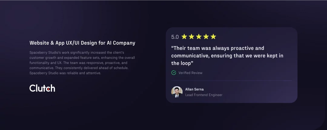
We were delighted to receive a positive review from the client, which you can read on Clutch.
On that note, we conclude our story. If you enjoyed this format, you can read more about our other projects that feature AI in their interfaces – healthcare platform OptimallyMe or language-learning app Picklang.