Peoplelogic – UX Redesign for an AI Performance Platform Used by 1,200+ Organizations

3 min reading Apr 2, 2026
Overview

Peoplelogic is an AI-powered platform designed for managers and HR teams to run performance reviews, collect continuous feedback, and analyze team engagement. The product helps companies better understand employee dynamics, improve retention, and build healthier, more productive teams.
As the platform evolved functionally, its interface became overloaded and outdated. Despite strong AI capabilities, users struggled to understand metrics, navigate dashboards, and clearly see the value behind the data.
The client approached us to rethink the user experience, modernize the interface, and turn complex analytics into a clear, intuitive, and scalable product.
LocationUnited States
Duration~3 months
IndustryHR Tech, SaaS
Product type: AI-driven performance & feedback platform
Scope of work: UX audit, UI redesign, UX optimization, design system
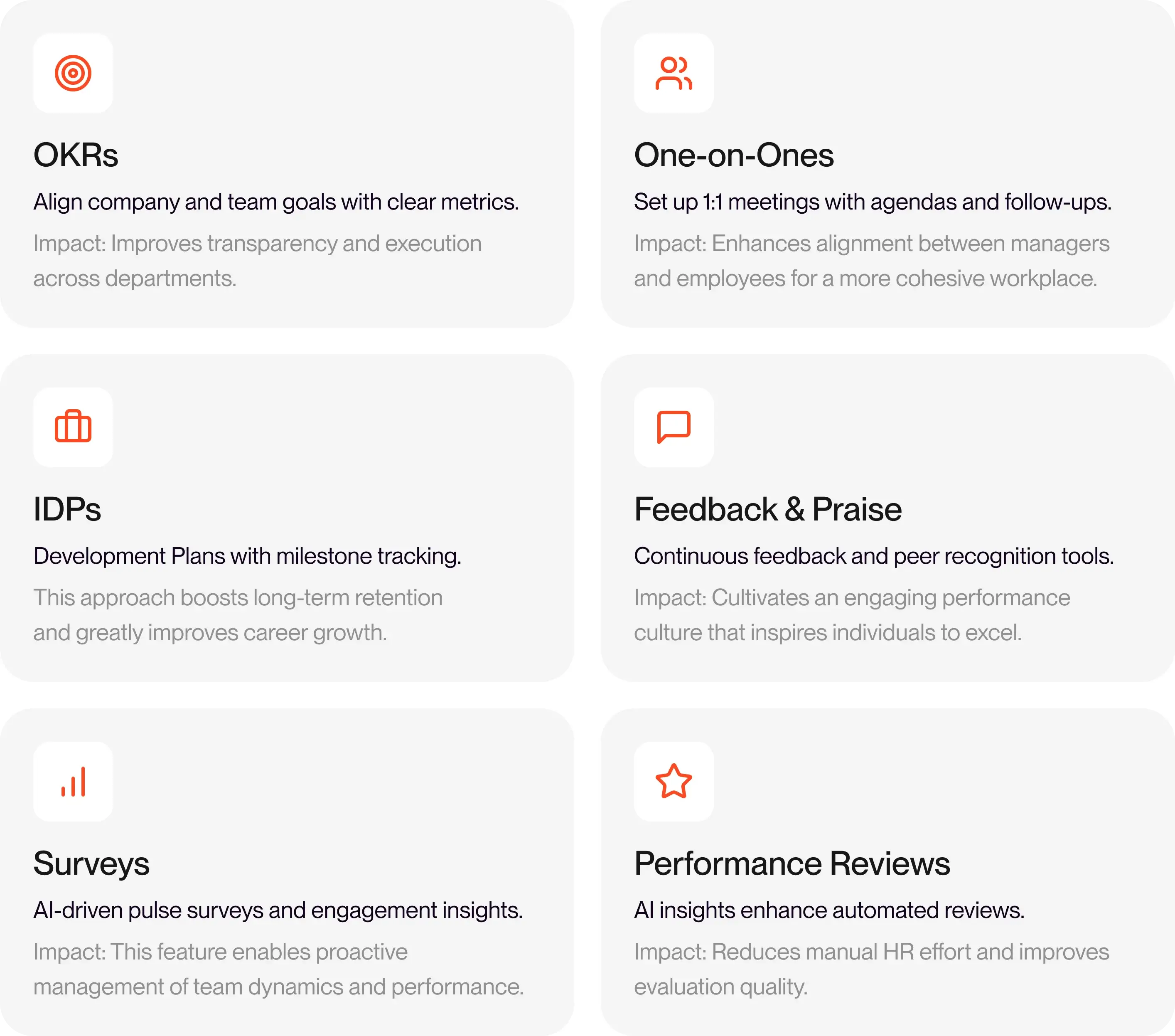
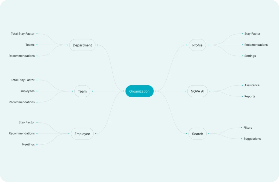
Core Features That Power Performance
AI-driven tools that help teams align, grow, and perform better.
Challenge
Peoplelogic faced several UX and UI challenges that directly affected product adoption and daily usage:
- The interface was visually overloaded and hard to scan, especially for first-time users
- Key metrics lacked context and explanations, making analytics feel abstract and hard to interpret
- Weak visual hierarchy made it difficult to identify priorities and next actions
- The absence of a unified design system caused inconsistencies across modules and slowed down product scaling
The main challenge was not only to refresh the UI visually, but to translate AI insights into clear, actionable understanding for managers and HR professionals.
Our Approach
We structured the redesign into clear, product-focused phases.
1. Research & Analysis
- UX audit of existing dashboards and flows
- Analysis of user pain points in analytics interpretation
- Identification of friction in onboarding and daily workflows
- Defining UX principles focused on clarity, hierarchy, and guidance
2. UX Strategy & Information Architecture
- Reworked information hierarchy for dashboards and metrics
- Defined clearer user paths for managers and HR roles
- Introduced contextual guidance instead of static data blocks
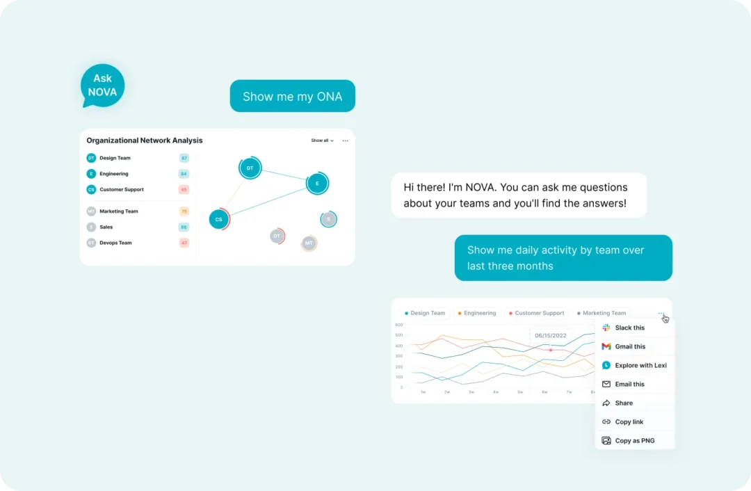
3. Analytics & AI Visualization
One of the core redesign goals was to make AI insights understandable.
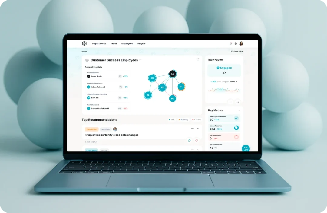
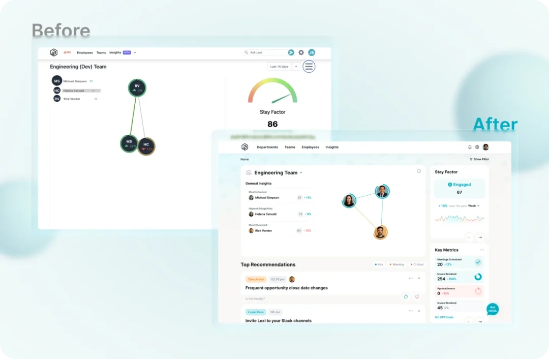
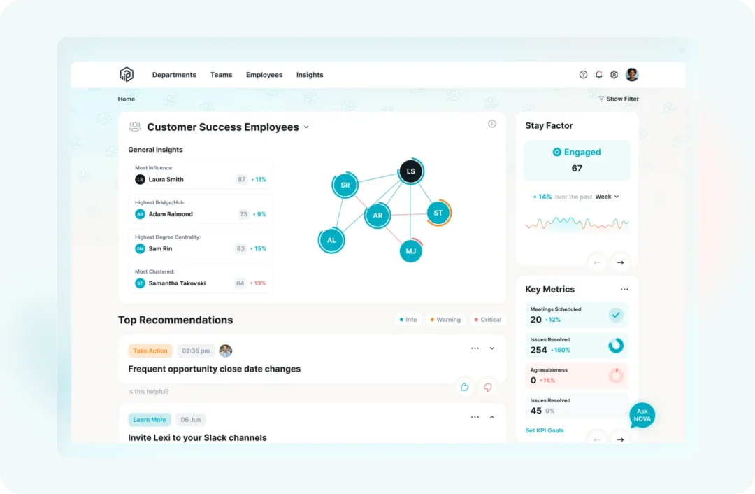
- Redesigned key metrics (e.g. StayFactor) from static widgets into modular, multi-level views. Key Improvements:
- Clearer engagement state (Engaged / Neutral / Disengaged)
- Contextual weekly trend visualization
- Reduced cognitive load for faster decisions
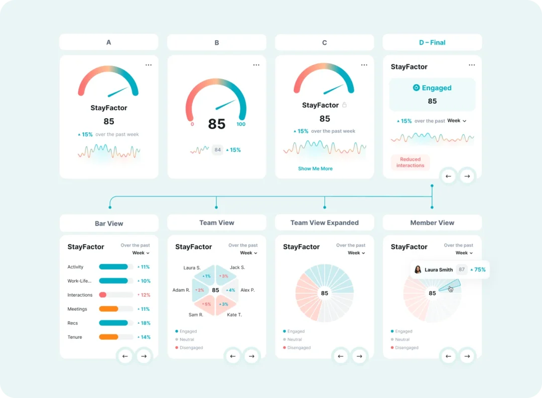
- Introduced drill-down analytics:
- Overview
- Team level
- Expanded insights
- Individual member view
- Added AI-powered explanations that clarify why changes happen (e.g. reduced interactions, engagement drops)
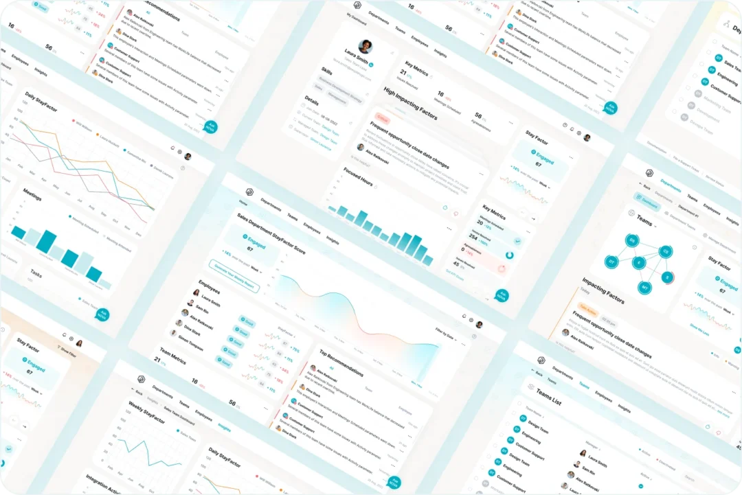
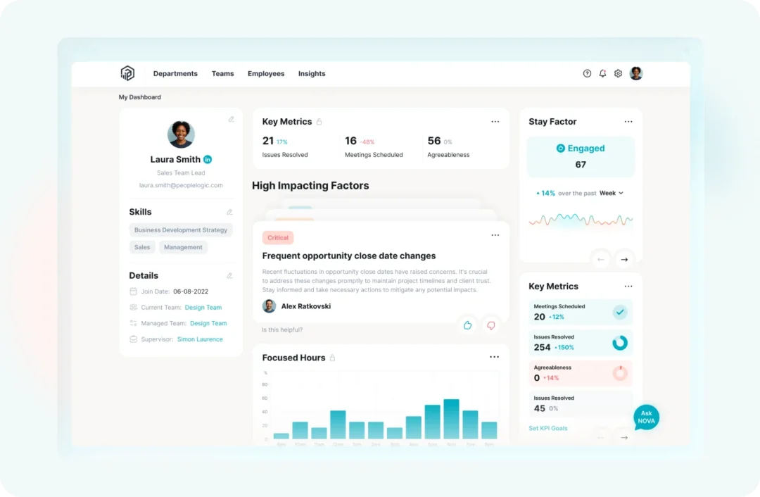
4. UI Redesign & Design System
- Modernized visual language with cleaner layouts and spacing
- Built a unified component-based UI kit
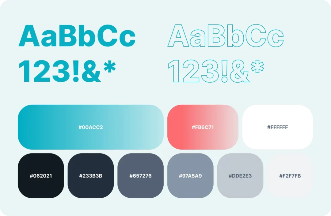
- Defined typography, color system, and iconography
- Created reusable patterns for dashboards, tables, charts, and AI hints
The new design system ensured consistency across all modules and made future product scaling faster and more predictable.
5. Onboarding & Contextual Navigation
- Introduced contextual onboarding for new users
- Added AI-driven hints and guidance within key screens
- Implemented clearer navigation logic to reduce cognitive load
- Helped users understand “what to do next” at every stage
Results
As a result, we delivered:
Improved UX & Product Clarity:
- Cleaner, more structured dashboards
- Clear visual hierarchy for key metrics and actions
- Easier understanding of AI-driven analytics
- Reduced entry barrier for new users
Higher Engagement with Analytics:
- Users interacted more frequently with analytical blocks
- Managers gained faster insights into team dynamics
- Metrics became actionable, not just informational
Scalable design system:
- Dozens of reusable components
- Unified visual patterns across all modules
- Faster implementation of new features
- Consistent UI across the entire platform
Redesign Impact:
Business Impact:
- Better understanding of performance and engagement metrics
- Improved quality and frequency of internal feedback
- Increased overall satisfaction with the product interface (based on client feedback)
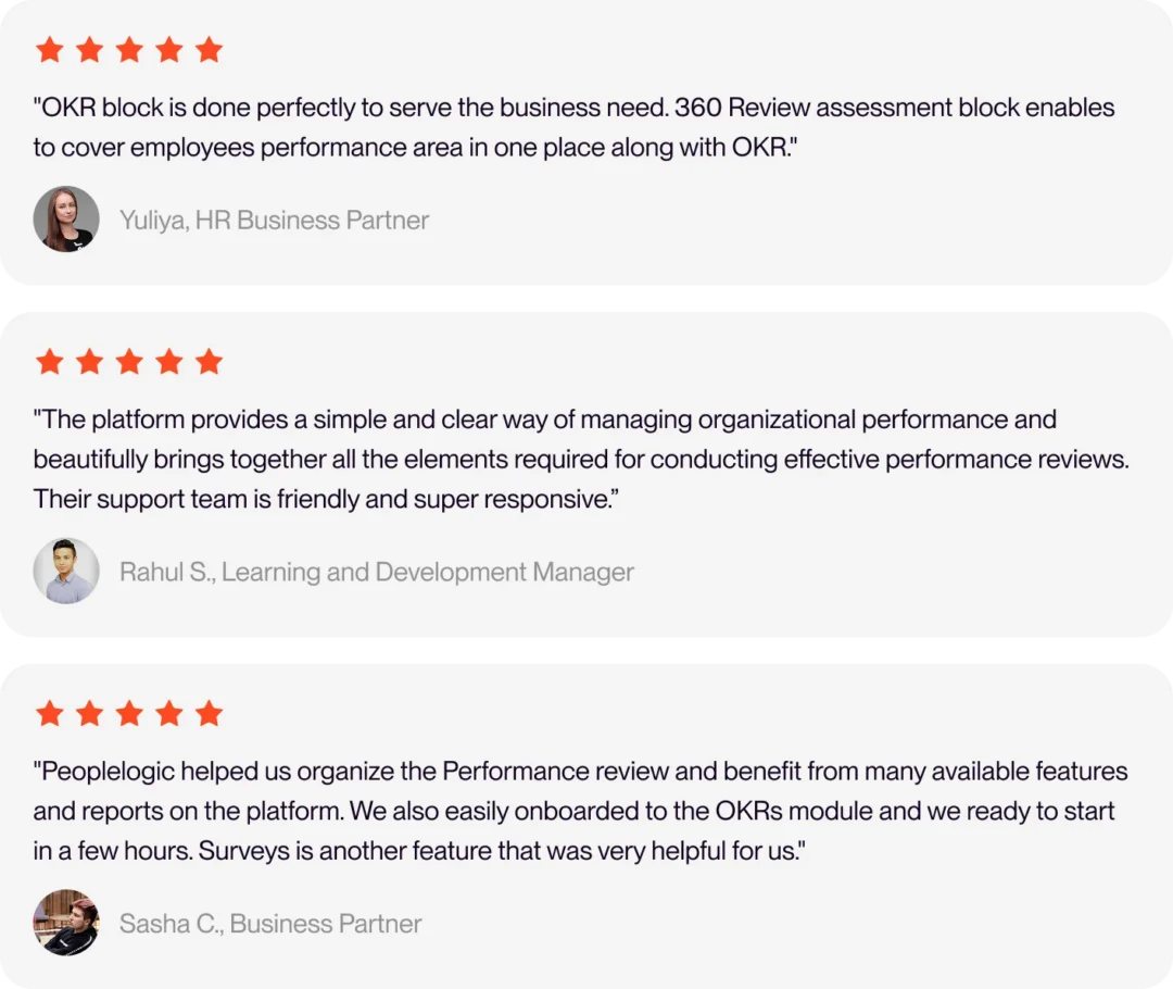
Trusted by leaders
Conclusion
The Peoplelogic redesign went far beyond visual improvements. We rethought how users interact with AI-driven insights, transformed complex analytics into understandable narratives, and created a scalable design foundation for future growth.
The platform became clearer, more intuitive, and better aligned with the needs of modern managers and HR teams – turning AI from a hidden engine into a visible product advantage.