Salud.ia: Designing an AI-powered health and longevity platform from scratch
8 min readingOct 15, 2026
Overview
In short: In about three months, Spaceberry designed Salud.ia — an AI-powered health and longevity platform for web and mobile, launched in Mexico and Latin America — from scratch, then reworked onboarding and the dashboard with alpha-user feedback, cutting the steps to first meaningful value by ~30% and making onboarding ~25% faster.
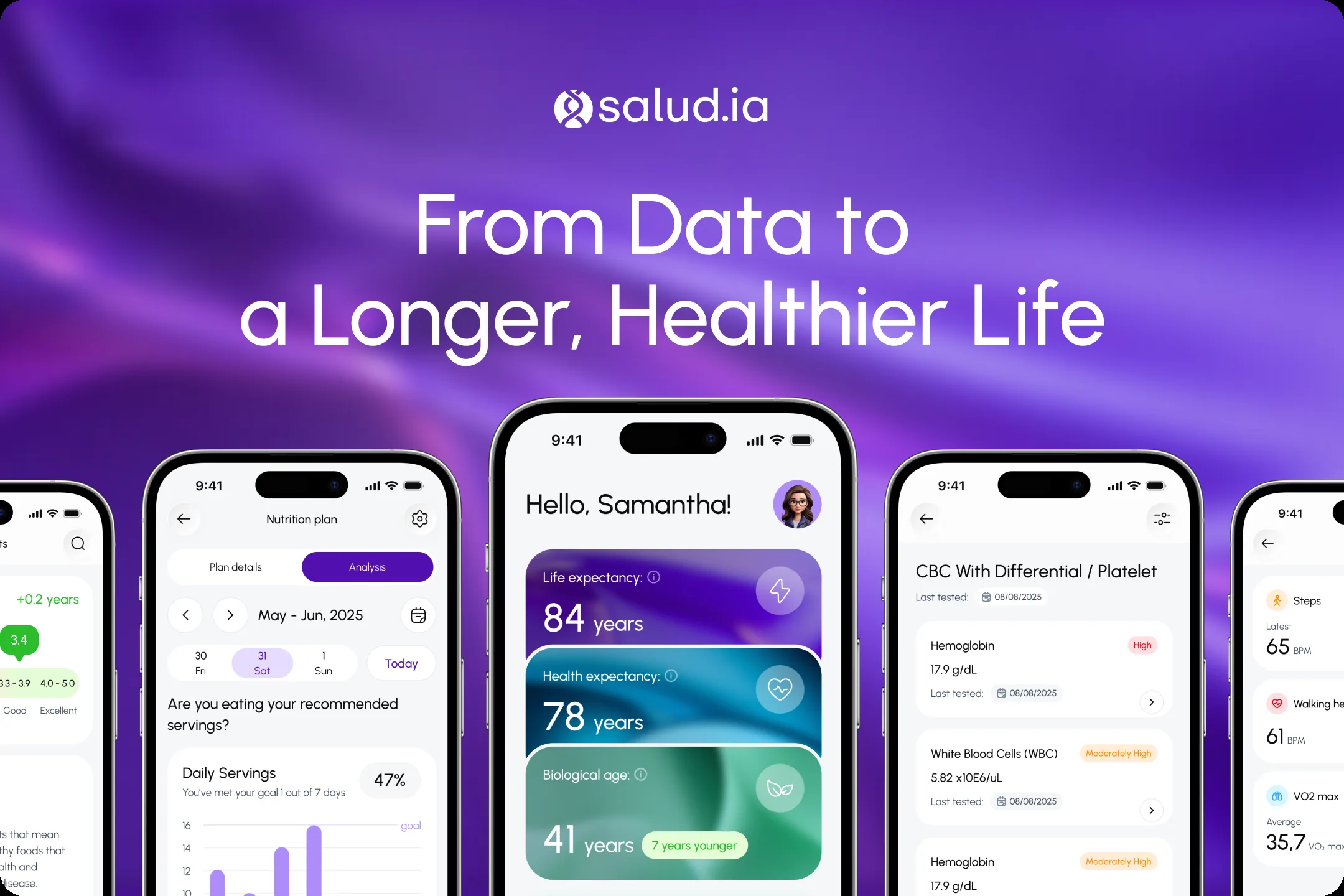
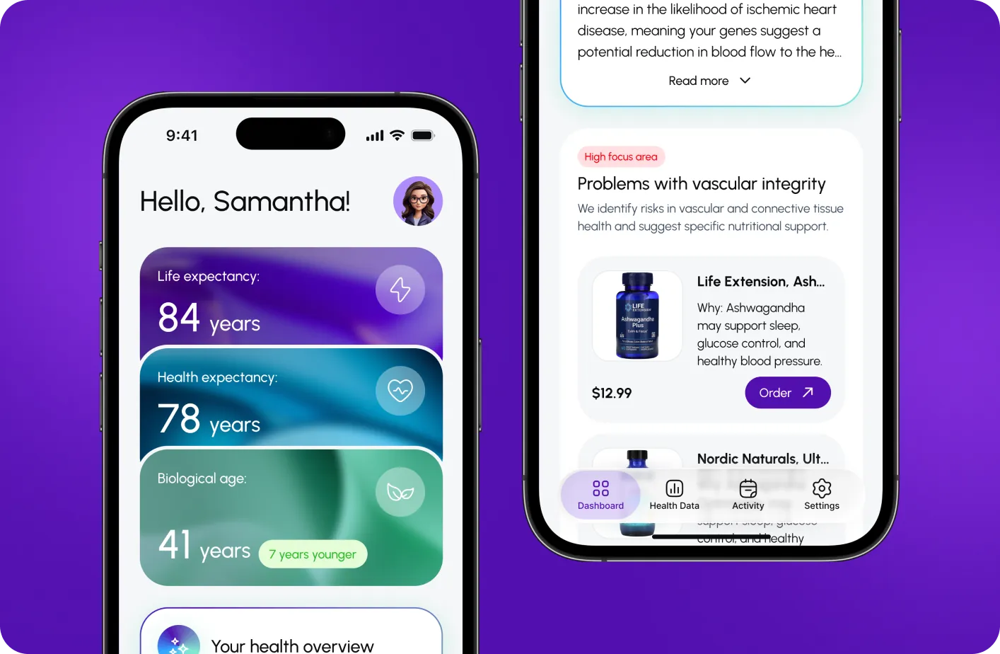
Salud.ia is an AI-powered health and longevity platform that helps users better understand their current condition, assess their healthspan and lifespan, and receive personalized recommendations for nutrition, physical activity, sleep, supplements, and lifestyle.
The product works with complex medical and biological data, including biomarkers, DNA data, and other health indicators, and translates them into a clear, practical, and motivating user experience.
- Location
- Mexico
- Duration
- ~3 months
- Industry
- HealthTech, AI
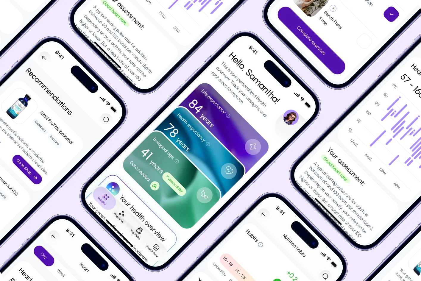
Product type: Health & Longevity Platform, Web and Mobile App
Scope of work: Competitor research, product workshops, product structuring, navigation mapping, user flows, wireframes, UI concepts, web and mobile design, feedback collection, iterative redesign, beta release preparation
Challenge
The main challenge was to make a complex health-tech product feel clear, valuable, and engaging from the very first minutes.
Salud.ia relies on a large amount of personal data and multi-step journeys. In products like this, it is easy to create a sense of overload before the user even reaches the first meaningful value. That is why it was important not only to present information well, but to structure the experience in a way that helped users reach the aha moment as quickly as possible, understand why each step mattered, and feel motivated to continue.
The main challenges included:
- Users did not clearly understand the product value, which created a high risk of low activation and early drop-off
- The onboarding flow was too complex, leading to drop-offs before users reached first meaningful value
- Multi-step data input increased friction and caused cognitive overload
- A lack of clear progress and reward reduced users’ motivation to continue the journey
Our Approach
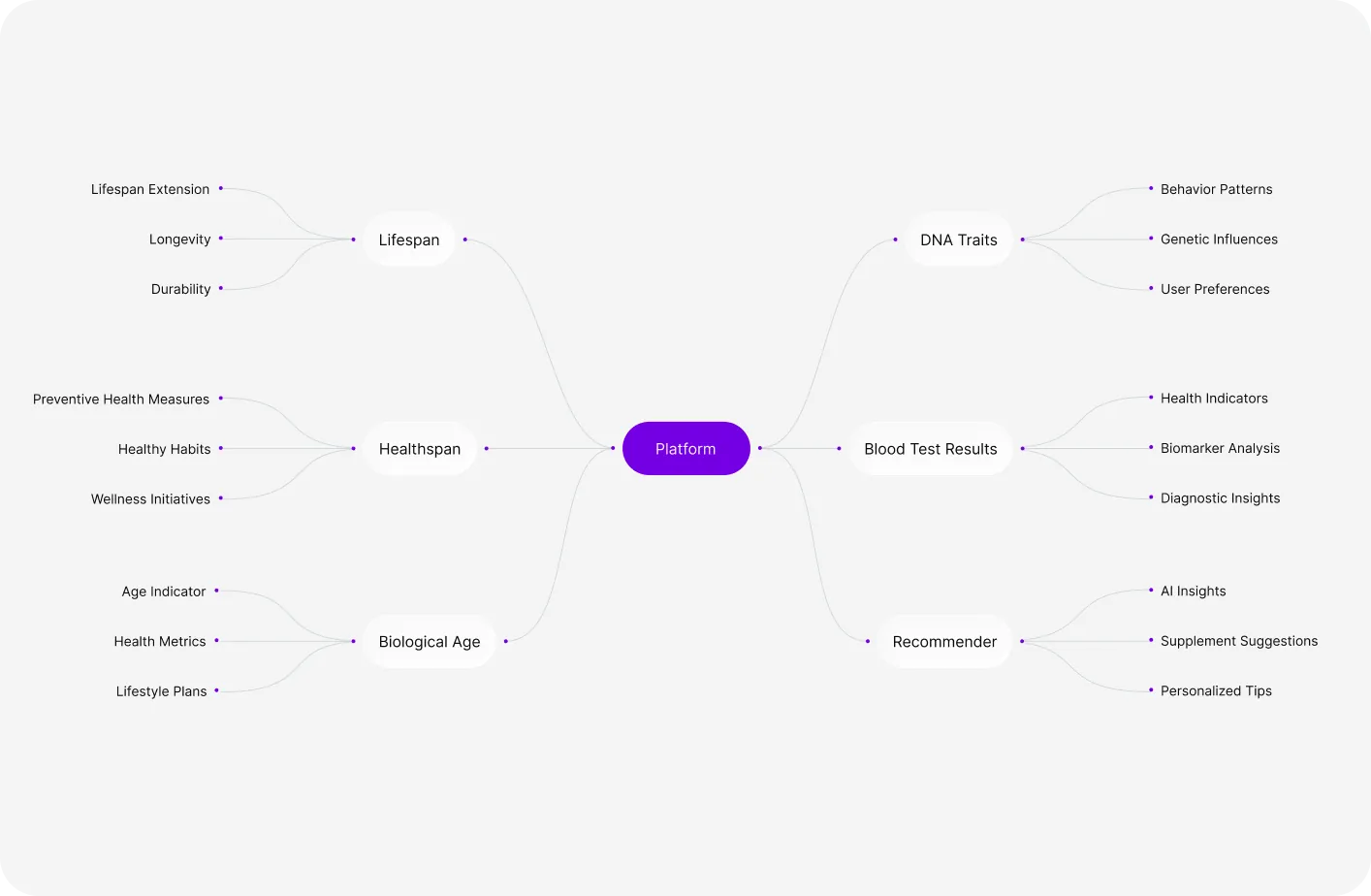
We shaped Salud.ia as a full end-to-end product, not just an interface. The process combined research, product structuring, and iterative validation to build a scalable web and mobile experience.
We analyzed competitors and behavioral patterns in health and wellness products to identify friction points, user expectations, and activation drivers. These insights informed the product logic, navigation, and key user flows.
The experience was built from the ground up through wireframes, UI concepts, and full interface design, with a strong focus on reducing friction and accelerating time to first value.
Rather than treating the work as a one-time delivery, we approached it as an iterative process. We tested hypotheses with alpha users, identified drop-offs and engagement gaps, and refined the onboarding and dashboard experience to improve activation and retention before arriving at a stronger beta version.
Workshops
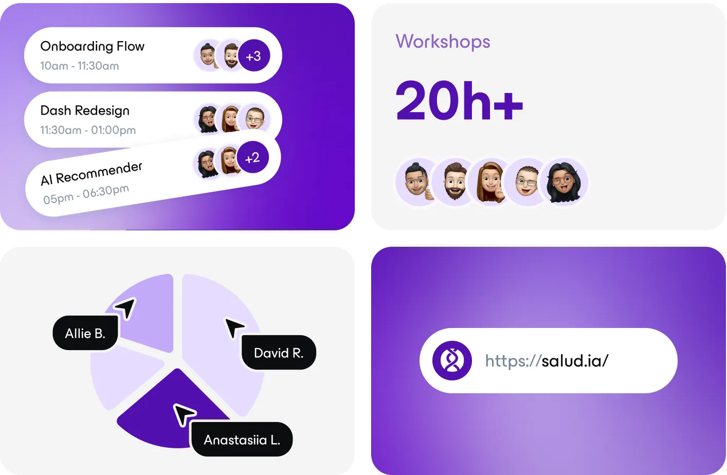
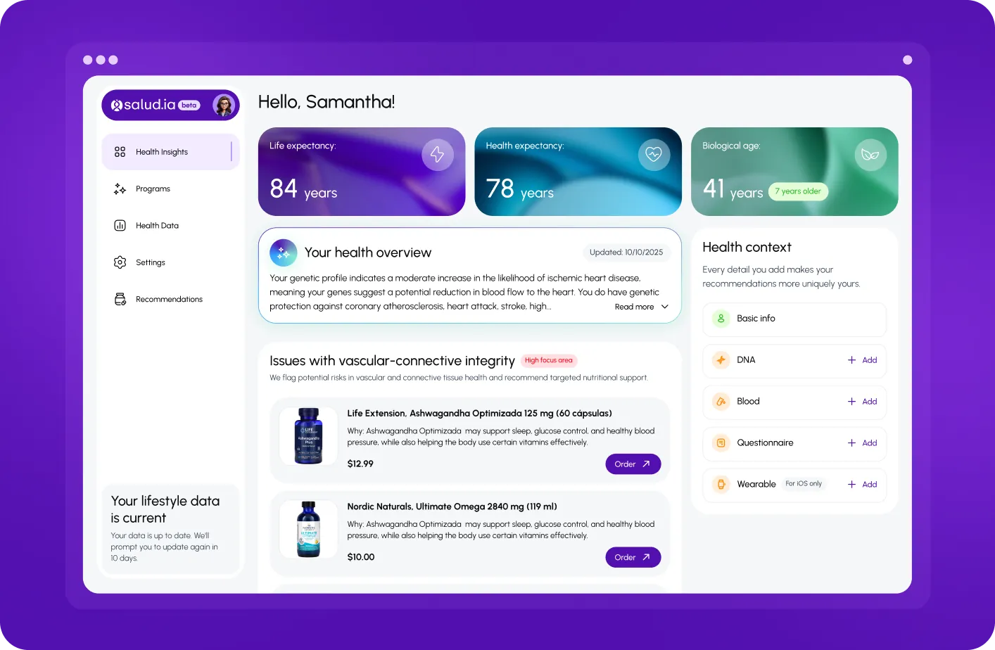
Workshops played an important role in aligning product vision, priorities, and key experience principles early in the process. They helped turn broad ideas into a clearer product direction, define what mattered most for users, and create a stronger foundation for flows, structure, and interface decisions.
Solutions
We approached the product through clear cause-and-effect decisions:
- Simplified onboarding and reduced the amount of initial data input to prevent early drop-offs, introducing a more progressive flow where value appears before effort
- Made product value visible within the first session by surfacing personalized insights earlier, helping accelerate activation
- Increased motivation in multi-step flows by introducing progress indicators, micro-feedback, and clear milestones
- Aligned web and mobile through consistent product logic to ensure a seamless cross-platform experience
Iteration Through Feedback
After creating the initial version of the product, we moved into a feedback phase with alpha users. This feedback was not treated as minor polish, but as an important source for rethinking key parts of the experience.
We analyzed:
- where users lost interest or motivation
- which steps created confusion
- what slowed down the path to the aha moment
- which parts of the experience needed a stronger sense of progress, clarity, and reward
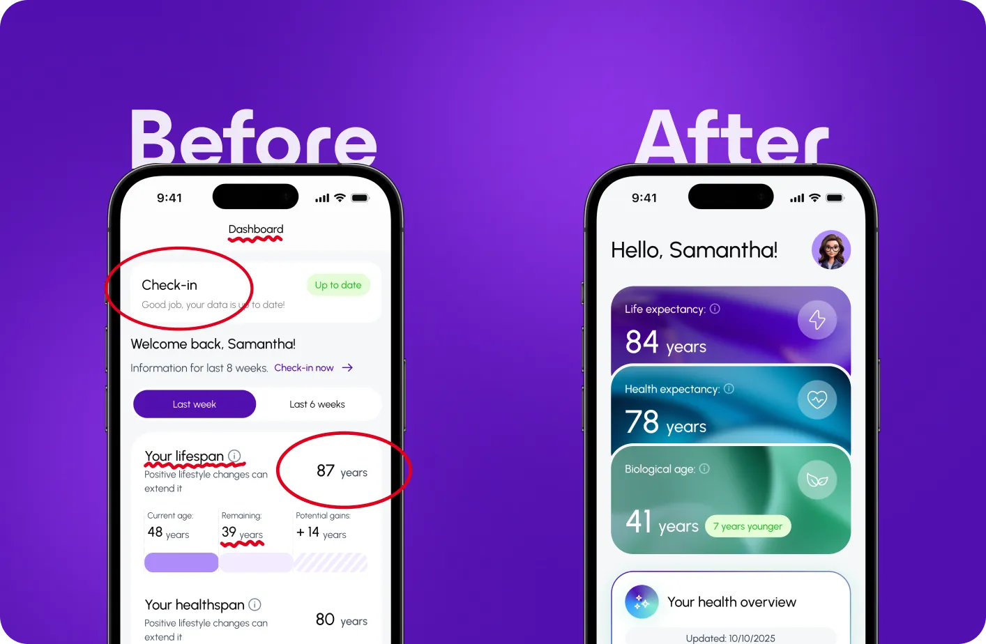
Based on these insights, the key journeys were revisited, and the product went through a redesign before the beta release. The most important changes were made in the onboarding and dashboard experience, since these had the strongest impact on speed to entry, first impression, and users’ willingness to continue.
Beta Outcome
As a result of these iterations, the product became stronger not only visually, but also at the level of product logic.
The updated beta version helped:
- bring users to the aha moment faster
- strengthen engagement within the core journey
- increase involvement throughout the product experience
- improve retention signals compared to the previous experience logic
To evaluate the redesign, we focused on measurable UX signals tied to activation and clarity:

- ~30% Fewer steps to first meaningful value
- ~25% Faster and smoother onboarding process
- 18+ Usability issues identified and fixed
- 8.4/10 UX maturity score improved
+ Stronger dashboard interaction potential through clearer hierarchy and guidance
Note: product metrics such as Day 1 / Day 7 retention, return rate after onboarding, and feature usage rate were defined as key success indicators for post-beta validation.
The most important shift was the relationship between user effort and perceived value. The product became much better at showing why users were completing each step, what they had already gained, and why it was worth continuing.
Product Impact
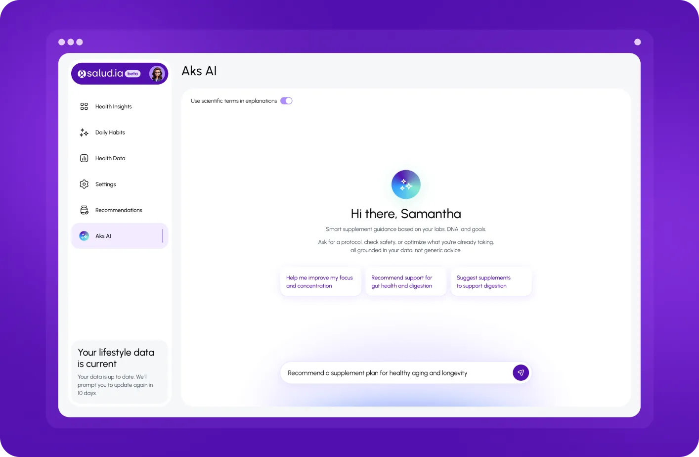
This project was not only about interface design, but about building an iterative product experience capable of attracting attention, delivering value quickly, and keeping users engaged.
The main success signals of the redesign were:
- faster arrival to first meaningful value
- stronger activation into the core product journey
- higher interaction with key parts of the experience
- better conditions for early retention
- a more natural continuation of the journey after the first session
Conclusion
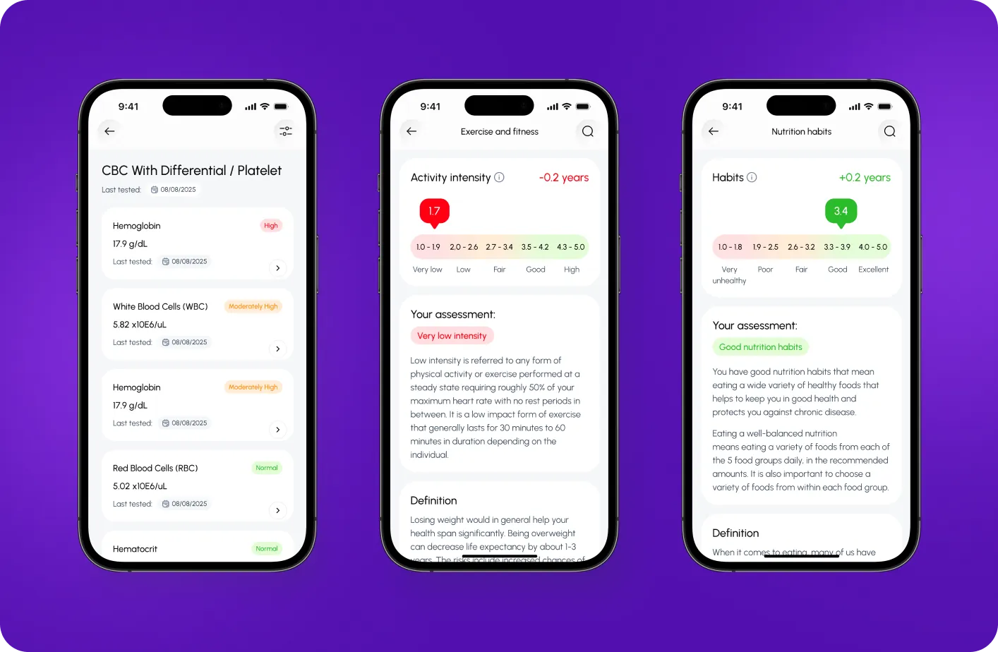
Salud.ia required much more than a polished UI. It demanded deep work on the logic of a complex digital product in the health-tech space.
Through competitor research, product design from scratch, the creation of a unified web and mobile experience, and iterations based on alpha feedback, we were able to shape a stronger beta version of the product.
The result was a more cohesive, understandable, and motivating experience that brought users to value faster, increased engagement, and created a better foundation for long-term retention.
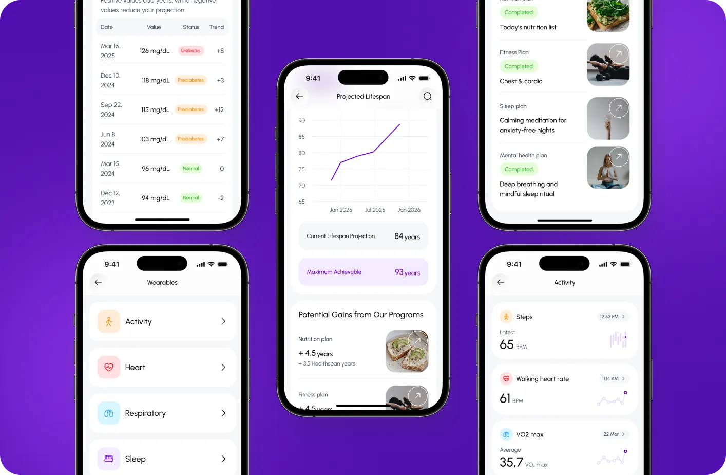
Live Product
Salud.ia is now live on the App Store, giving users access to the product in a real environment. The launch included an iPhone app with iPad support, a public 5.0 rating, and a live version history that shows the product continued evolving after release through onboarding improvements, nutrition updates, and new biomarker support.
Early trust signal
For an early-stage health product, even a small but positive public rating matters. It shows that the experience was credible enough for real users to validate publicly at launch.
While this is not yet a scale metric, it is an honest early trust signal in a high-friction category, where users need to feel confidence before engaging with personal health, biomarkers, and lifestyle recommendations.
Mexico + LATAM market entry. Commercial launch validation
Public launch materials positioned Salud.ia as Genetria’s first platform in the market, with rollout focused on Mexico and Latin America.
Our design work helped shape a launch-ready experience that could communicate complex health insights clearly, support onboarding, and introduce users to a new AI-powered health platform in a commercially active market.
3 post-launch updates within 72 days after the initial App Store release
The App Store version history shows an initial launch followed by several post-launch updates, including improvements to onboarding, nutrition-related functionality, and biomarker support.
This is a strong operational signal: the product was robust enough to launch, but flexible enough to support rapid feedback-driven refinement after V1.
For a founder or product team, this matters because it shows that the design system and product structure were not rigid. They created a foundation that could evolve quickly as the team learned from real users and adjusted the experience after release.
Client Feedback
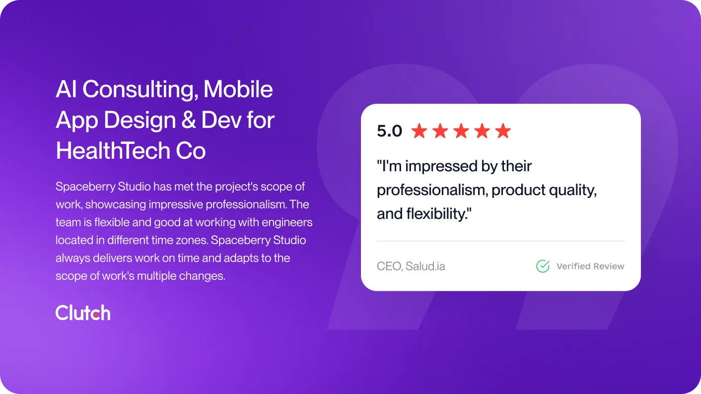
Alfredo’s response confirmed that the collaboration delivered exactly what was needed. He gave the project a perfect five-star rating and highlighted the team’s professionalism, product quality, and flexibility throughout the process. He noted that the work consistently met the agreed scope while adapting smoothly to new requirements as the product evolved.
Beyond the formal feedback, his comments showed real confidence in how the partnership was handled day to day. He emphasized that the team was always on time, responded positively to changes, and kept everything moving within the same fair pricing parameters presented from the start. That kind of response speaks not only to the quality of the final output, but also to the trust built during the collaboration.
What stood out most was his description of how the team worked under complex conditions. He pointed to their ability to collaborate effectively with engineers across multiple time zones, handle demanding requirements, and keep the project on time and on budget without needing constant follow-up. In his words, the team’s professionalism, flexibility, and product quality were what made the experience especially impressive.
Explore more of our work.