Subscription UX Patterns That Reduce Churn in Regulated Products
By Spaceberry Studio 6 min reading Feb 25, 2026

Subscription UX for regulated products plays a critical role in retention across fintech, healthtech, insuretech, banking, and compliance SaaS. They are a long-term trust agreement. And churn in these products rarely happens because of price alone. It happens because users lose clarity, confidence, or perceived value.
In complex, compliance-driven environments, UX becomes the primary retention engine. When onboarding is overwhelming, pricing feels risky, or cancellation flows create friction without reassurance, users don’t just cancel – they disengage emotionally long before they hit “unsubscribe.”
Effective subscription UX for regulated products isn’t about pushing harder. It’s about designing for trust, predictability, and sustained value.
Why Subscription UX for Regulated Products Impacts Retention
It’s easy to look at cancellation data and conclude you have a pricing issue. Or a support issue. Or a feature gap. In regulated products, the real cause is usually harder to see: cognitive overload, fear of making a compliance mistake, unclear value, or simply a feeling of being out of control.
Users in complex, compliance-driven environments don’t cancel because they dislike the product. They cancel because something made them uncertain. And uncertainty, left unaddressed, compounds quietly until it becomes a decision to leave.
Subscription UX for regulated products isn’t just a payment screen. It’s an ongoing experience that either reinforces confidence at every step or slowly chips away at it.
Give People a Reason to Stay Before Asking Them to Commit
Regulated products come with unavoidable friction. KYC verification, document uploads, legal confirmations, multi-step approvals – all of it necessary, none of it enjoyable. The mistake most teams make is placing all the value on the other side of that wall.
If users have to complete everything before they experience anything meaningful, churn risk spikes before the relationship even starts.
The better approach is designing early value moments: a simulated dashboard, a limited preview of insights, a guided walkthrough that produces something real. Not smoke and mirrors, but enough to make the user feel the product working before they’re fully committed.
The same logic applies to complexity. Don’t front-load it. Ask only for what’s essential in the first step, and introduce additional requirements gradually – when context makes them feel necessary rather than bureaucratic.
There’s a metric worth tracking here: Time to First Value. In regulated subscriptions, it matters more than trial length. If users experience something meaningful within the first 24–72 hours, the probability of them sticking around increases significantly.

Pricing Should Feel Safe, Not Just Affordable
In regulated industries, users don’t read pricing pages the same way they do in consumer SaaS. The questions running through their heads aren’t “Can I afford this?” – they’re “What happens to my data if I cancel?” and “Am I locking myself into something I can’t get out of?”
Pricing UX in these products needs to speak to risk, not just value. Instead of listing features, frame plans around what they protect – compliance coverage, data security scope, support guarantees. Make the safety explicit.
Renewal moments deserve the same attention. Before a billing cycle repeats, show users what they’ve actually used, what value was generated, what they’d be continuing. Surprise renewals damage trust. Predictable ones reinforce it.
One more thing worth saying clearly: dark patterns don’t work here. Hidden cancellation flows, confusing billing structures, forced downgrades – they might move short-term metrics, but in regulated markets, they create legal exposure and destroy the credibility you’ve spent months building. Ethical UX isn’t idealism. It’s the smarter long-term strategy.

Retention Requires Ongoing Design, Not Just Good Onboarding
Churn rarely happens suddenly. It builds in the background – a session not completed here, a feature not understood there – until one day the user decides it’s not worth continuing.
Retention UX means designing for that entire lifecycle, not just the first week.
Before renewal cycles, make progress visible. Show users what they’ve accomplished, what risks they’ve avoided, what reports they’ve generated. People are more likely to continue something when they can see it working.
In regulated products, education is also a retention tool. Policies change. Compliance standards evolve. Product features get updated. Contextual tooltips and in-product guidance keep users informed and confident – and confidence is what keeps them subscribed.
It’s also worth monitoring behavioral signals early. Drop in active sessions, incomplete processes, failed payments – these are signals, not just data points. Designing proactive intervention flows around them, whether that’s a gentle reminder or a simplified guide, is almost always cheaper than trying to win back a user who’s already left.

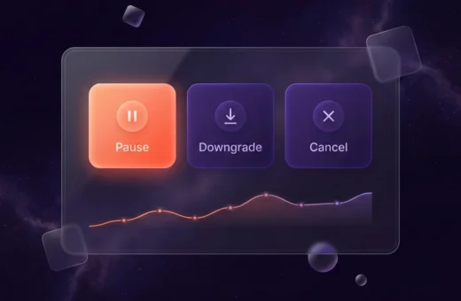
How You Handle Cancellation Matters More Than You Think
Cancellation is a high-emotion moment. The UX around it directly affects whether you lose a user permanently or create a path back.
Not everyone who wants to cancel is done with your product. Some are dealing with budget pressure. Some are in a slow period. Some just need a break. Offering a pause option – not as a desperate retention trick, but as a genuine acknowledgment that circumstances change – reduces impulsive churn without creating resentment.
Similarly, allowing users to downgrade without losing their historical data or core access reduces the psychological cost of stepping back. When people know they can leave without losing everything, they’re often more willing to stay.
And when someone does choose to cancel, a short optional question “What made you consider leaving?” isn’t manipulation. It’s how you learn. Products that let users exit respectfully tend to see more of them come back.
Security Isn’t Just a Backend Concern
In regulated products, visible security is a retention driver. Users need to feel protected, not just be protected.
Small, consistent UX cues: security badges, clear permission management, accessible audit logs, transparent activity history – reduce the background anxiety that regulated product users carry. And anxiety, more than almost anything else, quietly drives churn.

The Underlying Pattern
Across all of these onboarding, pricing, lifecycle, cancellation, security the same logic holds. In subscription UX for regulated products, churn is driven by uncertainty, not dissatisfaction. Users leave when they stop feeling safe, in control, or clear on the value they’re getting.
UX can’t fix a fundamentally broken product. But when the product is solid, UX is what keeps people from talking themselves out of it.
Retention isn’t a billing feature. It’s a design system: one built around clarity, predictability, and the ongoing feeling that staying is the right decision.
If your subscription product operates in a regulated market and retention hasn’t been a design priority yet – that’s usually where the biggest gains are hiding.
👉 Schedule a strategy call with our team or explore our monetization UX insights to know where users are losing confidence. We’ll help you identify where users are losing confidence and what it takes to keep them.

Bohdan Ostafiiv


