Telemedicine UX Design: 7 Best Practices for Healthcare Platforms
By Bohdan Ostafiiv5 min readingApr 11, 2024
- 1. Easy Navigation and Information Search
- 2. Video Consultations with Doctors
- 3. Convenient Doctor Appointment Booking
- 4. Use Simple and Readable Fonts
- 5. Use Health-Related Icons
- 6. Accessibility Across Devices
- 7. Data Visualization and Analytics
- What We Learned from Our Healthcare Projects
- FAQ
- What makes a good telemedicine app?
- How do you make a telemedicine platform accessible?
- How long does it take to design a telemedicine platform?
A telemedicine platform is judged in the first few minutes. A patient who is unwell, anxious or simply short on time has to find the right doctor, book a slot, join a video call and understand what happens next — often on a phone, sometimes with poor eyesight or a weak connection. Every unclear label or extra step at that moment is a reason to call the clinic instead.
At Spaceberry we design healthcare products for web and mobile: an AI health and longevity platform (Salud.ia), a dental staffing marketplace with an iOS app, a web app and an admin panel (Ponteo), and a UK health platform that turns blood, DNA and wearable data into personal recommendations (OptimallyMe). Below are the seven practices we apply to telemedicine interfaces, and what we learned on those projects.
1. Easy Navigation and Information Search
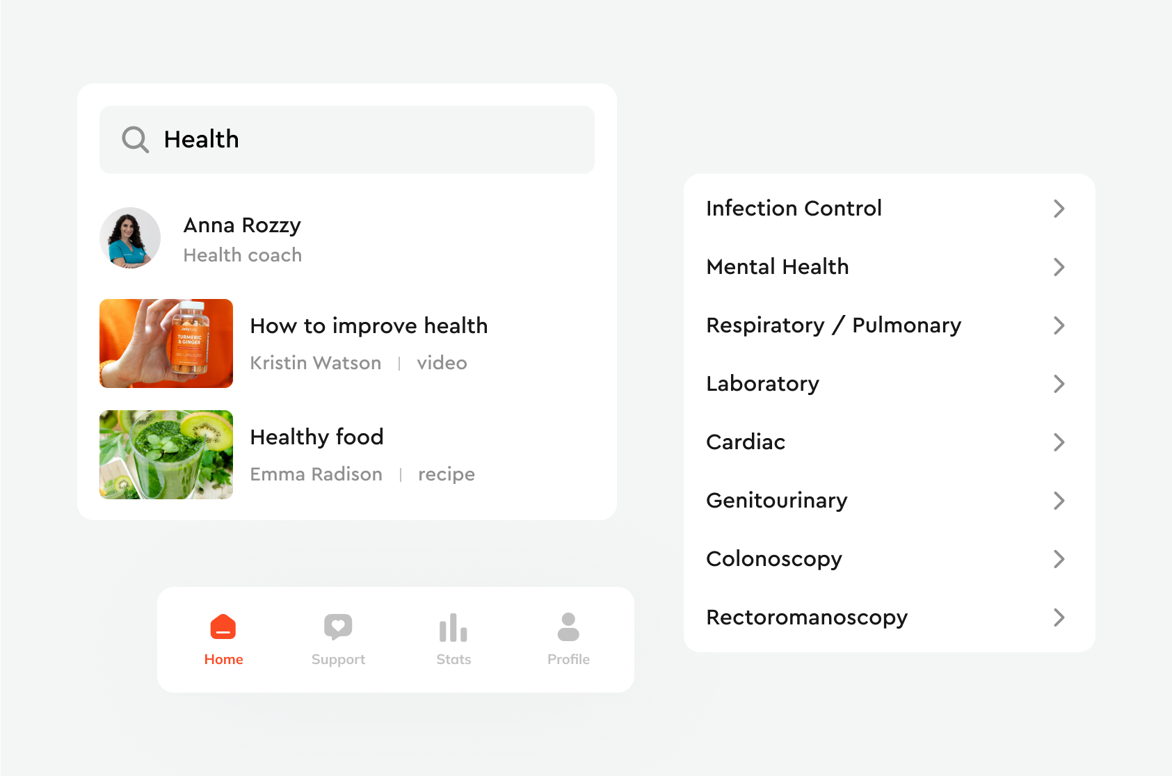
Search and navigation decide whether people with little technical experience can use the platform at all. Patients should reach a doctor, a consultation type or their test results in two or three taps, without learning the product first.
Start from the information architecture: group content by what the patient is trying to do (get advice, book, see results, pay), not by how the clinic is organised internally. Then make the design mirror that structure, with short, plain labels — "Book a visit", not "Scheduling module".
2. Video Consultations with Doctors
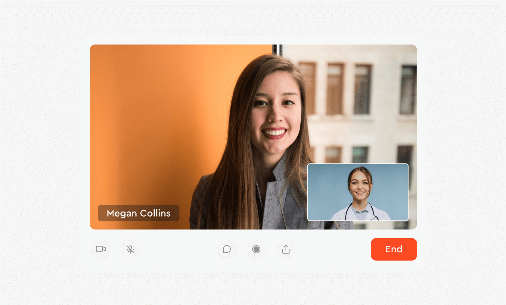
Video consultations let patients get care at home, shorten waiting times and give doctors a way to see people outside regular hours or in remote regions. According to the World Health Organization, telemedicine improves access to care in underserved regions.
The interface work is in the details around the call:
- Before the call: a pre-call check for camera, microphone and connection, so the first two minutes of a paid consultation are not spent on "can you hear me?".
- During the call: large, labelled controls (mute, camera, end), the doctor's name and specialty always visible, and a clear state when the connection drops.
- After the call: a summary screen with the next step — prescription, follow-up booking or test referral — instead of returning the patient to the home screen.
3. Convenient Doctor Appointment Booking
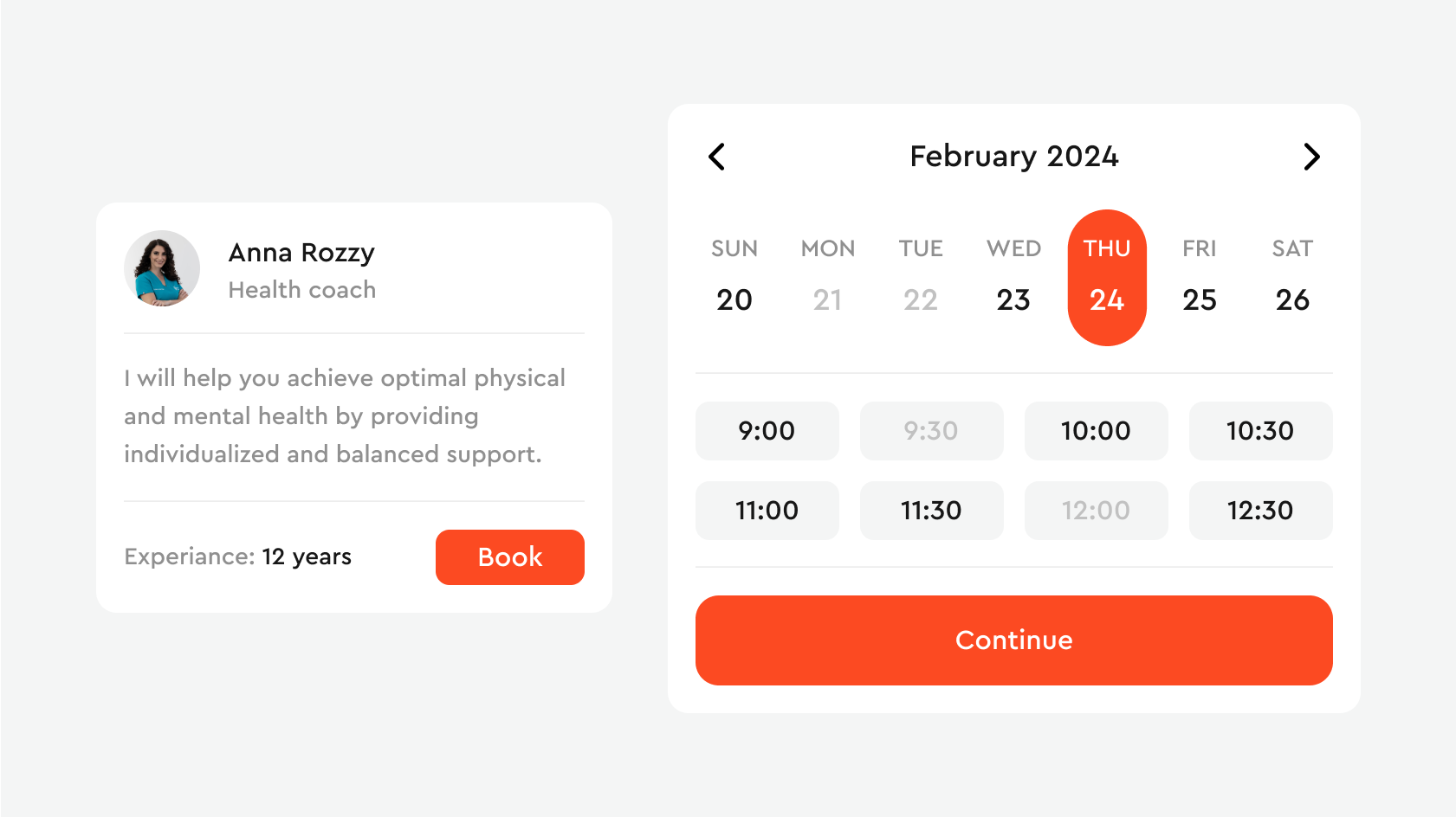
Online booking is the feature patients use most, and the one that saves clinics the most admin time. A good booking flow covers the whole cycle: booking, rebooking, cancelling, reminders and follow-ups.
- 24/7 availability: patients book when it suits them, not during the clinic's phone hours.
- Fewer no-shows: push and email reminders, with a one-tap way to reschedule, so a missed slot becomes a moved slot.
- Clear payment: price, what is covered and refund rules shown before confirmation, not after.
- Less paperwork: intake questions collected in the app before the visit.
On Ponteo, where dental practices book freelance specialists, practices manage the same bookings in board, list and calendar views, and specialists get jobs with a map view and filters by distance, pay, date and specialty — so each side sees bookings in the form that suits how they plan.
4. Use Simple and Readable Fonts
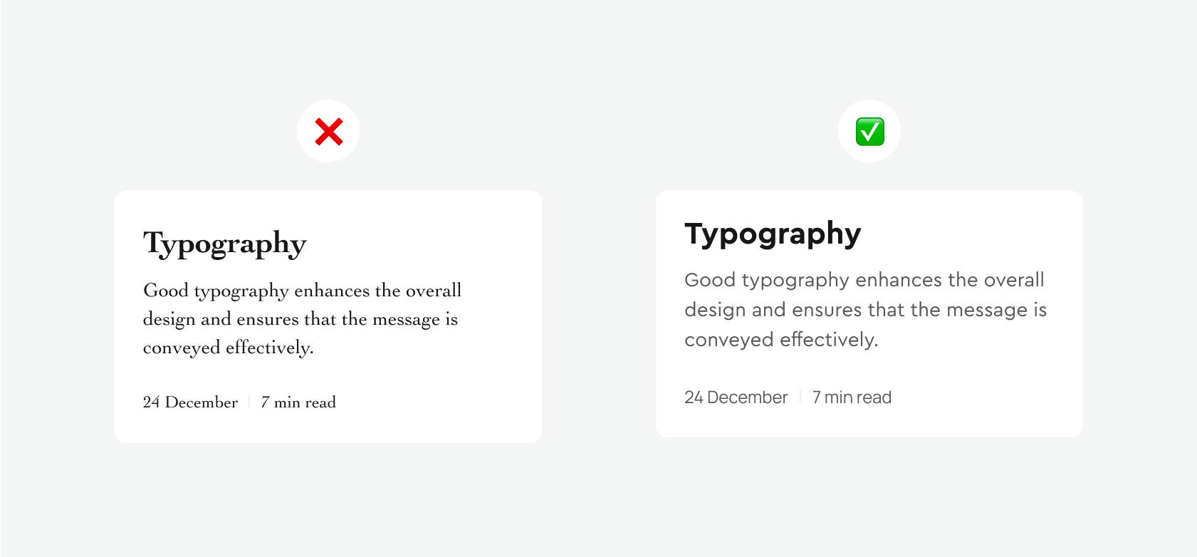
Medical information has to be read correctly the first time. Use clean sans-serif typefaces, generous line height and enough letter spacing (kerning) so that dosages, dates and instructions are not misread. Make sure text scales with the system font size: many telemedicine users are older or have impaired vision.
5. Use Health-Related Icons
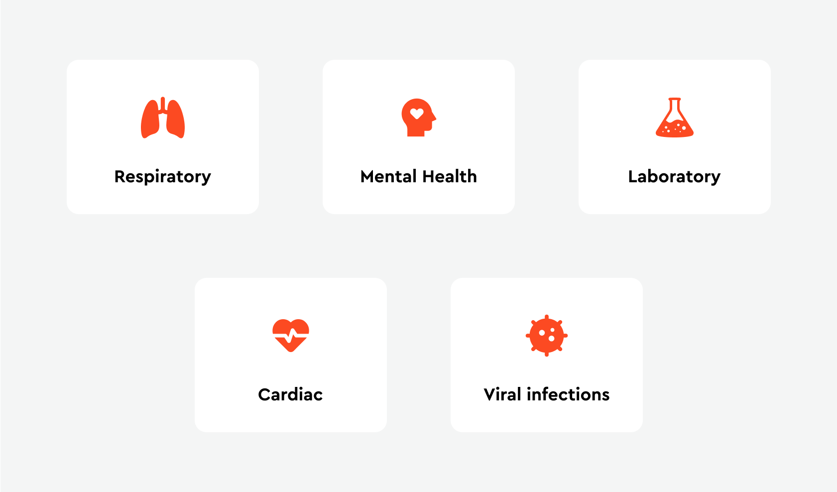
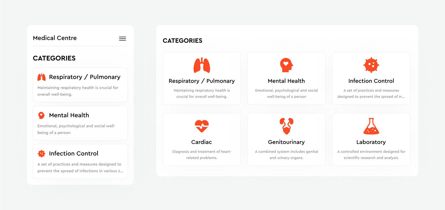
Icons for body systems, tests and actions (chat, video call, prescription) make long category lists faster to scan. They only help when they are consistent in style, colour, contrast and size — and when every icon still has a text label next to it. An icon alone is a guessing game for a worried patient.
For more on what to avoid, see 7 common UI design mistakes and how to fix them.
6. Accessibility Across Devices
Patients switch between phone, tablet and desktop, and the platform has to work the same on each. Design responsive layouts, support screen readers, keep colour contrast at WCAG levels and give captions or chat alternatives for people with hearing impairments.
Test on real devices as well as emulators. Ponteo's three products — an iOS app for specialists, a web app for practices and an admin panel — share one infrastructure of bookings, payments and compliance, and on Salud.ia we aligned web and mobile through the same product logic so that patients can switch devices without relearning the flow.
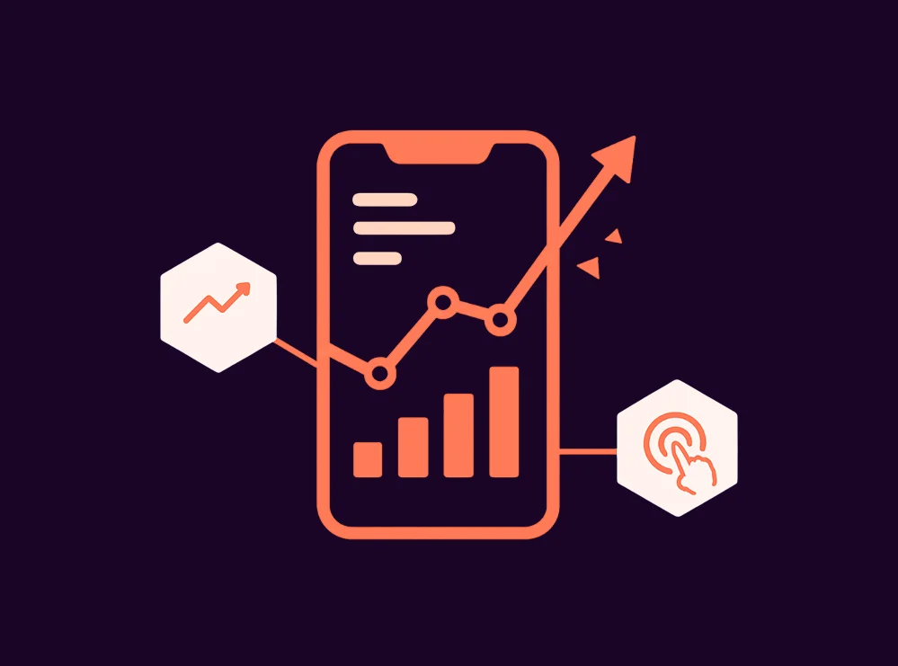
7. Data Visualization and Analytics
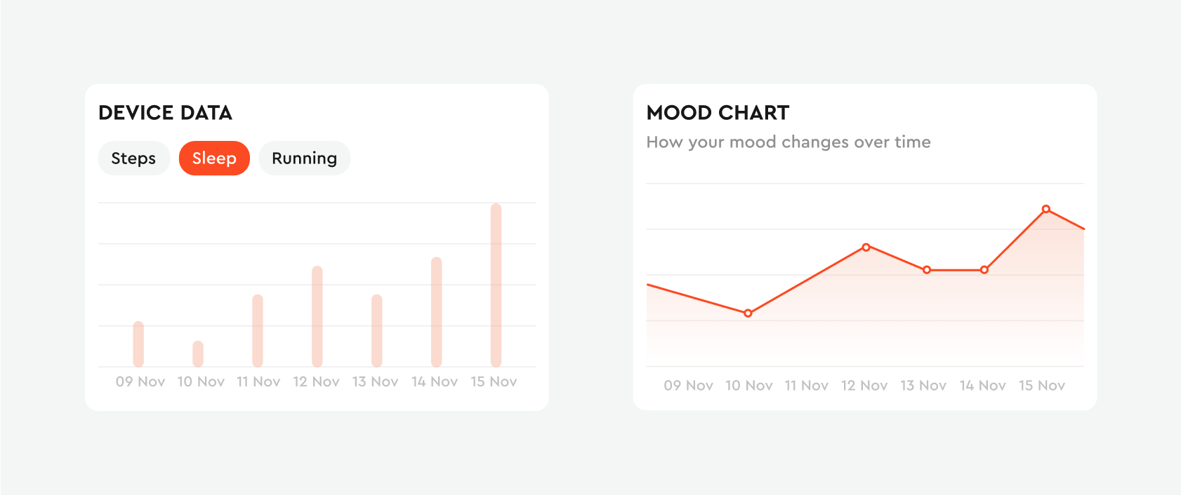
Telemedicine platforms collect a lot of data: consultation history, vitals from wearables, lab results. For clinics, analytics show wait times, demand and outcomes. For patients with chronic conditions such as diabetes or hypertension, trends over time are what make the data useful — a rising blood sugar curve is a reason to act before the next visit.
The design challenge is to turn raw numbers into a clear next step. On OptimallyMe, blood tests, DNA results and smart-device data feed one dashboard, so the interface had to explain what each number means and what to do about it, not just plot it. On Salud.ia, which works with biomarkers and DNA data, we reworked onboarding and the dashboard after alpha-user feedback so that personal insights appear in the first session. That cut the steps to first meaningful value by about 30% and made onboarding about 25% faster.
What We Learned from Our Healthcare Projects
- Value before effort. Health products ask for a lot of personal data. Ask only for what the first result needs, and collect the rest progressively once the patient has seen something useful (Salud.ia).
- Trust has to be visible. Verification status, credentials and payment rules should be on screen, not in the terms. On Ponteo we designed structured verification with visible progress and status, and the project resolved 18 critical usability issues.
- Medical accuracy needs medical eyes. On OptimallyMe one of our designers has a degree in medicine, which let us check that health content was accurate as well as readable.
If you are planning a product like this, our healthcare design services page shows the kinds of products we design. For retention in health and other regulated products, read subscription UX patterns that reduce churn.
FAQ
What makes a good telemedicine app?
Fast access to a doctor, a booking flow with reminders and easy rescheduling, a reliable video call with a pre-call check, readable medical information and a clear next step after every consultation.
How do you make a telemedicine platform accessible?
Follow WCAG contrast and screen-reader guidelines, let text scale with system settings, label every icon, offer chat or captions next to video, and test on the real devices your patients use.
How long does it take to design a telemedicine platform?
It depends on scope. Salud.ia, a web and mobile health platform, took about three months from research to a beta-ready design; a focused redesign of booking or onboarding can take a few weeks.

- 1. Easy Navigation and Information Search
- 2. Video Consultations with Doctors
- 3. Convenient Doctor Appointment Booking
- 4. Use Simple and Readable Fonts
- 5. Use Health-Related Icons
- 6. Accessibility Across Devices
- 7. Data Visualization and Analytics
- What We Learned from Our Healthcare Projects
- FAQ
- What makes a good telemedicine app?
- How do you make a telemedicine platform accessible?
- How long does it take to design a telemedicine platform?
Related articles

Feel we’re a perfect match?
If we’ve managed to impress you with our works and you have no doubt that you’re ready to collaborate with us, choose your preferred way to reach out.
Want to test our skills?
We offer a free 3-day trial to explore our expertise and see how we add value to your project. Assess our skills and workflow before committing to a partnership.