Common UI Mistakes and How to Do It Right
By Spaceberry Studio 8 min reading Mar 14, 2024

UI Mistakes can quietly undermine even the most promising digital product. A well-designed user interface significantly impacts product success, while poor UI decisions can frustrate users and reduce engagement. It’s a make-or-break element that often dictates success. Yet, it’s not uncommon for even seasoned designers to stumble upon certain pitfalls. To assist you in avoiding common pitfalls, we have compiled a list of 7 tips to help you improve your user interface development skills. Understanding common UI Mistakes helps designers avoid usability pitfalls and build more intuitive, accessible interfaces.
Common UI Mistakes in Visual Design
UI Mistakes: Incorrect Color Accents
Color transcends mere aesthetics; it’s a vital tool for guiding and communicating with users. Thoughtfully implemented color accents can transform user navigation, providing intuitive cues and drawing focus to critical interactive elements. Consider using color accents as an element of navigation, user orientation, and drawing attention to key interactive details or zones. This increases the likelihood of correct clicks and avoids confusion among a multitude of similar layout elements.
Common mistakes include incorrect color contrast, mismatching colors with the overall context, and inattention to the target audience’s characteristics. Always choose colors that harmoniously complement each other and are not harsh on the eyes. Also, consider that depending on the site’s theme, certain color palettes may be appropriate. For example, financial and insurance sites often use shades of blue. It is also necessary to consider that different age and gender groups prefer different colors.
When using brand colors on several elements, they complement each other. Avoid overusing accent colors, as it distracts the user and reduces the effectiveness of your interface.
As you explore the use of color in UI design, understanding the foundational design principles can be invaluable. Gain further insights by reading our article on Spaceberry Studio Design Principles.
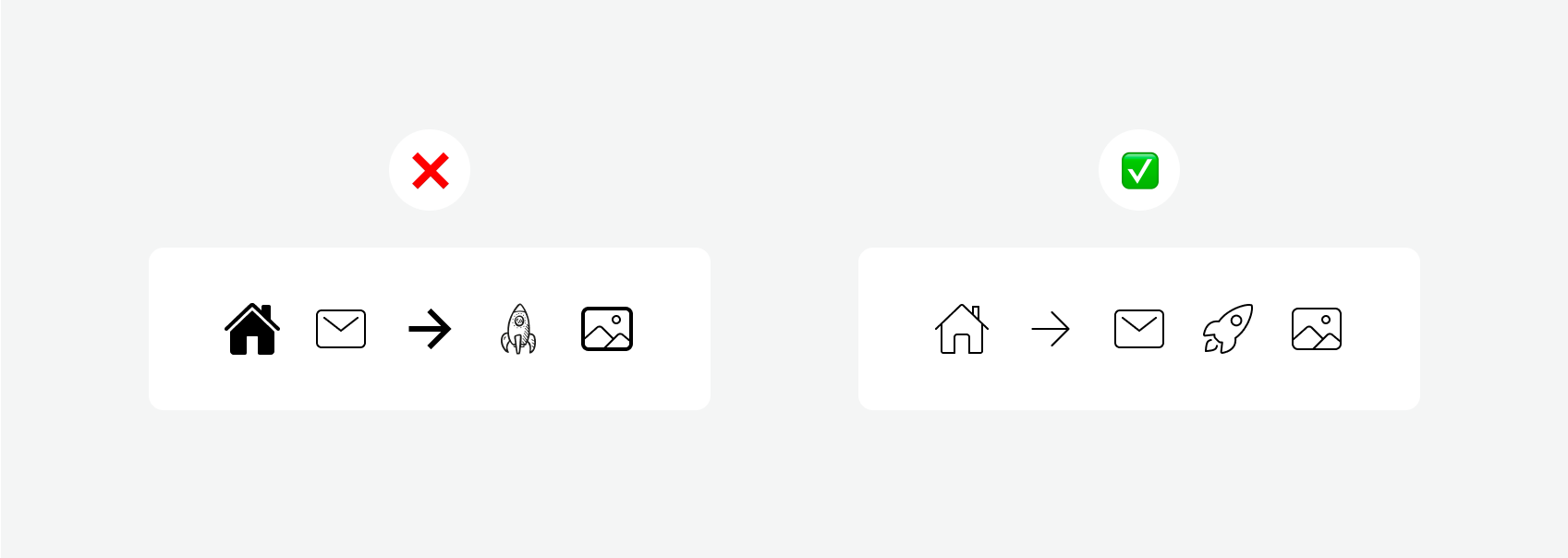
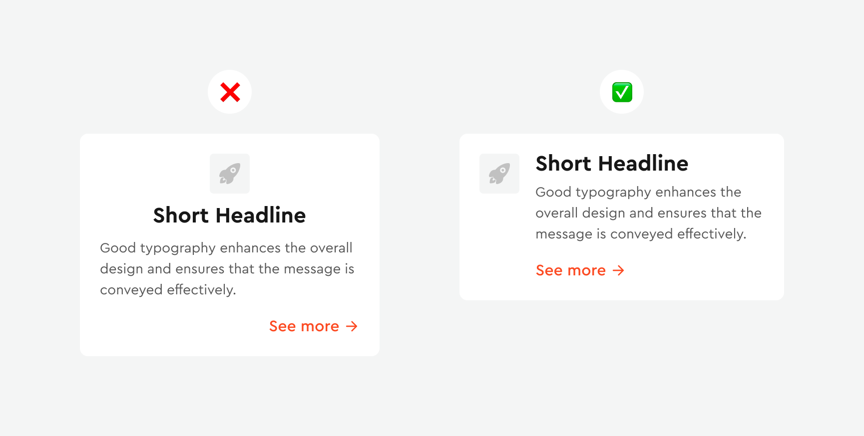
UI Mistakes: Poor Iconography
Icons are much more than decorative elements; they are the linchpins of effective and engaging interfaces. Their role in shaping user experiences and facilitating information perception is particularly pronounced in mobile design, where icons often stand in for physical buttons. In this segment, we delve into the art and science of selecting the right icon styles: a decision that can make or break the clarity and functionality of your user interface. Poor icon usage is one of the most overlooked UI Mistakes in mobile and web design.
- Maintain consistency in icon style. All icons should follow one style, whether it be line, filled, minimalist, or others. Also, ensure consistent line thickness and corner radius.
- Use vector formats, such as SVG, to ensure clarity of icons on any device and resolution, providing adaptability.
- Choose icons that accurately reflect their purpose to avoid confusion and misunderstanding by users. If they convey content intuitively, it eases interaction with the interface.
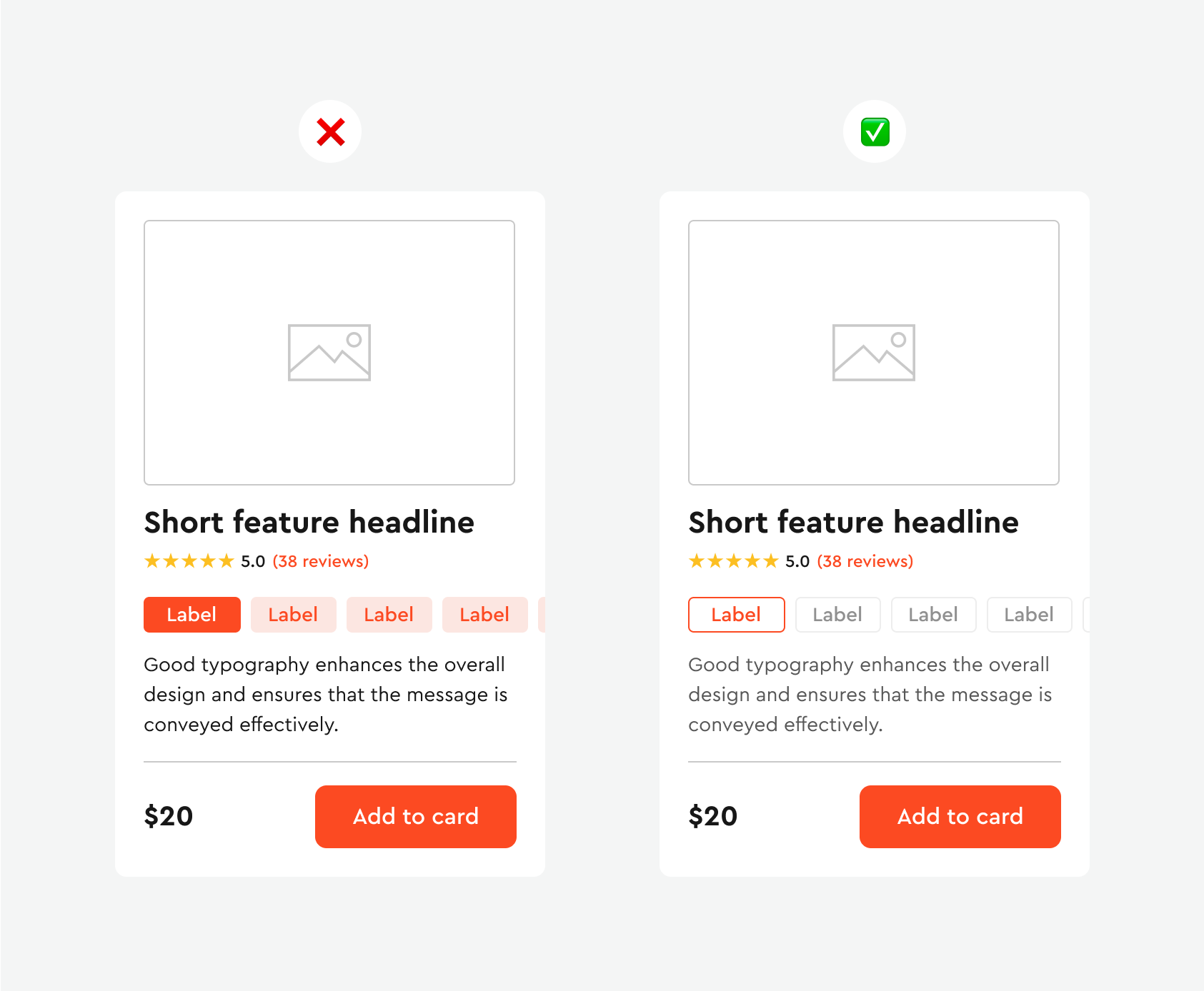
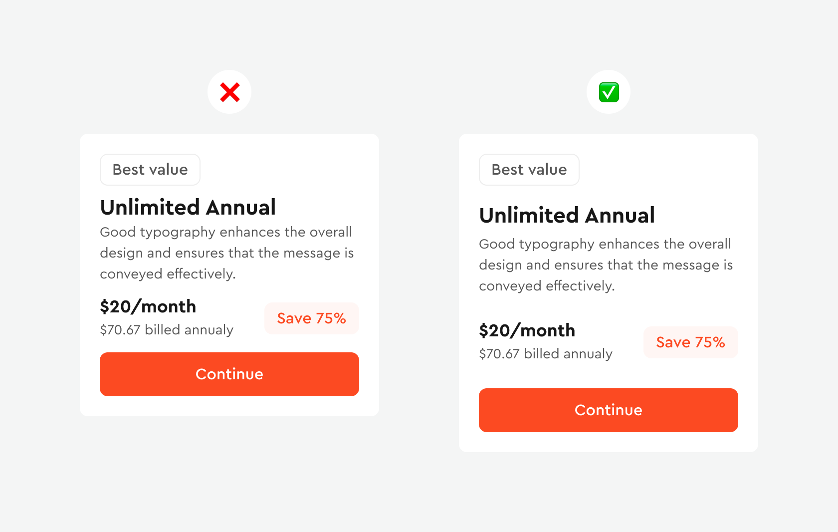
UI Mistakes: Lack of Button Hierarchy
Most projects require three button styles in your design system: primary, secondary, and tertiary. Each style should express a clear visual hierarchy for effectively displaying different levels of importance and actions that facilitate navigation and accessibility for all users, including those with visual impairments. It is important to balance their appearance and functionality for an optimal user experience. Use different visual weights for primary and secondary buttons. The button with the greatest visual weight will attract more attention. A lack of button hierarchy is another frequent UI Mistake that weakens clarity and accessibility.
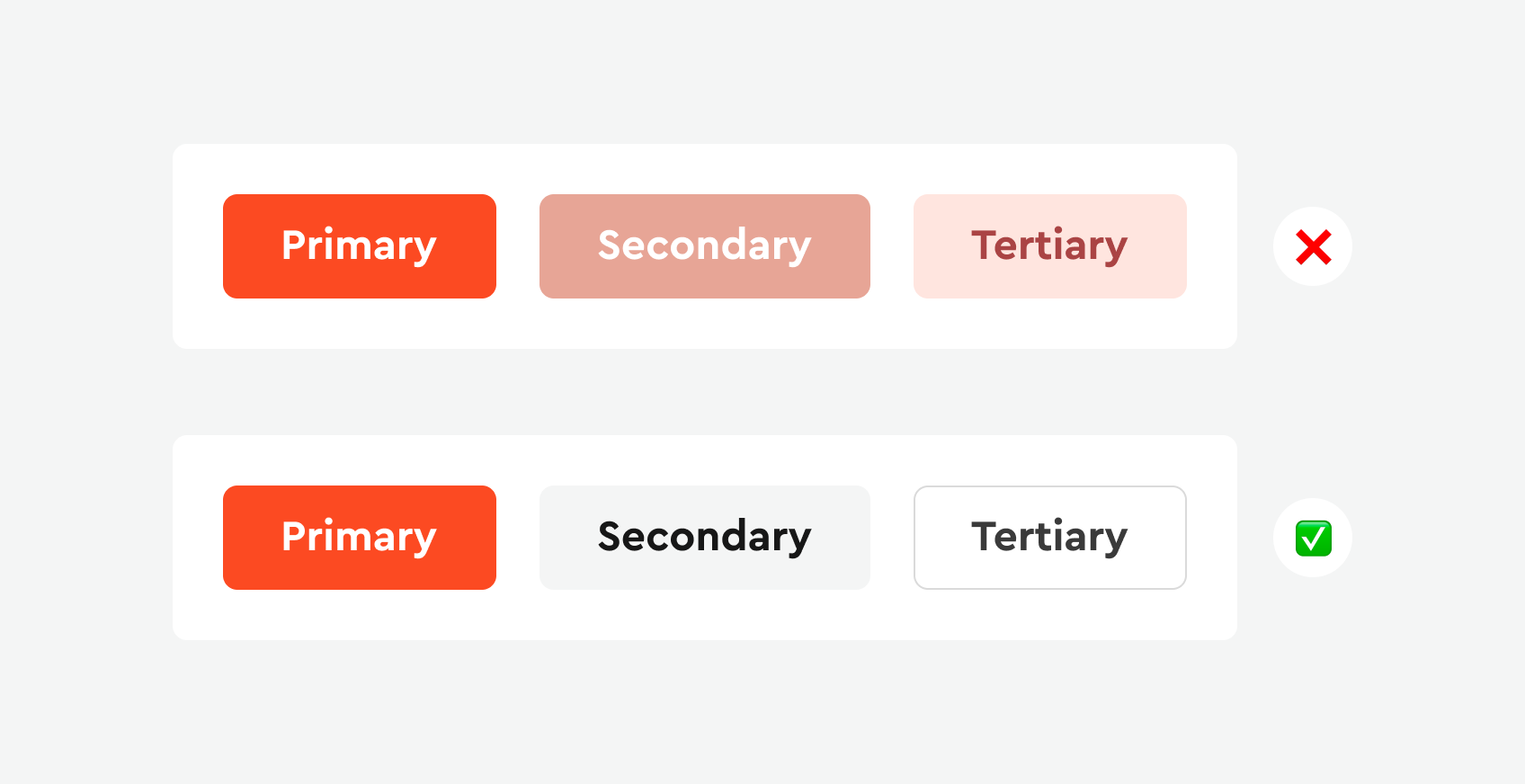
Consider the mistakes in the example above: the styles of these buttons are so similar that people with visual impairments find it difficult to differentiate them. The only way to identify the difference between them is the contrast ratio, which is currently too low. It is important for buttons to have a clear visual hierarchy that is not solely dependent on color.
Now, look at the correct button styles. We highlighted the secondary button using borders without filling inside and used the color from the primary button. For the tertiary button, we represented it in textual form.
Lack of Typography Hierarchy
The power of text in a UI goes beyond mere words; it’s an integral component of design that conveys information and emotion. As designers, our challenge lies in structuring typography to be both comprehensive and accessible. This section will focus on how to effectively use typography, from choosing fonts to creating a hierarchy that guides the user’s eye, enhancing the aesthetics and functionality of your interface.
- Use no more than two font styles. If you use too many fonts, your design will appear at least cluttered.
- Ensure contrast between headings of each style, using size, weight, and color for clear differentiation.
- To make the information hierarchy visibly clear, always start with a large headline, which should be the most noticeable element on the page. Subheadings and other text should be significantly smaller, and so on.
- Ensure consistent spacing and precise kerning to enhance readability and create a visually balanced, professional design.
- Clearly separate blocks of text, and use a small space to connect related information.
Just compare two examples and note the feelings they evoke due to different designs. Weak typography hierarchy remains one of the most common UI Mistakes affecting readability.
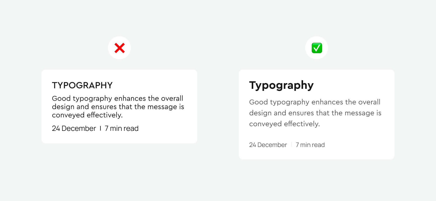
In the example on the right, we see that the headline stands out significantly thanks to the bold font and increased size. The line spacing in the main text has also been increased, making it easier to read and more pleasant to the eyes. Increased space under the main text groups it with the headline and separates it from the date and reading time section, visually emphasizing the hierarchy of these sections. Another small detail: I changed the color of the main text and the date and reading time section, making them lighter, which further highlighted the headline.
Conclusion: Selecting appropriate fonts can give your design uniqueness and draw attention to specific elements. By creating greater contrast for subheadings, adjusting spacing, and fine-tuning other details, you will make your design more accessible for perception, which in turn will make it look more professional and contribute to the desired success of your project.
Negative Space
White space, also known as negative space, is a key element of user interface design. Despite its name, white space does not necessarily have to be white. It can be any color, texture, pattern, or even a background image.
The use of white space in user interface design has several important aspects:
- Utilizing white space helps focus the user’s attention on key interface elements, such as buttons, forms, or important text blocks. Ample space around significant objects can make them more prominent and noticeable.
- Two main things to consider for improving legibility and readability are paragraph margins and line spacing. Line spacing can significantly improve text legibility. Generally, the larger the spacing, the better the reading experience for the user, though too much spacing can disrupt unity and make the design disjointed.
- Proper use of white space helps distinguish different parts of the interface, facilitating perception and navigation for the user. A large amount of information in a compact space can seem overwhelming and difficult to comprehend.
- White space can also help reduce screen fatigue. Free space around text and other elements makes the interface more pleasant to perceive and does not strain the user’s eyes, especially during prolonged use.
Consider the example on the left, where the use of white space successfully grouped elements to make it easier for the user to scan information without it appearing cramped together.
Content Alignment
Proper text alignment is one of the most noticeable indicators of a professionally created digital product. Alignment affects how our brain scans content on the screen. When you see properly aligned typography, it creates the impression that you are using a more thoughtful interface. And when something is out of place, it immediately detracts from our perception.
Alignment helps to realize that elements are related to each other. If something does not align with anything else, it seems out of place in the design. Ideally, each element should be aligned with other elements based on a certain logic.
As we see in the example on the left, the alignment that hangs creates a clear direction for the text, eliminating zigzag eye movements.
Rounded Corners
Rounded corners are a very modern trend in user interface design. Devices have become more rounded, interface elements are becoming rounder, and dramatic rounded corners are an effect you can encounter very often, especially on iOS and Android mobile interfaces.
Rounded corners gently direct users’ attention inward, focusing on the content within the container. This subtle guidance ensures that users remain engaged with what’s truly important: the content.
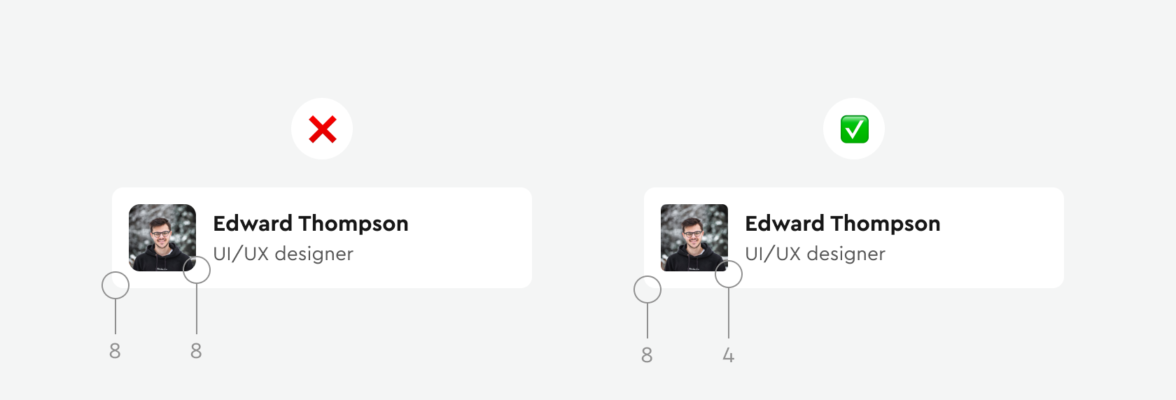
If you use an element with rounded corners on a shape that also has rounded corners, use twice the corner radius for the larger one. For example, on the left, I used a 4-pixel corner radius for the avatar container and an 8-pixel radius for the card.

Always try to ensure that the radius of the card’s rounded corner matches the content within it. This technique helps create a perfect balance between intervals.
Conclusion
Avoiding these UI Mistakes can transform your designs from good to exceptional. Remember, the key to a successful design lies in its ability to attract and hold the user’s attention, guiding them seamlessly through the interface. Regularly review and analyze your designs, noting elements that catch your eye or disrupt the flow. This continuous process of refinement is what distinguishes a professional, user-centric design approach.

Bohdan Ostafiiv


