IONA Pay: Fintech App Redesign with Improved UX Clarity and Reduced User Errors

7 min reading Feb 26, 2026
Overview

Complete FinTech app redesign case study for Iona Pay, focused on modernizing the mobile product for the Turkish market. The project included UX optimization, scalable design system development, light & dark modes implementation, and creation of an investment-ready interactive prototype.
LocationTurkey
Duration3–4 months
IndustryFinTech / Mobile Banking / Crypto Payments
FinTech UX Challenges in the Turkish Market
This FinTech app redesign case study explores how we transformed Iona Pay into a modern, competitive product for the Turkish FinTech market while strengthening its appeal for investor presentations. This FinTech app redesign case study focuses on building a scalable, investor-ready product with strong UX logic and modern fintech aesthetics.
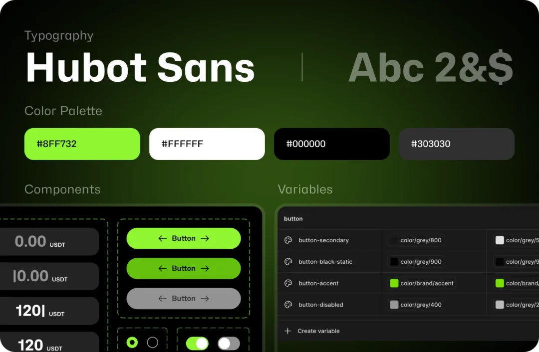
A key technical challenge arose after screen approval: the client requested that all elements down to spacing between blocks be fully built using design variables. This required reworking spacing and component logic to create a consistent, scalable design system.
We specialize in complex fintech products. Explore our FinTech UX design services and discover how we approach secure financial ecosystems.
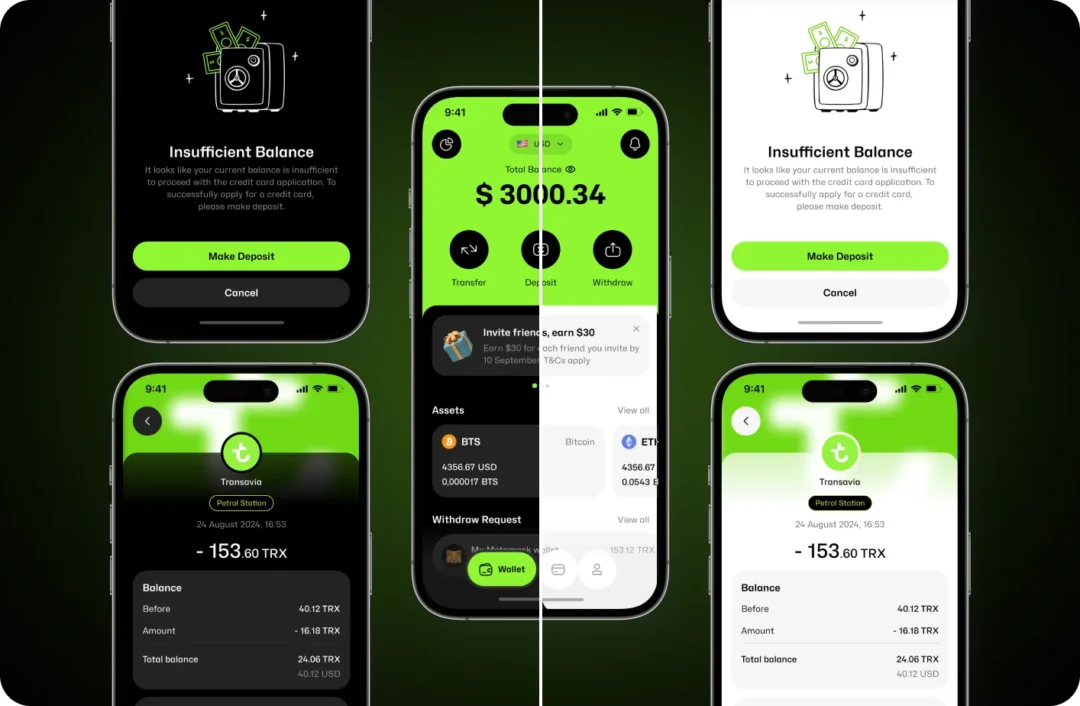
Light & Dark Mode Strategy in FinTech App Redesign
When designing the light and dark modes, we treated them as a core part of the design strategy rather than a visual add-on. We carefully crafted the color palette to ensure that key accent colors remain equally expressive on both light and dark backgrounds, preserving contrast, readability, and clear visual hierarchy.
The light mode was designed as a fully functional experience rather than a fallback. It is clean, airy, and visually engaging. The dark mode emphasizes the product’s technological character and reduces visual fatigue during prolonged use.
We implemented both modes using a variable-based system, allowing the design to scale easily, adapt quickly to changes, and remain consistent across different screens and use cases.
FinTech App Redesign Case Study: Our Approach
In this FinTech app redesign case study, we structured the project into several clear and strategic phases:
1. Research & Analysis
- Competitor analysis across the Turkish and international fintech market.
- UX audit of the existing application and identification of “weak spots”
- Vision and direction for the new design and UX logic.
2. Design Concepts
- Creation of three visual directions.
- Client selected the most modern and expressive option.
3. UX Optimization
- Reworking payment and transfer flows.
- Simplified navigation, cleaner logic, shorter steps.
4. Scalable Design System in FinTech App Redesign
- As part of this FinTech app redesign case study, we developed typography rules, a color palette, components, and scalable UI patterns.
- Full support for Light & Dark themes.
- Token-based variable system (spacing, colors, radiuses, etc.).
5. Interactive Prototype
- High-fidelity clickable prototype for investor presentations.
- Animated transitions and realistic mobile flow demonstration.
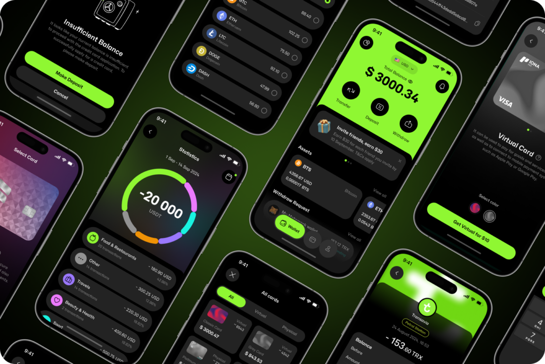
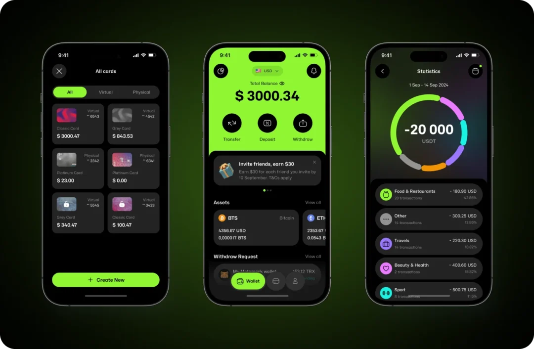
Virtual & Physical Cards
The purpose of this section was to thoughtfully integrate existing card designs into the product experience and make them easy to understand and use. While the visual design of the cards was provided by the client, our focus was on how they are presented, selected, and managed within the app.
Both virtual and physical cards are shown as clearly differentiated options, each with its own context and purpose. Users can preview available color variations for both card types, allowing for personalization while keeping the interface clean and intuitive.
The card selection flow was designed to reduce friction and support informed decision-making. By structuring the content, descriptions, and actions consistently, we ensured that users can quickly understand the differences between virtual and physical cards and confidently proceed with the next steps.
Special attention was also given to supporting states such as insufficient balance, confirmations, and informational screens, ensuring clarity and trust throughout the card-related experience.
Overall, the card section was designed to feel structured, transparent, and fully aligned with the product’s design system.
Card States: Freeze & Unfreeze
Card states were designed to give users full control over their cards and help prevent unwanted transactions. Users can manually freeze their card at any time and easily unfreeze it when needed, reducing the risk of accidental or unauthorized charges.
The freeze action temporarily disables card usage while keeping all card details securely stored. This allows users to quickly respond to suspicious activity or simply pause card usage without needing to contact support.
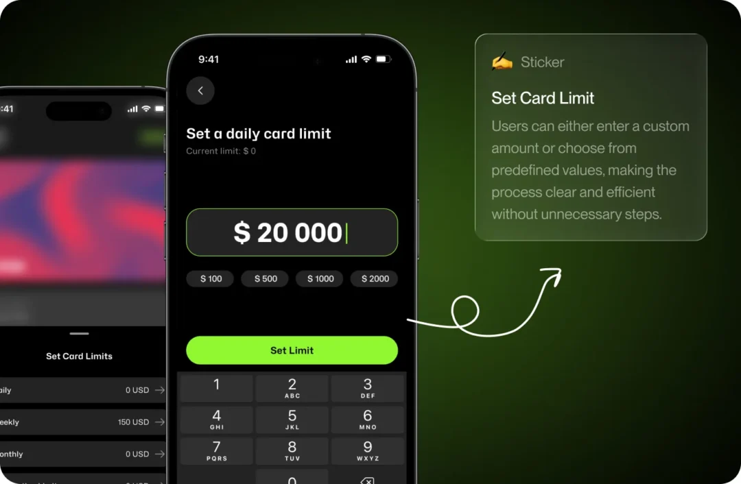
Card Limit Control
Card limits were designed to give users more control over their spending and improve overall security. Users can easily set daily, weekly, or monthly limits, helping them manage expenses and reduce the risk of unintended or excessive transactions. This feature supports better financial awareness while rhelping users feel more in control and confident while using the app.
Crypto Deposit & Transfer UX Optimization
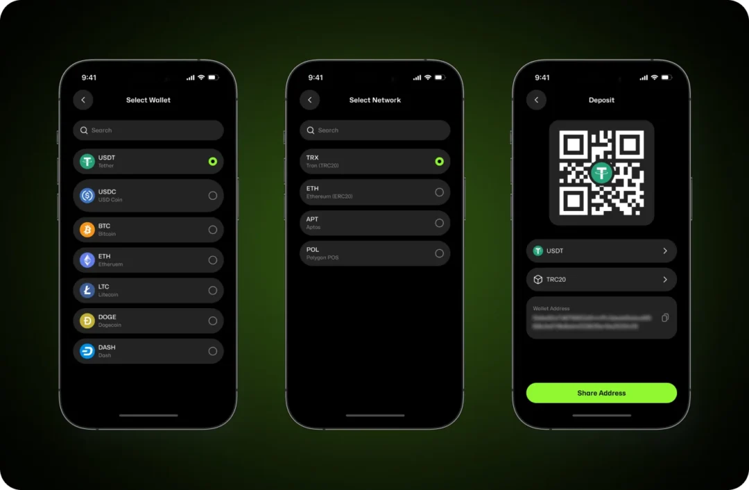
The deposit process follows a clear, step-by-step structure that helps users complete transactions confidently while reducing the risk of errors. Each step was intentionally separated to ensure users make informed choices before receiving a deposit address.
First, users select the wallet they want to top up. This allows the interface to immediately narrow down available options and keep the flow focused and relevant.
Then, users choose the appropriate network for the selected asset. This step plays a critical role in preventing common mistakes associated with crypto deposits, such as sending funds to an incompatible network.
After users confirm both the wallet and the network, the system displays a QR code and the full wallet address. To support different user behaviors, the address can be scanned, copied, or shared, making the deposit process flexible and convenient when transferring funds from external wallets.
Secure Transfer Flow in FinTech App Redesign
Money transfers require a high level of clarity, especially in crypto-related scenarios where actions cannot be reversed. The transfer flow focuses on helping users move funds deliberately and with full awareness of each step.
The process begins with selecting the asset and recipient, followed by entering the transfer amount. The interface keeps the available balance visible at all times, helping users assess their action before proceeding.
The review screen clearly summarizes all transaction details and highlights critical information before confirmation in a structured layout, including wallet information, amount, and recipient. An explicit warning highlights the irreversible nature of the transaction, reinforcing the importance of verification before confirmation.
Once the transfer is completed, users receive immediate confirmation through a success state, providing reassurance and a clear sense of closure. The flow ends with a simple action that allows users to return to their wallet and continue using the app.

Financial Analytics in FinTech App Redesign
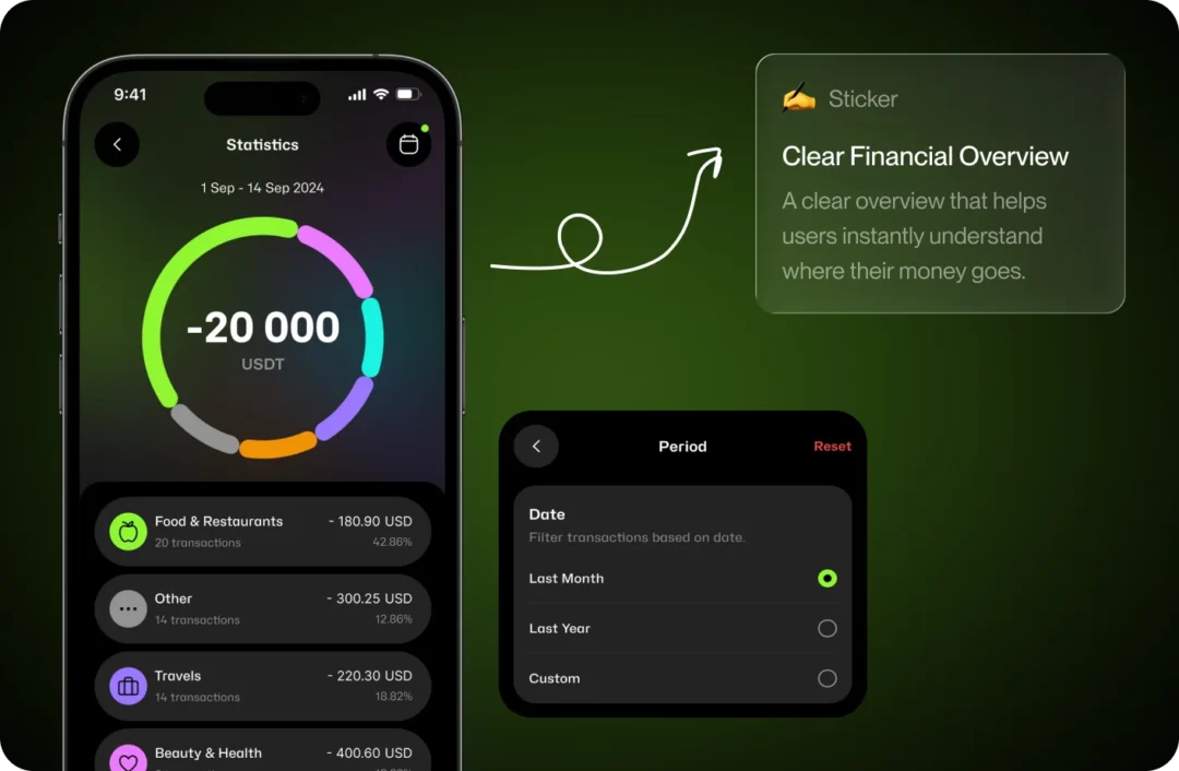
As part of our contribution to the product, we suggested adding a dedicated statistics section to help users make sense of their financial activity, not just view a list of transactions. The focus was on creating a clearer, more insightful way to understand spending behavior over time.
We proposed grouping transactions into visual categories, allowing users to quickly identify where money is being spent. Time-based filters, including preset ranges and custom periods, give users flexibility in exploring their data depending on their goals.
By presenting both high-level visual summaries and detailed breakdowns, this section supports greater financial awareness and encourages more conscious decision-making.
This feature reflects our initiative to add meaningful value to the product by improving clarity, usability, and long-term engagement through better data visualization.
Delivery & Process metrics
Time to market: 4 month
Scope of work: 180+ screens
Number of flows: 20 flows
Platforms covered: IOS / Android
Product Readiness Metrics
- Investment-ready prototype.
- Clear product vision for stakeholders.
- Unified UI across the product.
- Ready for user testing / development handoff.
Results
As a result of this FinTech app redesign case study, we delivered:
Strong, modern visual identity:
- A brand-new UI aligned with modern fintech standards.
- Two fully developed themes with a robust token-based variable system.
Improved UX and usability:
- Optimized flows and reduced user errors.
- Clear navigation, logical transitions, and faster task completion.
Scalable design system:
- Updated spacing logic.
- Complete component library.
- Simplified and faster future development.
Investment-ready prototype:
- Interactive demo for investors.
- Improved product credibility.
- This FinTech app redesign case study strengthened Iona Pay’s competitive positioning in the Turkish market.
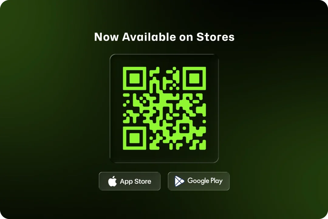
Live Product
Iona Pay is now live and available on the App Store and Google Play. The product can be downloaded and tested, allowing users to experience the design, flows, and interactions in a fully functional environment. Interested in similar transformations? Explore more UX case studies or read insights on our UX blog.