Pulse.gov.ua: GovTech platform redesign with +61% UX maturity growth and 450,000+ ratings collected

6 min reading Mar 25, 2026
Overview
Pulse.gov.ua is a platform created to gather business feedback on interactions with government institutions, aiming to enhance the quality of public services. Initiated by President of Ukraine Volodymyr Zelenskyi and developed by the Ministry of Economy with support from the Ministry of Digital Transformation, it serves as a direct channel between businesses and the state.
The platform enables entrepreneurs to leave reviews on any government service or institution they engage with while running their business. Additionally, Pulse.gov.ua aggregates feedback data, providing statistical insights into the performance of various government agencies and services.
All submitted reports are processed by Regional State Administrations (OVA), and when necessary, businesses receive assistance in resolving their concerns.
LocationUkraine
Duration2 months
IndustryGovTech
What was doneUI/UX Design
The Challenge of GovTech Platform UX Redesign
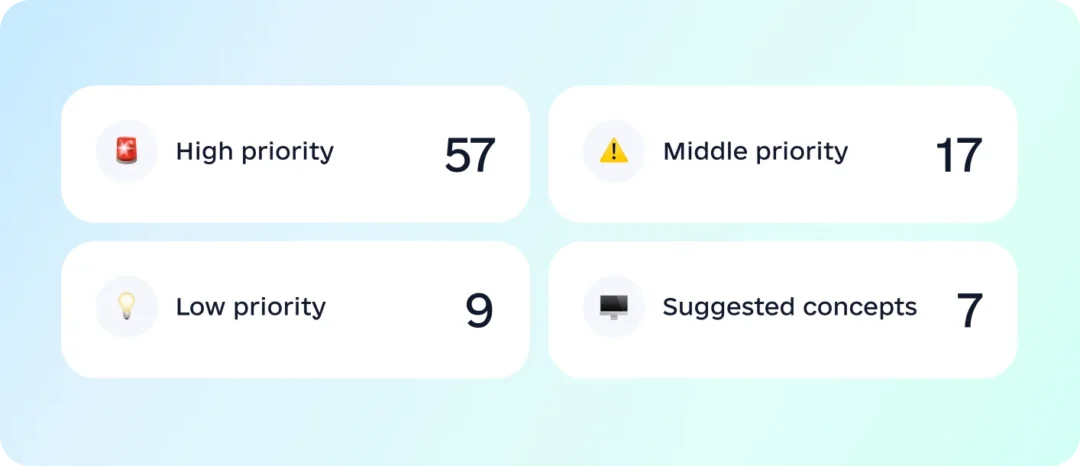
It’s worth mentioning that as responsible citizens, we take great pride in contributing to government projects that drive positive changes. And while this is more about our feelings than the challenges, we must admit – this project wasn’t a walk in the park, we had to roll up our sleeves and dive deep. A successful GovTech platform UX redesign requires balancing institutional credibility, usability, and transparency.
Our task was to redesign the platform and create some parts from scratch, including the dashboard and several blocks on the homepage. The initial version had been developed without professional UX/UI input, which led to usability gaps and a lack of visual and functional cohesion. It needed a complete design overhaul to enhance accessibility, clarity, and overall user experience.

A significant pain point for entrepreneurs – the platform’s target audience – was the fear of potential repercussions when providing honest feedback. Many worried that negative reviews could result in unwanted consequences for their business or even government-imposed obstacles.
Another critical aspect was the platform’s promotion strategy. Aside from the traditional online distribution of the platform, a significant portion of the target audience would access it via QR code stickers placed in government institutions. This made it crucial to focus on a mobile-first approach, ensuring a seamless feedback flow on smartphones.
Finally, there was the design system dilemma. Since Pulse.gov.ua is not officially part of the Diia.gov.ua ecosystem, we were free to explore a fresh visual identity. However, Diia’s sleek, government-associated design language already carried a sense of trust and credibility for Ukrainian users. The challenge was to strike a balance – creating an interface that felt new and independent, yet still reliable and familiar to those accustomed to government digital services.
UX audit for GovTech platform redesign
Since Pulse.gov.ua had no direct competitors, we studied existing Diia services and global best practices for feedback platforms. However, our initial step was to evaluate the visual interface solutions and usability of the platform that were already available to us.
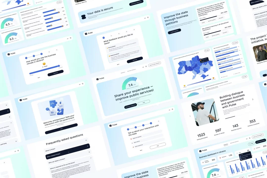
As a result of the audit, we proposed improvements and developed concepts for a new homepage design and the feedback flow.
- For the homepage, we suggested multiple gradient color variations and different UI possibilities
- For the feedback flow, we enhanced the existing UI and modernized the component design
Deep Dive into the Product
After successfully completing the audit, we proceeded with a deeper exploration of the product. Our team conducted several sessions with the client side to thoroughly examine all aspects of the platform’s functionality, interaction specifics, and potential development constraints.
Among the key interaction features, the most critical was the feedback submission flow. This flow consists of different stages and levels of evaluation (general rating, complaint/suggestion/positive experience, evaluation of specific institutions). It was crucial to:
- Understand the differences between these stages
- Determine which steps are mandatory and which can be skipped
- Identify the key elements each stage should include
Additionally, we needed to clarify the logic behind user authentication and why certain data points were required from users.
One of our meetings was with the developer, where we discussed how all components function, explored the customization possibilities of library components, and aligned on the technical feasibility of our design solutions.
Branding
The next step was working on branding. We won’t dwell on this too much, as the branding is still a work in progress. However, we have already created three concepts for the client, and this is a story we have yet to fully unfold.

Wireframes & Product Logic
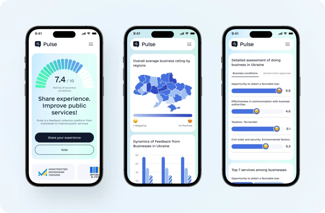
Alongside branding development, we created wireframes for key pages and structured the platform logic. At this stage, we also separated statistics from the homepage and placed it into a dedicated dashboard for better accessibility. Together with the client, we determined which graphs and visualizations would be most useful for users.
Balancing UI Innovation & Diia System Familiarity
While designing Pulse’s UI, we aimed to strike a balance between originality and familiarity with the official Diia design system.
Through collaboration with the client, we established key design principles:
- A friendly yet business-oriented tone of voice
- Gradients inspired by Diia for familiarity
- A light theme for a modern, minimalistic look
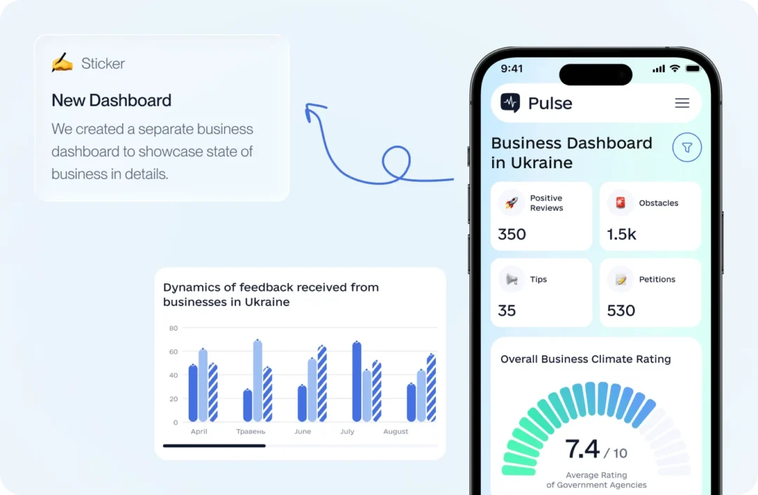
Optimizing the Feedback flow in the GovTech platform UX redesign
As you may recall, designing the feedback submission flow was a key focus, and it follows this structure:
- The user chooses the type of feedback – public or confidential, then authenticates via id.gov.
- The user rate overall business conditions using a slider, incorporating emoji and numerical values to enhance a business-friendly tone of voice.
- The user can either submit their rating immediately or provide more detailed feedback by sharing advice, a complaint, or a positive experience.
- In the final step, they have the option to evaluate specific government institutions or services.
After that, public feedback will be forwarded to the Regional State Administrations (OVA) for processing, and the business issue will be resolved if necessary.
Metrics
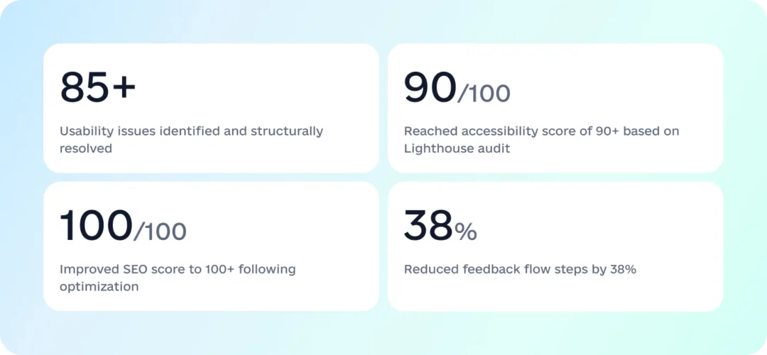
We redesigned and enhanced an existing government platform, restructuring core feedback flows and introducing a scalable dashboard experience. By reducing complexity, improving usability, and strengthening technical quality, the redesign enabled broader participation and supported platform growth at national scale. This created the foundation for sustained engagement, trust, and long-term product expansion.
- +61% UX maturity growth (5.2 → 8.4)
- 450,000+ ratings collected
- 30,000+ feedback submissions
- 90/100 Accessibility improved
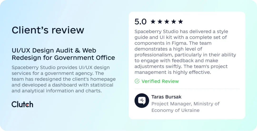
Clients Review
The project has been successfully launched and is now live, marking an important milestone in bringing the product to real users.
We’re proud to have contributed to this release and look forward to future opportunities to continue evolving the product together.
In the meantime, we’re excited to have received great feedback from our client on Clutch, and we’re thrilled that we could bring their vision to life. A big thank you to our clients for allowing us to be part of this journey!