The result of our work exceeds all expectations
By Spaceberry Studio 6 min reading Apr 27, 2023
So what we gonna get after your work is done?
The result of our work is a list of artifacts that contain research findings and provide recommendations for design and development teams. These artifacts define clear UI/UX Design results that teams can rely on throughout the product lifecycle.
There are many different techniques, terminologies, and definitions in the design world. Some of them exist for the sake of increasing project time and cost, and some of them are really working tools.
Having done more than 100 projects, from small startups to big well-known brands, we’ve identified for ourselves the most effective list of these artifacts:
- Competitor analysis
- User research (optional)
- Information architecture
- Low-fidelity wireframes (optional)
- UI layouts
- Interactive Prototype
- User testing (optional)
- UI animations (optional)
- Design system (optional)
As you may have noticed, only 4 of these are essential in developing or improving any product, while the others can really improve the user experience, but are not mandatory. It all depends on product requirements, budget and timing. This approach allows us to focus on measurable UI/UX Design results without overloading the project with unnecessary steps.
Now let’s take a closer look at each of them:
Competitor analysis as part of UI/UX Design results
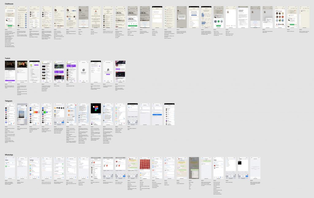
Competitor analysis is a valuable tool that helps us identify the strengths and weaknesses of our competitors.
Usually we choose 5-7 direct competitors and using benchmarking analysis we determine the leader in solving the particular problem.
User research
User research is another useful tool for any project.
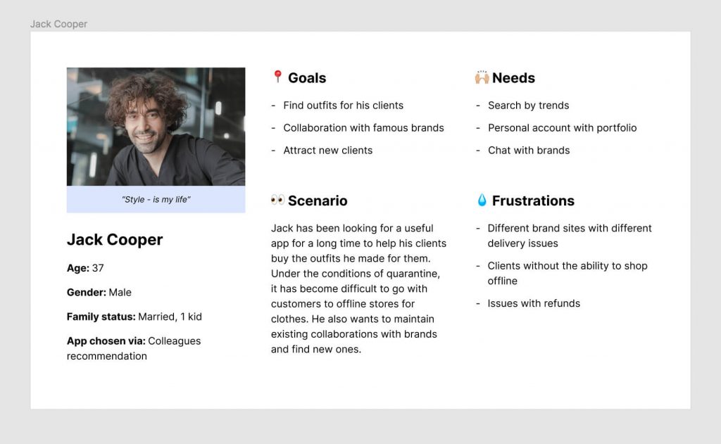
Using different methods, such as individual interviews, field research and online surveys, we get additional information about the needs, goals and behavior of the users of the product.
The results of this research are summarized in a final document – user portraits.
Information architecture and UI/UX Design results
Once the main research phase is complete, we use all the data collected to build an information architecture for a future product or refine an existing one to better meet the needs of users.
This is usually created in the form of a map, that gives a bird’s-eye view of the product.
A mind map helps identify the highest-priority features, define the scope of work, and serve creation of more thoughtful navigation.
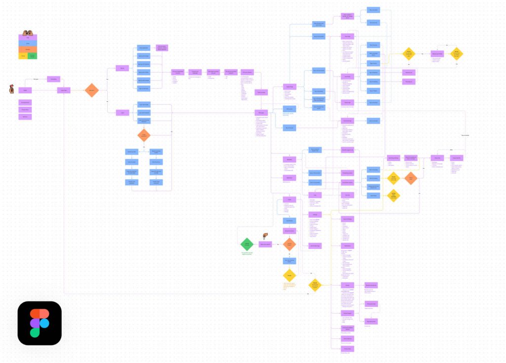
Over the years we have tried many online mapping tools, but in 2021 Figma released its own tool FigJam, and in the end we settled on it.
Low-fidelity wireframes
A few years ago, when there were no modern design tools available, it took a large amount of time to make a single screen. And the easiest edits, which can now be done in a couple of minutes, required hours of work.
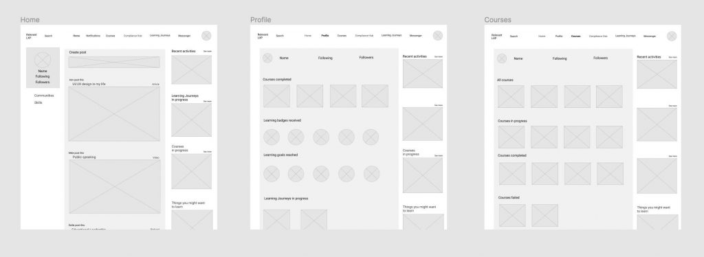
That’s when the idea of creating low or high fidelity wireframes came in handy for quick reproduction and testing. However, modern tools, such as Figma, have taken design to a new level. Using components and styles allows us to create full UI layouts at great speed. Therefore, as a full-fledged design stage, a high-fidelity wireframe is obsolete and has no logical use now, but only stretches the time and cost of any project.
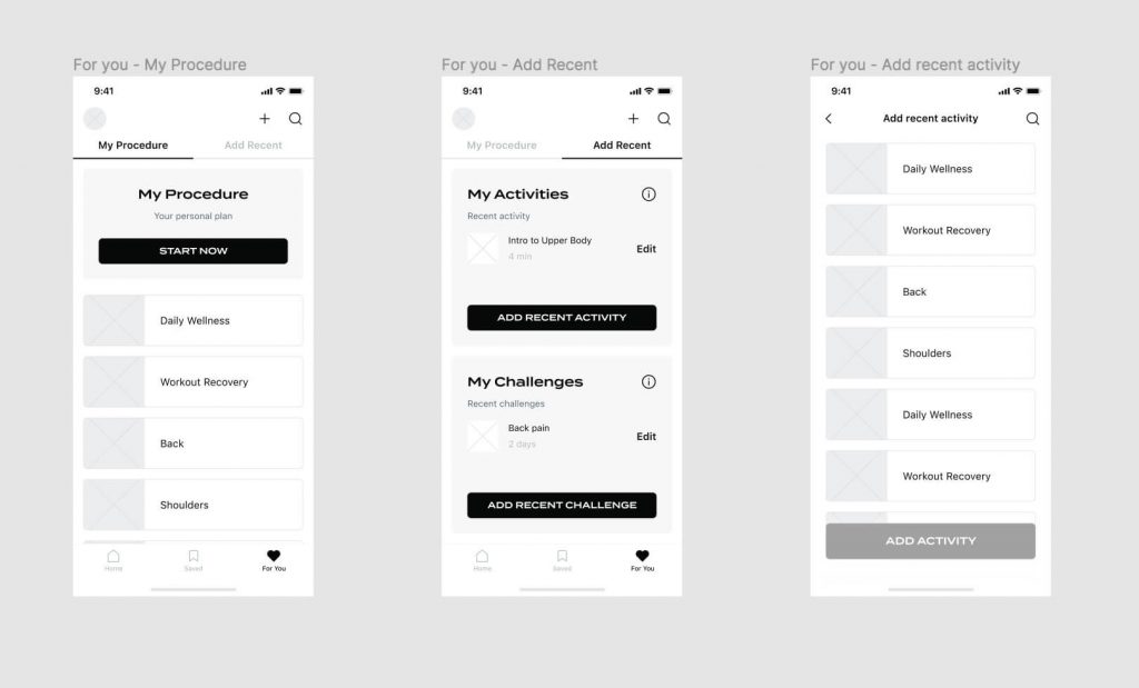
As for low-fidelity wireframes – we use them very rarely, when we need to quickly explain the approximate structure.
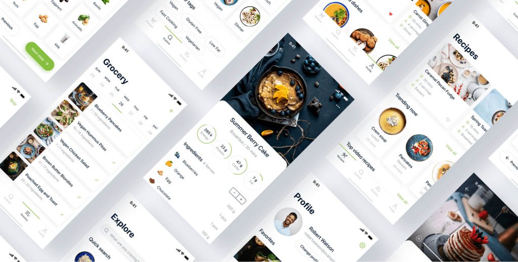
UI layouts that shape UI/UX Design results
Whether we have style recommendations from client or come up with everything from scratch, we always start with visual research. We create a mood board with a set of different visual design concepts to illustrate our vision of future product style. Your ideas and references are also very appreciated at this stage.
Once we’ve found a common ground in design direction, we move on to the design phase of the first pages. Once they are approved, we move on to the next ones.
Interactive prototype and UI/UX Design results
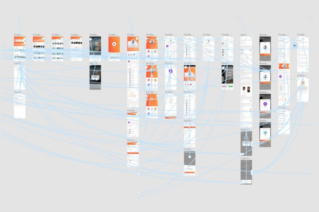
The interactive prototype is an integral part of the visual design process. It helps us identify weaknesses in the product, verify assumptions and test hypotheses.
For prototyping we also use Figma. It provides a full range of features for user testing.
User testing
When working on any project, it is always useful to make stops to test assumptions and design decisions. One of these stops is usability testing. With an interactive prototype, we conduct a series of user testing sessions. As a result, we create a report that summarizes our findings and recommends next steps.
UI animations
During the design phase, we can also provide short video clips showing key user interface interactions that help the user experience and guide users down the right path. These videos and animations are then used by developers as a guide for implementing these interactions in the final product.
Design system
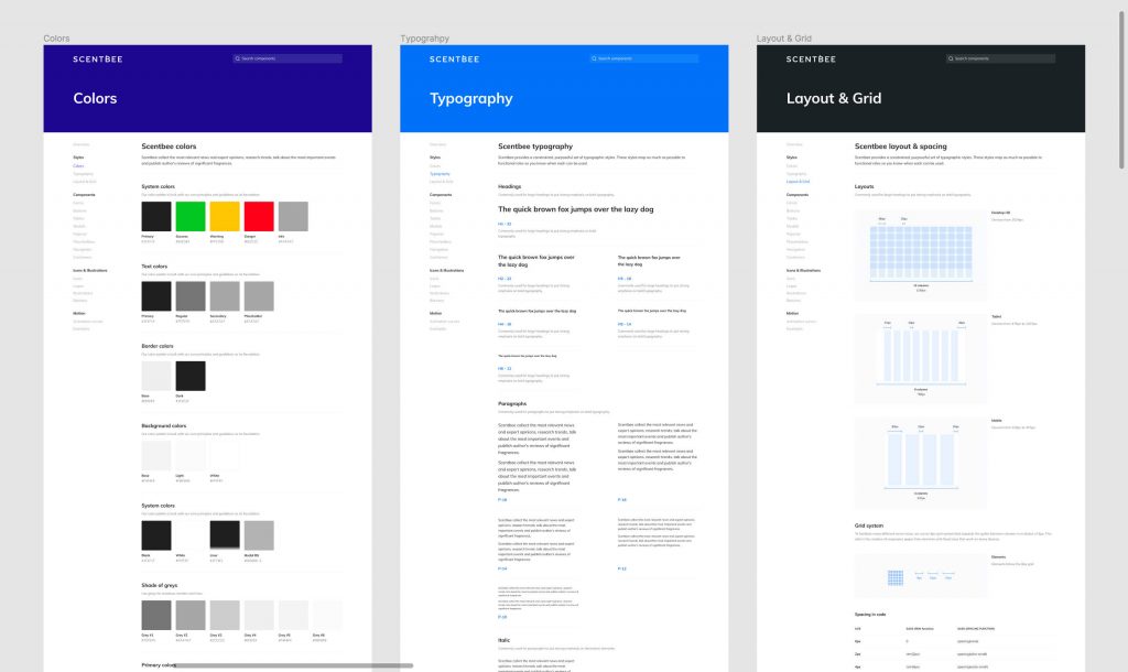
A design system is a file with all the design specifications that serves as a powerful tool for the in-house design team or third-party agencies, as well as the development team.
It contains key design principles, sets of UI elements in different states, basic rules for typography, colors, adaptive behavior, and more.
The design system helps maintain the visual identity (consistency) of the entire project and is used as building blocks for creating new pages and adding new features.
For developers
It happens that during the development phase some details could be overlooked. It may seem insignificant, but these small inconsistencies between design and implementation have a snowball effect that can end up dramatically affecting the final user experience.
To avoid all these problems, we work exclusively with the Figma. It is a versatile tool that is several times ahead of its competitors (Sketch, Adobe XD). You can read about all its features on their page, but we want to highlight a few key factors why it is it:
- In addition to dimensions and fields, Figma provides code snippets;
- It allows to quickly export elements into PNG or SVG formats;
- It has a collaboration and commenting system between the development and design teams;
- Quick work with components, which speeds up the design process and removes unnecessary step in design with low-fidelity wireframes;
- Interactive prototyping for usability testing;
- Can pull up the history of all changes;
- Autosave any changes;
- Easy to maintain throughout the project.
Conclusion
The process of creating UI/UX Design results is not always linear and depends on product requirements, budget, and deadlines. At the end of the project we provide all the finished files and transfer ownership of all the assets in Figma to the clients. We will share one of our projects with you as an example, where you can see how everything works.
After that, we can continue our collaboration: provide design support, oversee development to make sure everything is implemented properly, work as an internal design team, and be responsible for ensuring constant design updates.


