Monetizing Content: UX Design for Paywalls and Subscription Models
By Spaceberry Studio5 min readingJan 23, 2024
App monetization UX design plays a critical role in how effectively paywalls and subscription models convert users into paying customers. Paywalls are a pivotal strategy for monetizing mobile apps, offering access to premium content or features in exchange for payment. This article explores the intricacies of designing a mobile app paywall, including selecting the appropriate paywall type, crafting an impactful layout, efficient implementation, effective promotion, and optimizing the user experience to drive higher conversion rates.
With this comprehensive guide, you'll be equipped to seamlessly integrate a paywall into your mobile app, fostering revenue generation. A well-designed paywall facilitates immediate revenue and supports ongoing app development endeavors.
App Monetization UX: Make Subscriptions Easy to Find
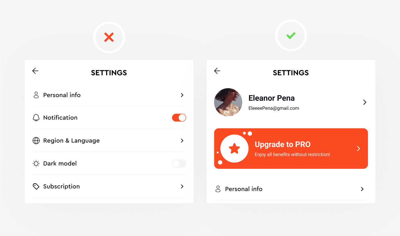
Ensuring a seamless path for users to subscribe within your app is paramount in maximizing conversions and revenue. The ease of finding and accessing subscription options significantly influences user decisions and engagement. Streamlining this process simplifies user journeys and enhances the overall app experience.
Solution: Incorporate an easily discoverable and informative paywall within the app settings to streamline the user journey toward premium content acquisition. Centralizing all upgrade options and benefits in one accessible location empowers users to explore and commit to subscriptions. This seamless and intuitive design facilitates conversions and cultivates user-centricity, enhancing overall satisfaction and loyalty toward the app.
App Monetization UX: Highlight the CTA Button
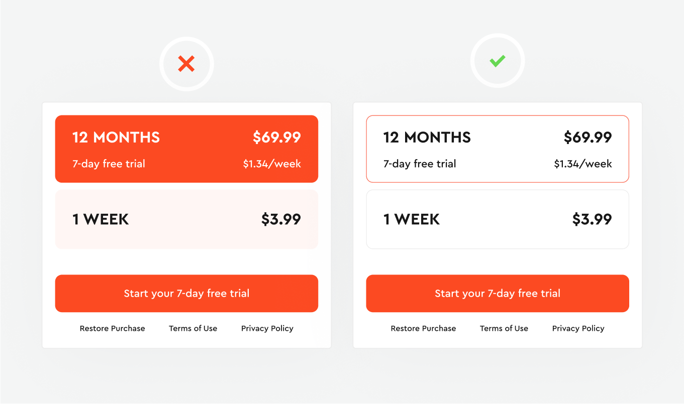
Color significantly influences user attention and actions within an app interface. Utilizing the psychological impact of color in paywall design is a strategic choice. A singular primary color acts as a focal point, guiding users' attention directly to the purchase CTA.
Solution: Employ the brand or primary color selectively on the purchase CTA within the paywall. This subtle yet powerful design technique enhances visual hierarchy, brand recognition, and user engagement without overwhelming users. This strategic color use influences user behavior, driving conversions while maintaining a visually appealing and coherent app interface.
In numerous cases, even small design changes have led to significant improvements in conversion metrics. Read our article on “How UI/UX impacts conversions”, where we explored 7 interesting examples of how custom website design has influenced conversion and the important lessons they hold for anyone looking to improve their web-based business results.
Display special offers within paywalls
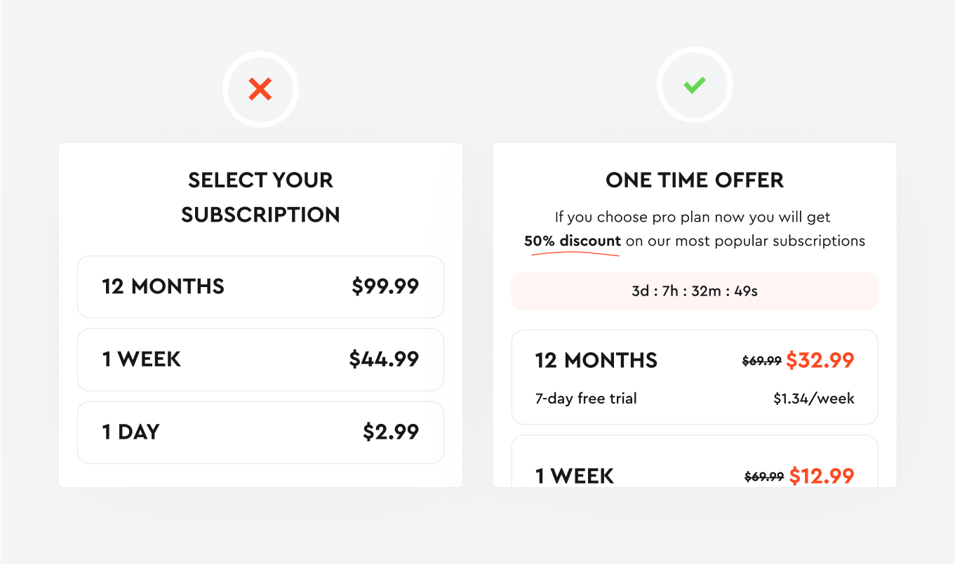
Limited-time offers, or exclusive deals within your app can be a compelling strategy to persuade hesitant users to purchase. Seasonal promotions, introductory discounts, or routine sales events often provide the extra incentive needed for users contemplating a purchase.
Solution: Emphasize the discounted price and highlight the redemption window when crafting these paywalls. These offers can surprise users at random intervals after engagement, align with scheduled events such as holidays, or trigger upon user interaction with promotional banners. These strategic touchpoints effectively nudge users towards irresistible offers.
Compose concise text for easy reading
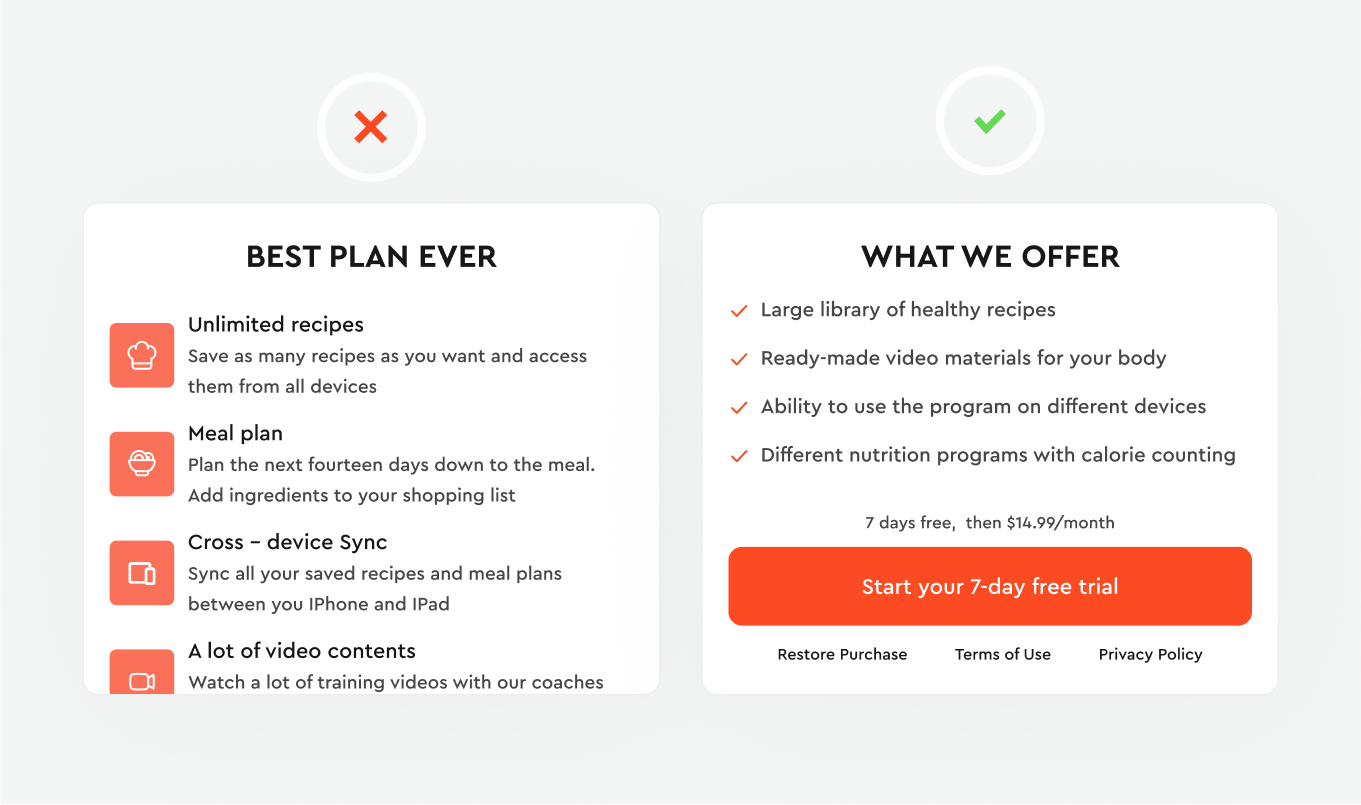
Recognize that users often skim through content on their phones, and lengthy paragraphs can be deterrents. Opt for concise, impactful copy akin to advertising. Present your message in a few lines, using short bullets to outline product benefits succinctly.
Solution: Limit bullets to a maximum of seven to ensure clarity and prevent information overload. Rather than adding more copy, experiment with content and arrangement, enhancing user understanding and engagement with your paywall.
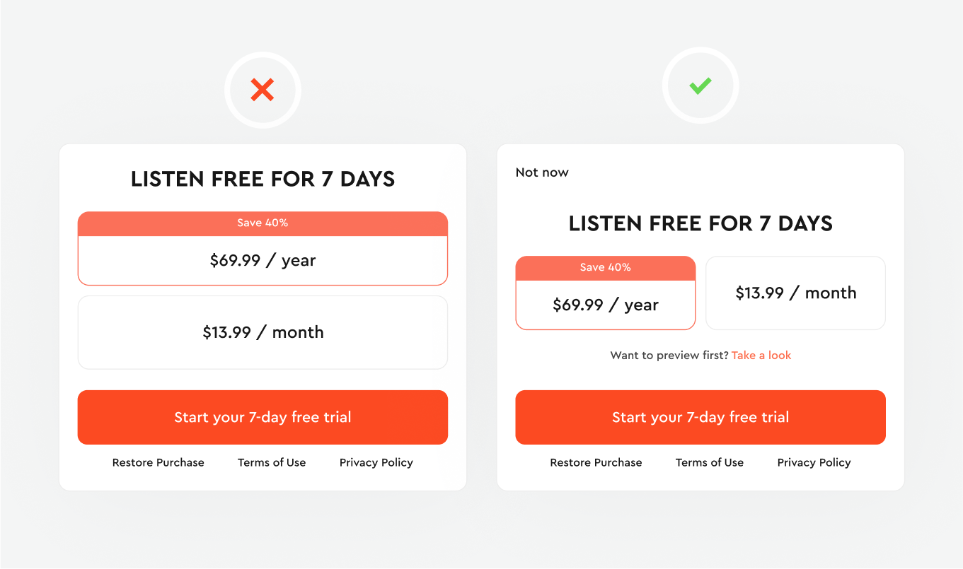
Enable preview without paying
Provide users with a transparent and hassle-free way to exit the paywall if they are not ready to make a purchase. Including a visible and intuitive close button or exit option enables users to comfortably navigate away from the paywall without feeling forced. This approach respects user autonomy, fostering a positive user experience that encourages them to return to your app.
Solution: Recognize that users often need repeated exposure to the paywall before considering a purchase. Avoid pressuring users into an immediate decision, which can lead to app abandonment. Include a prominent close button or exit option, granting users the freedom to navigate away without feeling forced.
Conclusion
Strong app monetization UX design balances revenue goals with user trust and long-term engagement. In-app monetization, strategic placement, and the design of paywalls are crucial for engaging users and generating revenue. This article emphasizes a user-centric approach, clear exit options, and concise yet impactful text and visuals, all of which are pivotal in optimizing paywall effectiveness.
Balancing the use of colors, implementing special offer paywalls strategically, and ensuring seamless subscription access within app settings are key strategies to enhance user experiences and drive conversions. Moreover, using primary colors to highlight CTAs judiciously and crafting careful text on paywalls ensure users' attention is captured without overwhelming them.
By understanding user behavior and preferences, providing clear exit paths, and respecting their decision-making timeline, apps can achieve a balance between promoting subscriptions and preserving a positive user experience. The art lies in creating paywalls that intrigue, inform, and guide users toward purchases while respecting their autonomy fostering long-term engagement and loyalty in the app ecosystem.

Feel we’re a perfect match?
If we’ve managed to impress you with our works and you have no doubt that you’re ready to collaborate with us, choose your preferred way to reach out.
Want to test our skills?
We offer a free 3-day trial to explore our expertise and see how we add value to your project. Assess our skills and workflow before committing to a partnership.