Monobank: Redesign Impacting 9M+ users
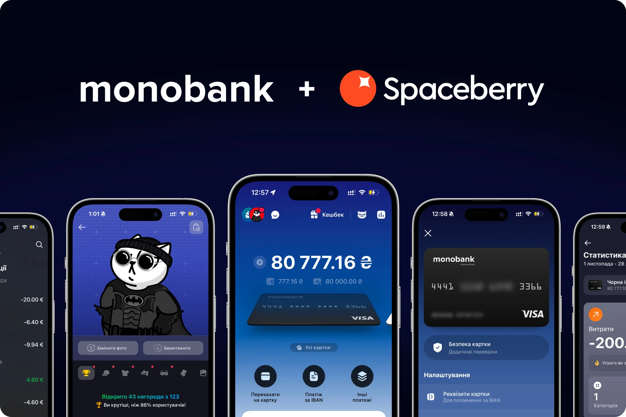
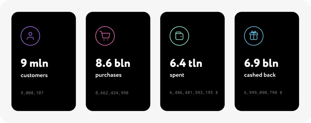
monobank is a Ukrainian leading neobank, serves over 9 million clients and boasts a daily active user base of 1.3 million. Ranked #2 in both Google Play and the App Store, it has been recognized in 2018 as “The Best Ukrainian FinTech Startup” by PaySpace Magazine Awards and “Neobank of the Year” by FinAwards. You can explore the full scope of its popularity here.
monobank’s standout advantage lies in its simplicity – Ukrainians can open a bank account effortlessly by downloading the app and completing just a few quick steps. With features like instant money transfers and a host of other conveniences, it’s no surprise they’ve become a Fintech favorite in Ukraine. But monobank doesn’t rest on its laurels, which is exactly why this bank design case study exists – to showcase their continuous drive for innovation.
LocationUkraine
Duration1 week
IndustryFinance, Banking
ServiseUX Audit
The Challenge
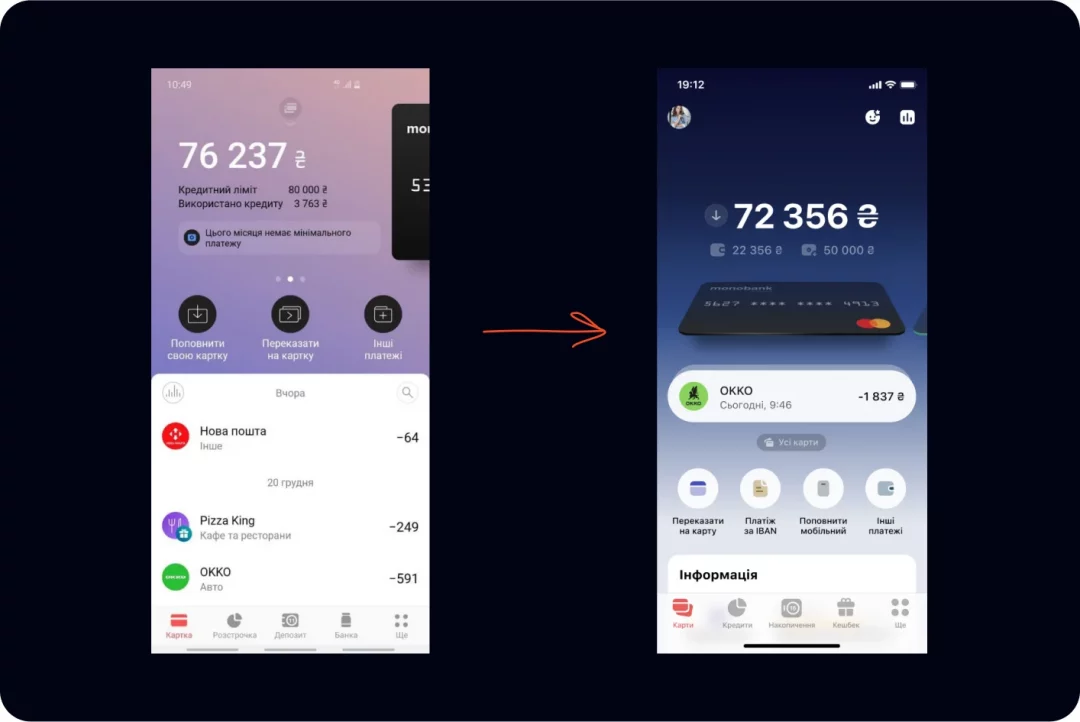
monobank had a bold plan: to transform their already modern, user-friendly mobile app into a scalable super-app. The catch? The bank has been in the market since 2017, already boasting a sleek and convenient design, with 9 million users accustomed to the existing interface. They needed the new design to introduce improved functionality without alienating their massive user base.
Despite monobank having an internal design team that knows the product and users inside out, they searched for fresh ideas to gain an expert external perspective and polish the design to perfection before its release. Guess what? Boom, we jumped right in!
Our task was clear: Conduct a product design audit from UX perspectives and deliver expert recommendations for updating the app’s design to help monobank’s team achieve more positive user feedback setting new trends in the market and creating an intuitive and efficient super-app.
We had just one week to analyze the product and uncover solutions that even monobank’s highly skilled internal team might have overlooked. The stakes were high: the reputation of a tech giant was on the line. But the opportunity was just as inspiring. As loyal monobank users and fans ourselves, we were deeply motivated to contribute to improving such a widely loved product.
Our Approach
To demonstrate that our approach goes beyond experience and embodies a well-rounded methodology, here is the foundation of our audit and overall design process. These core pillars enabled us to chart the way forward and uncover innovative ideas to present to monobank.
Audit Foundation
- Nielsen Norman Group Usability Heuristics
- Visual Design Guidelines
- Accessibility Standards
- User Feedback on the App Store and Google Play
- Analysis of 10 leading Fintech competitors
- Industry Best Practices
- Spaceberry Expertise
Below, we outline the key and most important stages we relied on during the audit.
Competitor Analysis
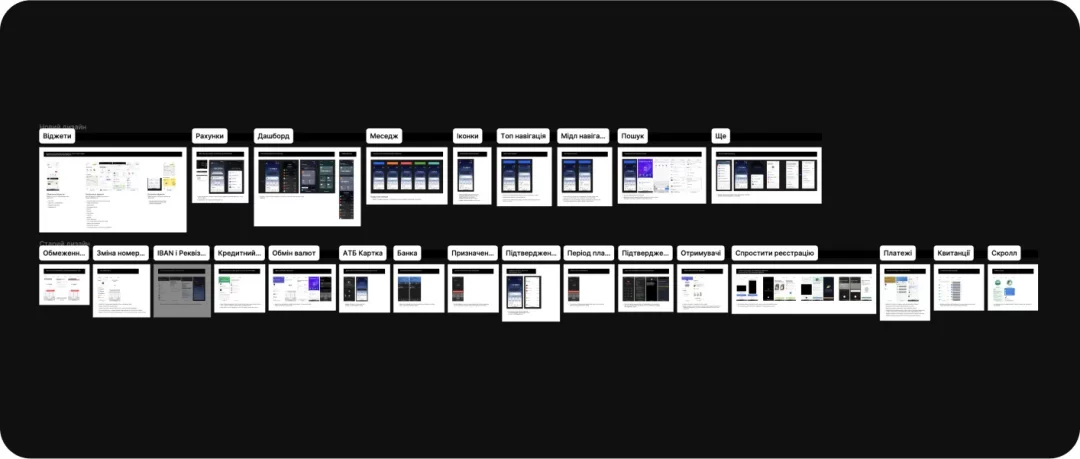
We analyzed competitors – 10 leaders in the Fintech and Banking sectors who employ the most advanced approaches, have demonstrated significant growth in recent years, and are innovators in the field. These competitors include Cleo, Revolut, KOHO, Monese, Monzo, N26, Neo Financial, Wise, Starling, etc. This allowed us to identify trends and discover the best and most user-friendly solutions.
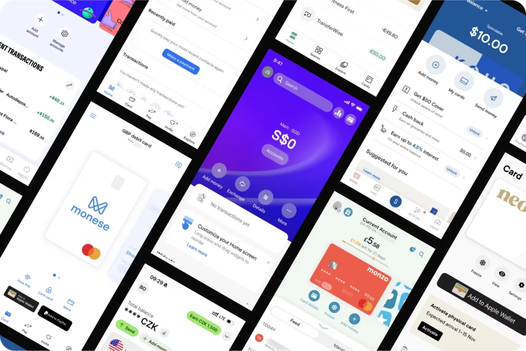
Our UX design competitive analysis highlighted several key features that leading Fintech apps prioritize to stay ahead and why they matter:
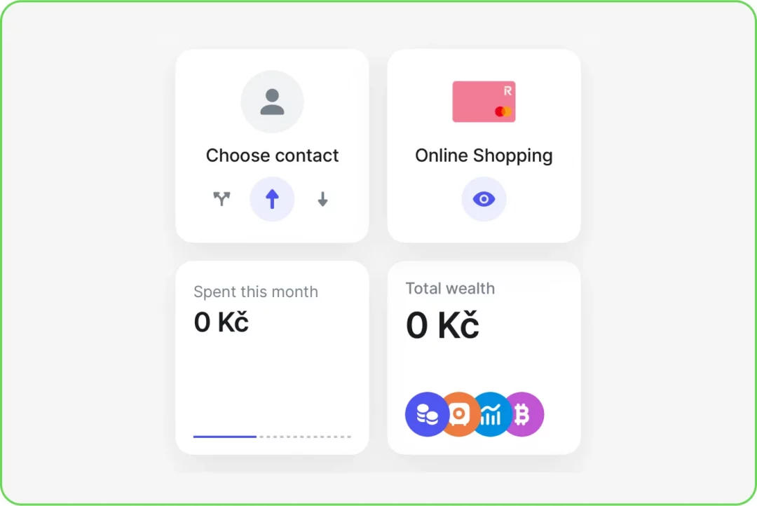
- Interface Customization with Widgets: Competitors focus on giving users control over their experience, making interfaces feel personalized and adaptable – critical for engagement.
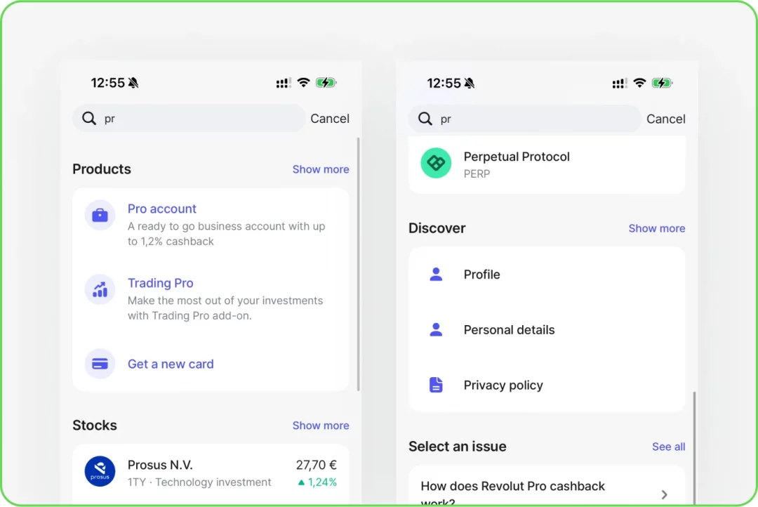
- Global Search Systems: Top apps integrate this feature to ensure users can effortlessly navigate and find what they need, reducing friction and saving time.
- Advanced Payment Flows with Templates: Payment systems in leading apps prioritize speed and simplicity, reflecting users’ demand for hassle-free, repeatable transactions.
- Simplified Registration: Competitors streamline onboarding, knowing that a smooth start is essential for retaining new users.
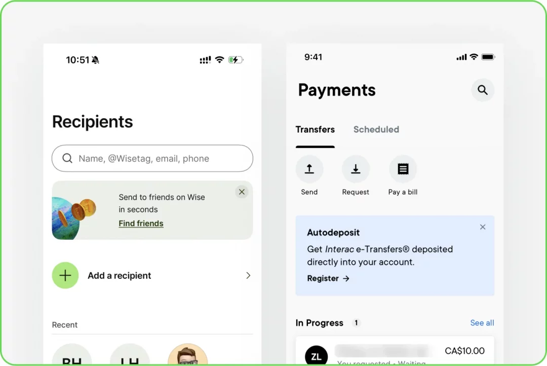
- Recipient Management Pages: Dedicated sections for recipient handling enhance usability by making frequent tasks like editing or adding contacts more intuitive.
- Enhanced Currency Exchange Functionality: Clear, standalone exchange tools ensure users can confidently manage foreign transactions – a feature users increasingly expect.
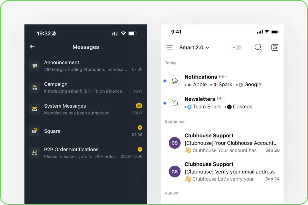
- Categorized Notifications: Grouping messages by type lets users quickly identify critical updates, minimizing frustration and improving app usability.
These features address real user pain points, fostering loyalty and showcasing why they’ve become essential elements in the most successful Fintech platforms.
Audience Analysis
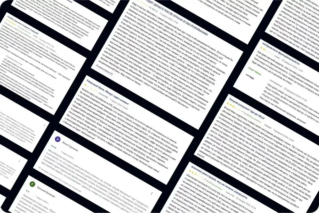
Our next step was diving deep into user feedback to uncover the good, the bad, and the “please fix this now!” aspects of monobank’s app. We meticulously reviewed thousands of user reviews and audience research examples to create a comprehensive user research case study, sorting the most relevant insights to identify what truly mattered to users. These ranged from minor inconveniences to critical pain points – and, of course, the features they absolutely loved.
To ensure no stone was left unturned, we categorized the feedback and formulated tailored recommendations for each major issue. This structured approach allowed us to address user concerns holistically while amplifying what was already working well.
But we didn’t stop there! We extended our research to Google search queries related to monobank. Why? Because search bars often tell us what users won’t say out loud. These searches revealed recurring themes, such as:
- “How to change my phone number?”
- “How to update my profile photo?”
- “Credit limit settings and conditions for increasing it”
- “Where can I see my IBAN or account details?”
- “How do I exchange or purchase currency?”
- “How to open an ATB card?”
- “How to open a savings account or business account?”
- “Where to enter payment purpose details?”
After completing all the analyses, our team gathered for a brainstorming session, where everyone shared the audit results, leading to the formation of the first set of proposals. By transforming these challenges into actionable insights, we ensured our recommendations were rooted in real-world needs. The outcome? Practical and impactful design enhancements that resonate with users at every touchpoint. After all, when users feel heard, they become your biggest advocates.
Presenting Results
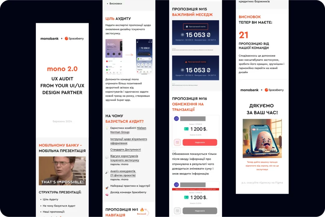
Having gathered all the data from our research, we moved on to the final phase of our work. We combined all ideas and proposals, grouped and prioritized them, highlighting the most important suggestions, and organized them into a presentation (by the way, the presentation was unique as it was specifically designed for mobile devices, allowing the monobank team to conveniently review it from their smartphones anytime, anywhere – mobile bank, mobile presentation).
Overall, we presented 21 proposals to the monobank team, including the co-founders. The work was showcased during a video call. Below, we’ll outline some of the key high-priority suggestions (of course, without revealing all the secrets):
1. Navigation
Problem:
The navigation doesn’t provide easy access to all key sections, isn’t scalable for future updates, and doesn’t follow intuitive user interface patterns that users expect.

Solutions:
- Replace the avatar customization icon with something clearer
- Make notifications accessible with a single tap by introducing a “bell” icon instead of requiring users to scroll through the main screen
- Add a settings icon next to the profile for better visibility
- Keep the navigation bar visible across all main pages to enhance usability
- Introduce a global search feature
- Add a support icon

2. Notifications
Problem:
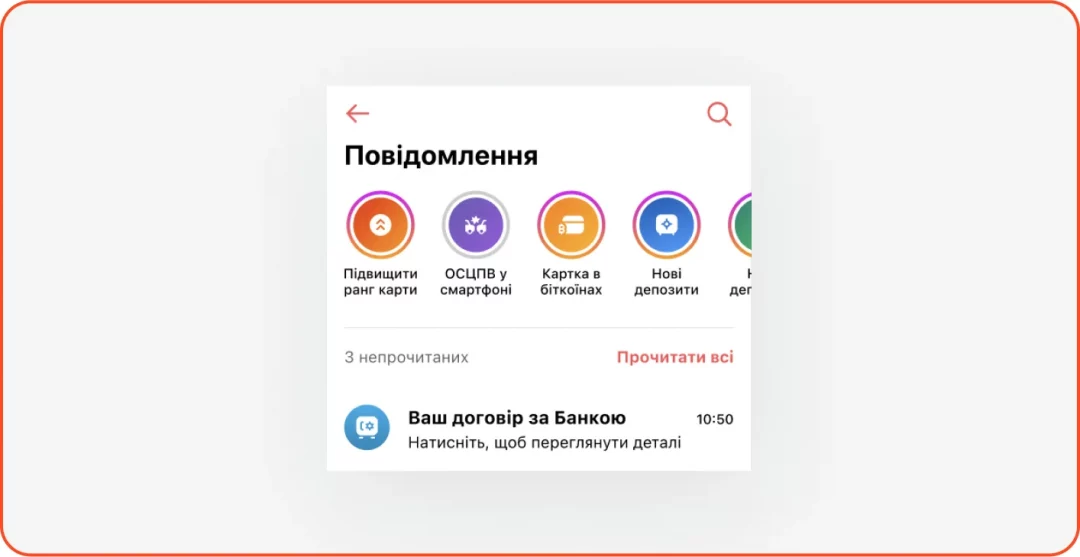
Notifications are hard to locate and easy to miss. Information tends to blend together, and the page isn’t designed for scalability.
Solutions:
- Group notifications into categories for better organization
- Highlight key updates like split bill requests, new card activations, and payment confirmations to make important messages stand out
3. Search
Problem:
Users need to jump between app sections to find what they’re looking for.
Solutions:
Implement a global search function that allows users to locate transactions, services, FAQs, contacts, and app sections all in one place.
4. Widgets
Problem:
Users cannot personalize widgets, leaving the home screen less engaging and functional.
Solutions:
Develop a widget catalog that lets users customize their main screen. Allow users to choose, remove, or reorder widgets based on their needs.
5. Dashboard
Problem:
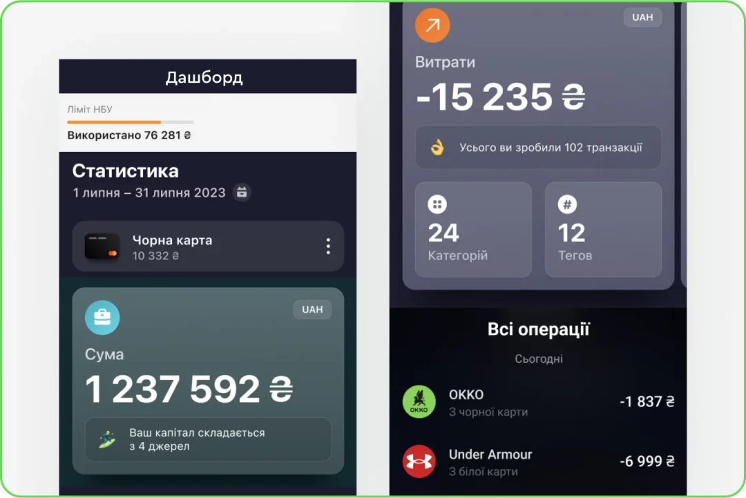
There’s no single view where users can check account limits, stats, and card statements conveniently.
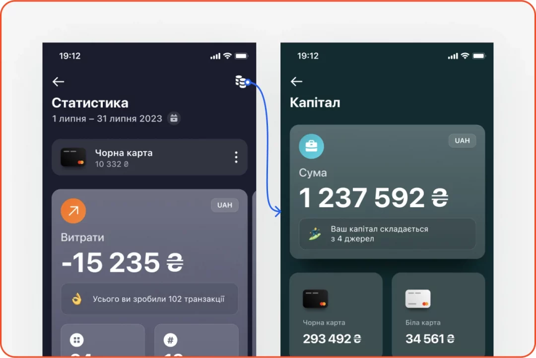
Solutions:
- Merge transaction history, statistics, and account details into a unified dashboard and make it accessible with a simple swipe from the main screen
- Add a toggle feature to switch between different cards or dates
- Introduce an onboarding flow to guide users on how to navigate the dashboard
6. Payments
Problem:
Managing payments for individuals and businesses happens in different app sections, and there’s no user-friendly way to handle recurring payments.
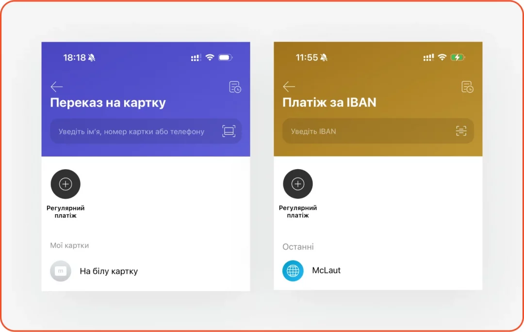
Solutions:
- Create a dedicated section for recipients, whether they’re individuals or companies. Enable users to add, edit, and save recipient details, including currency accounts
- Provide an easy way to set up and manage recurring payments for everything from utility bills to subscriptions. Features like templates, folders, and temporary pauses could simplify users’ experiences
7. Savings
Problem:
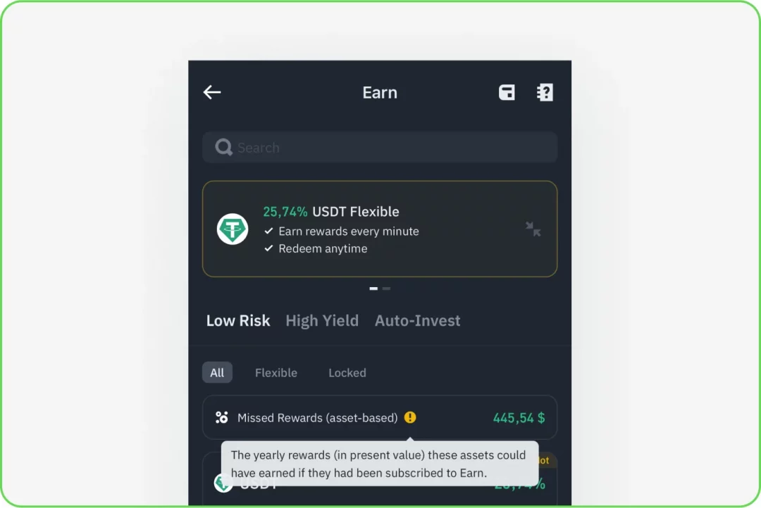
Users struggle to see the value of deposits or bonds, leading to the underuse of these features.
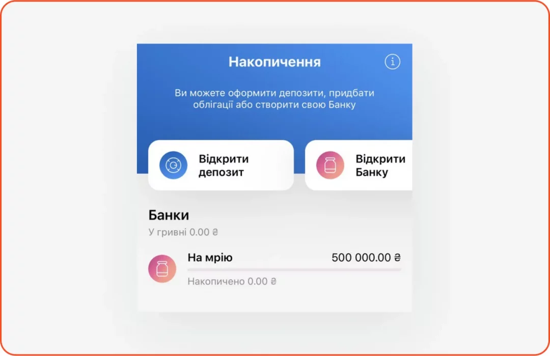
Solutions:
Tap into FOMO (fear of missing out) by showing users how much they could earn/lose with a deposit or bond investment. Add a calculator to visualize potential gains.
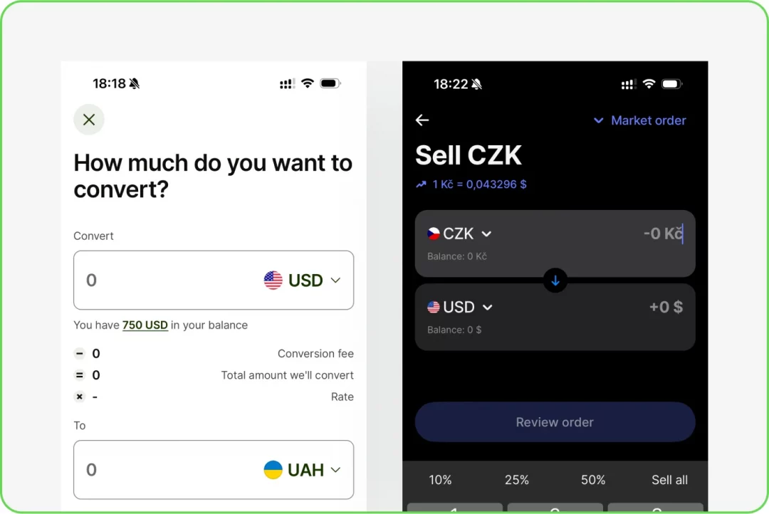
8. Currency Exchange
Problem:
Currency exchange feels complicated because it’s hidden within the card transfer functionality.
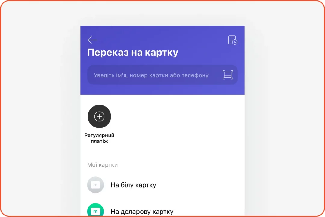
Solutions:
Add a separate service with currency exchange functionality where you can choose currency and cards, and see the rate, commission, and balance.
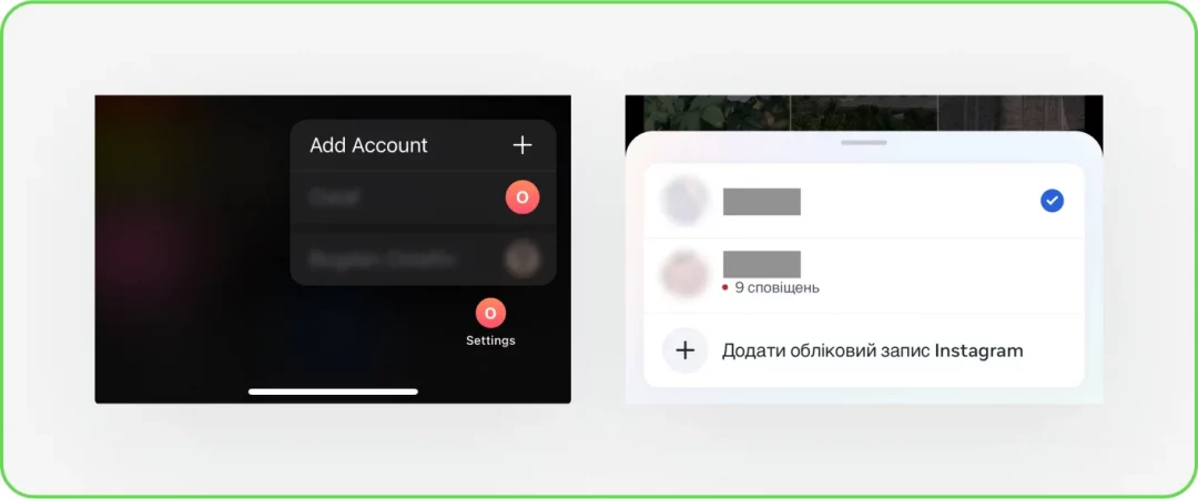
9. Accounts
Problem:
Switching between accounts requires too many steps.
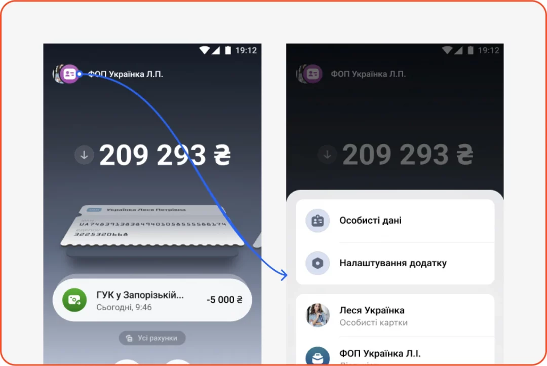
Solutions:
- Enable quick account switching with a long tap on the profile icon
- Add double-tap functionality for seamless toggling between accounts
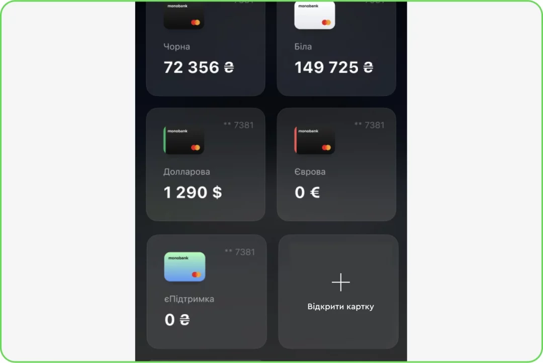
10. Adding Cards
Problem:
The “add card” button is obtrusive and rarely used.
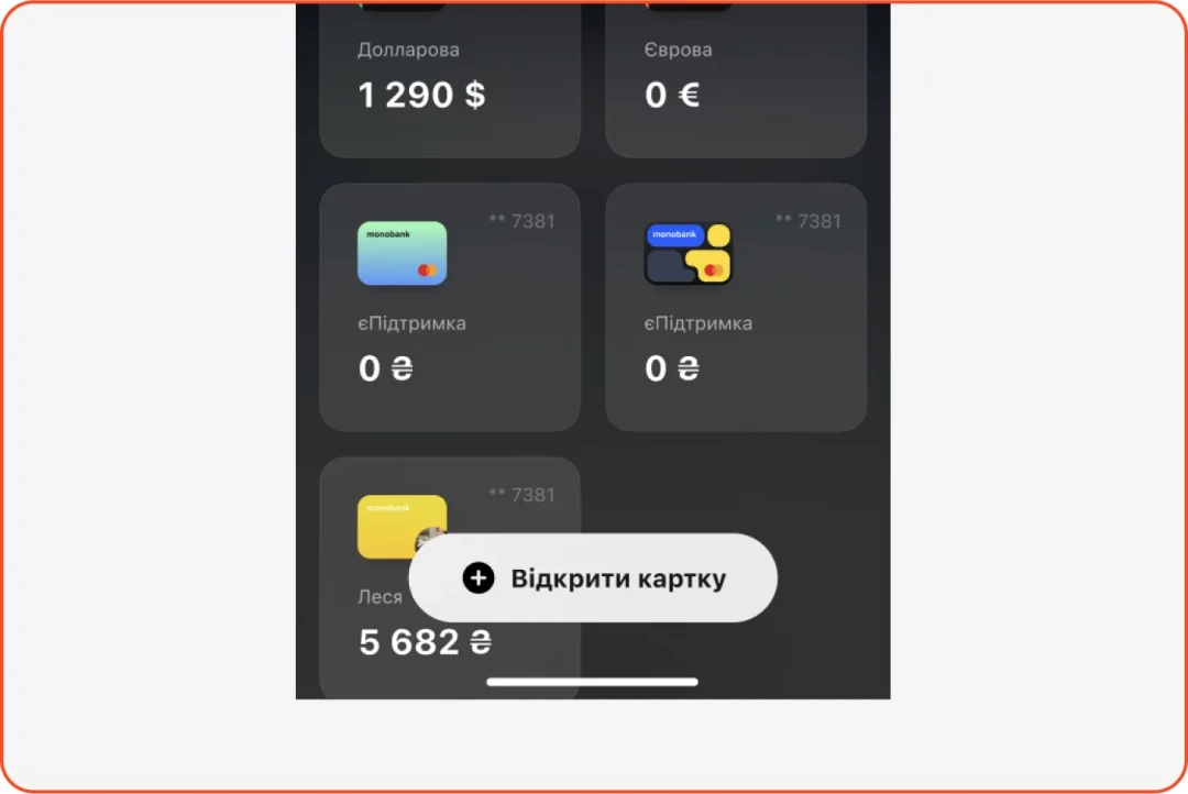
Solutions:
Move the “add card” button to a tile format as the last card option, keeping the interface clean and focused.
Conclusion & Results
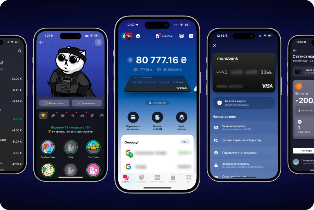
Some of our ideas resonated so well with the monobank team that they expressed their desire to implement them into the final design during the presentation. After the launch of the redesign, we were delighted to see several of our recommendations come to life, including:
- The redesign of the avatar customization icon
- An intuitive new icon for balance top-ups
- The message icon was moved to the navigation bar
Seeing our improvements come to life in an app used by over 9 million people was incredibly rewarding. Redesigns often face criticism simply for being new, but this time, the response was overwhelmingly positive – a clear win for both Spaceberry and monobank.
As regular monobank users, working on this project felt personal. Now, every time we use the app, we’re proud to see the impact of our work.
At Spaceberry, we aim to design experiences that bring joy, and nothing makes us happier than improving the lives of millions. Cheers to monobank – and stay with us; we have so much more to share!
If you enjoyed this case study, we recommend diving into another one from the Fintech industry: Option Tracker, which won the 2023 Red Dot Award for Best User Experience.