Option Tracker: Redesign with Red Dot Award and –20% Bounce Rate

4 min reading Jan 10, 2023
Overview


A trading tracker company, Options Tracker, reached out to us for help with improving the UX/UI of their platform. The software provides metrics and insights on trading and allows users to track their stock and options trading without the need for expansive and complex spreadsheets. This is all done via one program for ease of use.
Options Tracker posted the job to several job boards and received over 500 responses. After shortlisting those with the best reviews and portfolios, they decided upon Spaceberry as we were most aligned with them. We were hired to examine the platform’s UX/UI and make recommendations for improvements, in addition to implementing a more unified and improved style.
LocationUnited Kingdom
Duration3 months
IndustryFinance
What was doneWeb app design
The challenge
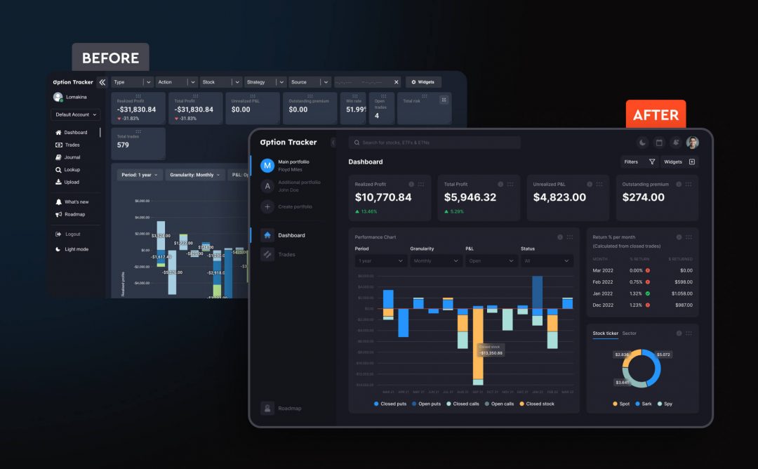
Options Tracker had problems with their UI/UX, yet their software was already up and running. The poor quality of the UI, which was measured and proved with real users’ reviews, led to reduced traffic, and the leads they acquired were low quality.
The client gathered the user requests and identified the following issues:
- Unintuitive interface;
- Complex and ill-conceived user flow;
- Poorly visualized data.
Spaceberry’s Project Manager said:
“After understanding the complexity of the task we realized that the project should be given to a senior UI/UX designer, as he has expertise and experience suitable for the task of this level”.
Our approach
To get started our custom web design, we had demos and presentations with the client to ensure that everything was effectively communicated to them. In the initial meeting, we brought Spaceberry project managers and set priorities. We discussed different approaches with the client and ensured that they were involved at every stage. In fact, the client said they “never felt out of touch”. Then, as a team, we worked together via Figma to develop the solutions.

We worked separately on UI and UX
From the UI point of view, we analyzed the market and chose the most suitable visual ideas within this domain to create a mood board for the client.
From the UX point of view, we made a UX audit of the current platform, and analyzed the feedback from the real customers, taking into consideration rivals’ designs. This gave us an opportunity to find the pain points of the platforms. As a result…
The following issues were fixed
The navigation has been radically redesigned, which made it much easier to get around the system and find the necessary actions in clear, easily accessible parts of the interface (sidebar, header, etc).
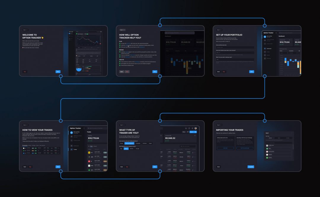
A system of onboarding and hints has been added so that the user will quickly learn about all the functions and capabilities of the system.
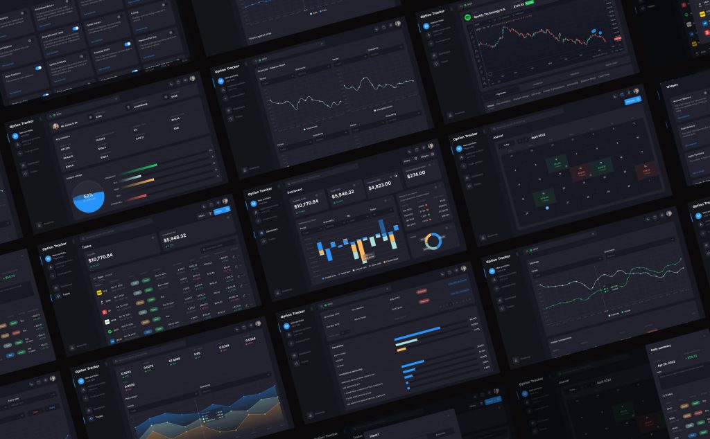
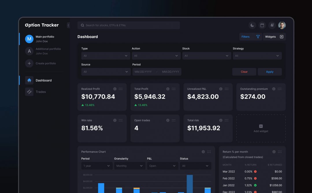
The deals page has been radically redesigned, and the information has been logically grouped, which significantly reduces the cognitive load.
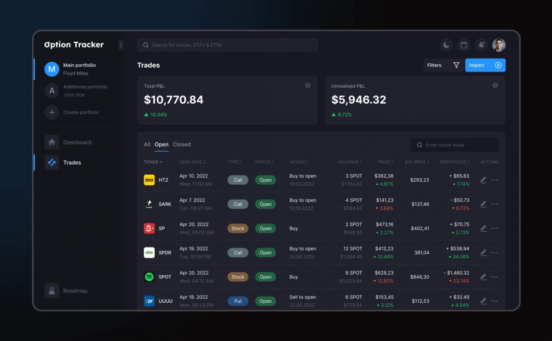
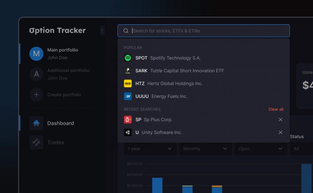
A global search system has been added, which makes it easier for the user to find their own or popular stocks.
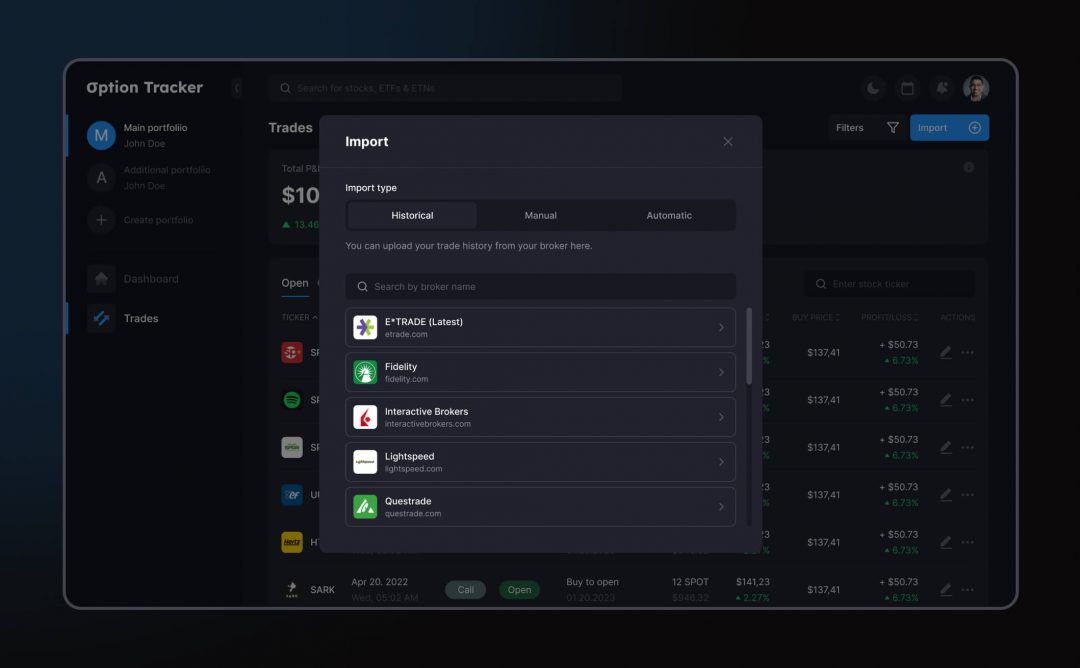
A multifunctional import system has been developed for customers to manually or automatically load stocks using a file.
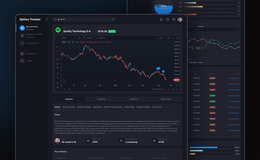
A detailed page was developed, which includes information about the promotion with infographics.
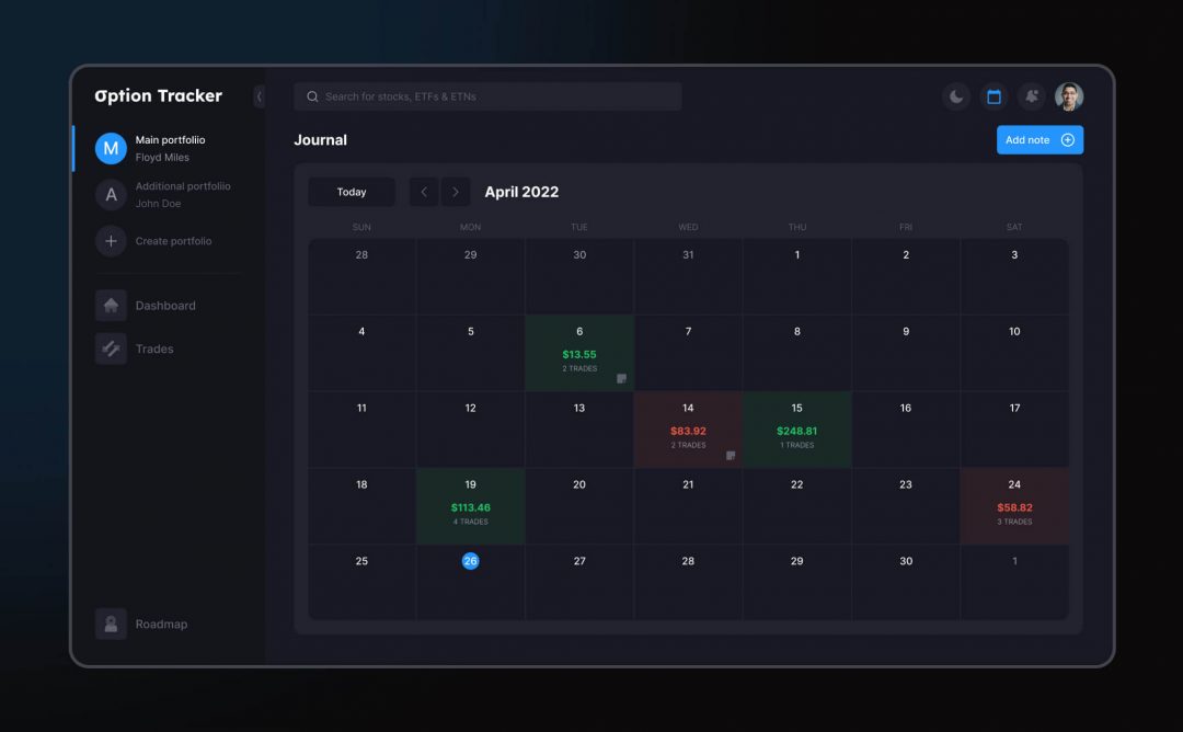
The calendar that allows users to see visualizations of transaction dynamics and history has been improved.
A system permitting deep workspace customization was created.
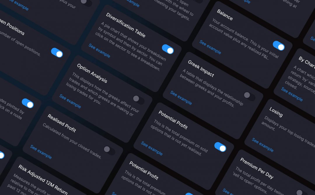
A system of global filters has been improved that allows customers to view information on all the necessary parameters.
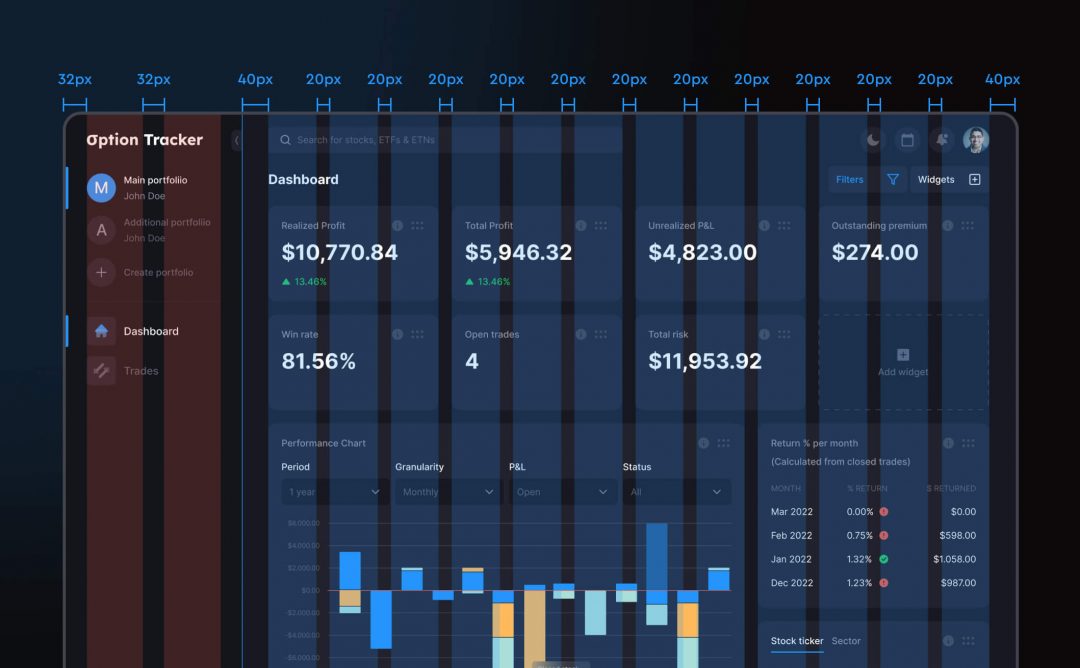
All interface elements have been aligned to clear grids and margins.
In the client’s review of Spaceberry, they noted how great it was to see progress in Figma, and we would reply to comments, so all small details were discussed. After the first and second phases of planning and drafting, the designs were implemented into the product, and we made it easy for them to “copy across styles”.
Client’s feedback
The client gave us full scores across the board, with scores based on schedule, cost, quality, and NPS. The client also said that (quotes):
- Deliverables are high quality and the project was a success.
- Great communication. Never felt out of touch.
- They clearly spent a lot of time thinking about the solution and discussing different approaches.

CEO, Option Tracker
Deliverables are high quality and the project was a success. They clearly spent a lot of time thinking about the solution and discussing different approaches.
Results
As an outcome of Spaceberry efforts, with a custom web design approach, we identified pain points and delivered a more intuitive interface, simplified user flow, and better-visualized data, resulting in higher traffic and improved lead quality. Our team of experienced designers worked collaboratively with the client throughout the 3-month project duration to ensure effective communication and a smooth implementation of the designs. As a result, the client expressed satisfaction with our web design pricing packages and rated us highly for schedule, cost, quality, and NPS. Overall, we’re proud to have delivered high-quality custom website design services that met the client’s needs and goals.