How UI/UX Design Impacts Website Conversion Rates
By Spaceberry Studio 7 min reading Dec 8, 2023

UI/UX design conversions are driven not only by aesthetics, but also by how effectively design supports user actions and decisions. There are numerous cases where even small design changes have led to significant improvements in conversion metrics. In this article, we will explore 7 interesting examples of how custom website design has influenced conversion and the important lessons they hold for anyone looking to improve their web-based business results.
Registration Process and UI/UX Design Conversions
ASOS, a fashion retailer, faced a cart abandonment issue. Their solution? Simplify the registration process. Previously, they mandated new users to create an account to make a purchase. In the new design, there is no mention of account creation. Instead, they ask users to click “Continue”.
This streamlined approach, requesting only essential info like name, email, and password, eased payment and security concerns, slashing cart abandonment by 50%. This example clearly shows how thoughtful UX decisions can directly improve UI/UX design conversions.
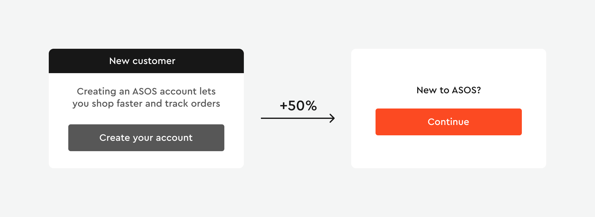
ASOS’s story highlights the importance of user-friendliness in website design. Simplifying the registration process, making payment easier, improving page loading speed, ensuring easy navigation, and enhancing security are crucial factors that can positively impact conversion rates and customer satisfaction. It’s important to continuously refine website design and functionality, as well as use testing and analytics to identify and address weaknesses for success in online commerce.
For more insights on user-friendliness in web and app design, explore our latest case study for the Healthcare platform OptimallyMe.
Customer Reviews and UI/UX Design Conversions
To understand the power of reviews, let’s take a look at WikiJob, the UK’s largest graduate job site. They ran a simple A/B test, adding three reviews to the original version that boosted conversions by 34%.
But just adding reviews won’t help if you bury its deep on your site or stash at the page’s bottom – it might go unnoticed. Take Michael Aagaard’s split test, for example. He offered a free ebook called “7 Universal Conversion Optimization Principles” and wanted to boost downloads with reviews. Four colleagues wrote positive reviews, initially placed at the bottom of the page. Then, he moved them higher for immediate visibility, resulting in a substantial 64.5% conversion increase.
Another interesting case – Company XYZ, renowned for premium coffee equipment, upgraded its site to enhance sales. They already had a section with brief customer reviews but decided to raise the bar. Instead of short reviews, they encouraged customers to provide comprehensive feedback, share experiences, highlight advantages, and rate various product attributes. These detailed reviews replaced the standard ones.
Implementing extended reviews led to a 28% increase in product page conversion. Customers became more informed and confident in their choices since they could explore other users’ experiences in more detail.
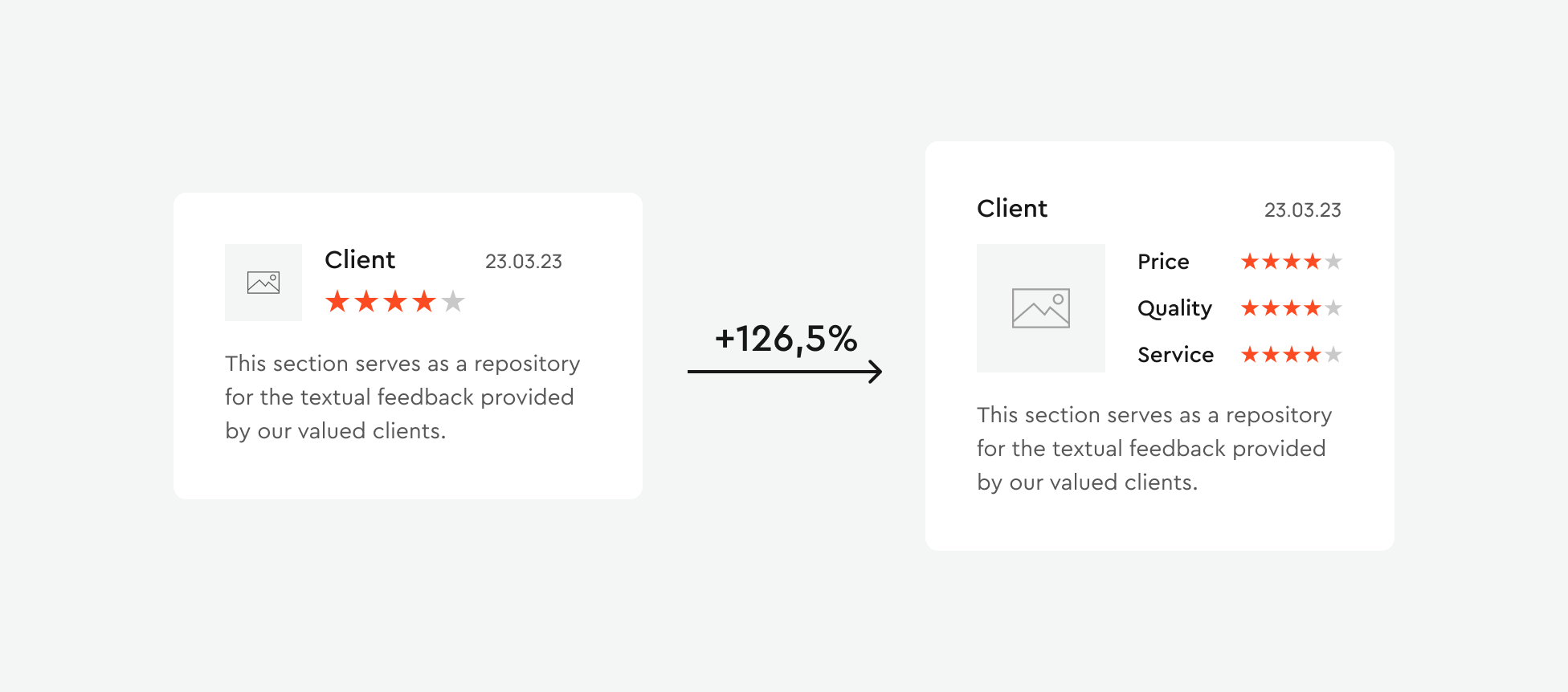
It’s important to pay attention to the effectiveness and placement of reviews on your website. Adding reviews can improve conversion, but where and how they are presented also matters. Reviews debunk customer concerns and doubts while boosting trust in a product or service. They provide objective information from other users, aiding potential customers in making purchase decisions.
Visual Harmony in UI/UX Design Conversions
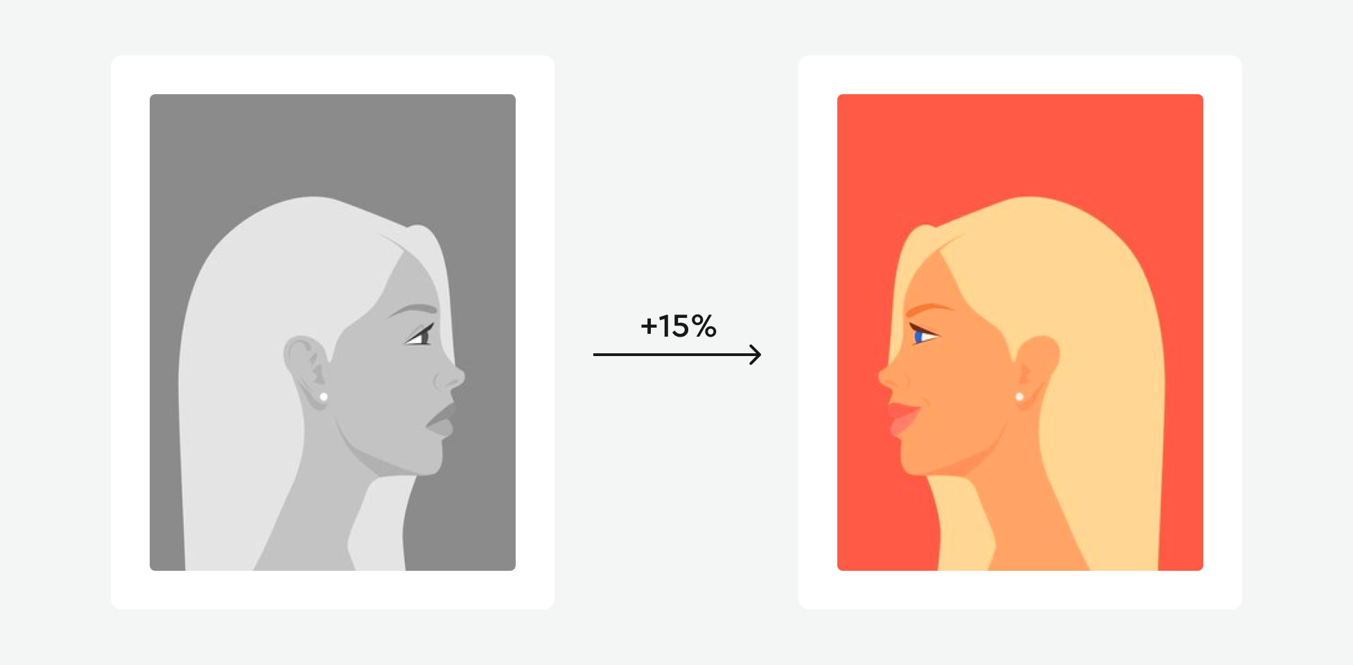
When 37Signal sought to boost its landing page’s conversion rate, they conducted experiments, including changing background images featuring people. These tweaks led to significant conversion improvements, with nuances in appearance, expressions, and poses making a difference.
A thriving website hinges on visual appeal, not just informative content. It’s about crafting an immersive visual experience – graphics, design – that captivates and retains user attention.
This approach helps identify the optimal design that attracts more attention and encourages users to make purchases, register, or subscribe. The choice of images, their appearance, and overall design are crucial for creating a pleasant impression and attracting users. Even the smallest details can impact conversion and prompt users to take action. It’s essential to remember the harmony of the visual experience and regularly conduct testing and analytics to achieve optimal results.
Call-To-Action Button
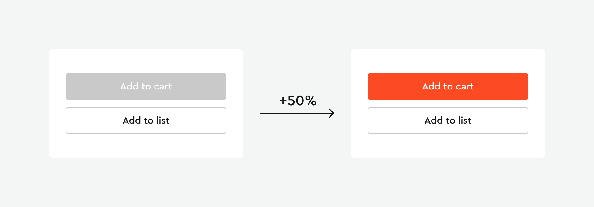
Saying that your call-to-action (CTA) is important for how customers interact with your website would be an understatement. You want the message to be clear, but you also have to consider the surrounding elements and the color scheme. Testing different colors is a straightforward way to create contrast with your CTA. Argo tested its homepage CTA button with gray and red colors. The content, message, and graphics were consistent across all variations. The only difference was the color of the button.
The result? The red button outperformed the gray one by 50%. Increasing the conversion of this page by 50% potentially meant a 50% increase across all downstream metrics. By getting 50% more people to click at the top of the funnel, the company added 50% to the bottom. This is why page optimization is so valuable.
This example underscores how even small design changes can lead to significant improvements in conversion. CTAs and the color scheme on a website can significantly influence conversion rates and the user experience. It’s crucial to test and analyze different CTA variations to determine the optimal look, including color selection.
Product Image Size
Czech company Mall conducted split testing of two product cards. The original product card featured small images of the product along with text descriptions. In the first test variation, they increased the size of the product images, and in the second one, they made the images larger with descriptions appearing on hover.
The second variation, with larger images and hover-over descriptions, emerged as the winner, leading to a direct revenue increase of 9.46%.
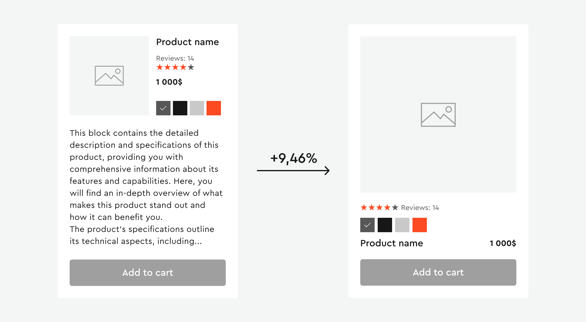
In split tests, it’s clear that website design strongly influences user behavior. Users look for captivating information and products they can thoroughly inspect before buying. Providing large product images for easy viewing can significantly boost conversions and revenue. Furthermore, a user-friendly interface with detailed, clear information presentation and intuitive interaction is essential.
Consistent Product Card Grid
Identical and consistent product card sizes in the grid can affect your conversion rate. In this example, Blue Acorn tested two variations of its product page. The original design had inconsistent card sizes, while the second variation had consistent ones.
After testing with 25,000 visitors and a 95% statistical significance, the variation with consistent card sizes outperformed the original, resulting in a 17.1% increase in revenue per visitor compared to the baseline.
Read the article about our Discovery and Research Approach to create user-focused interfaces.
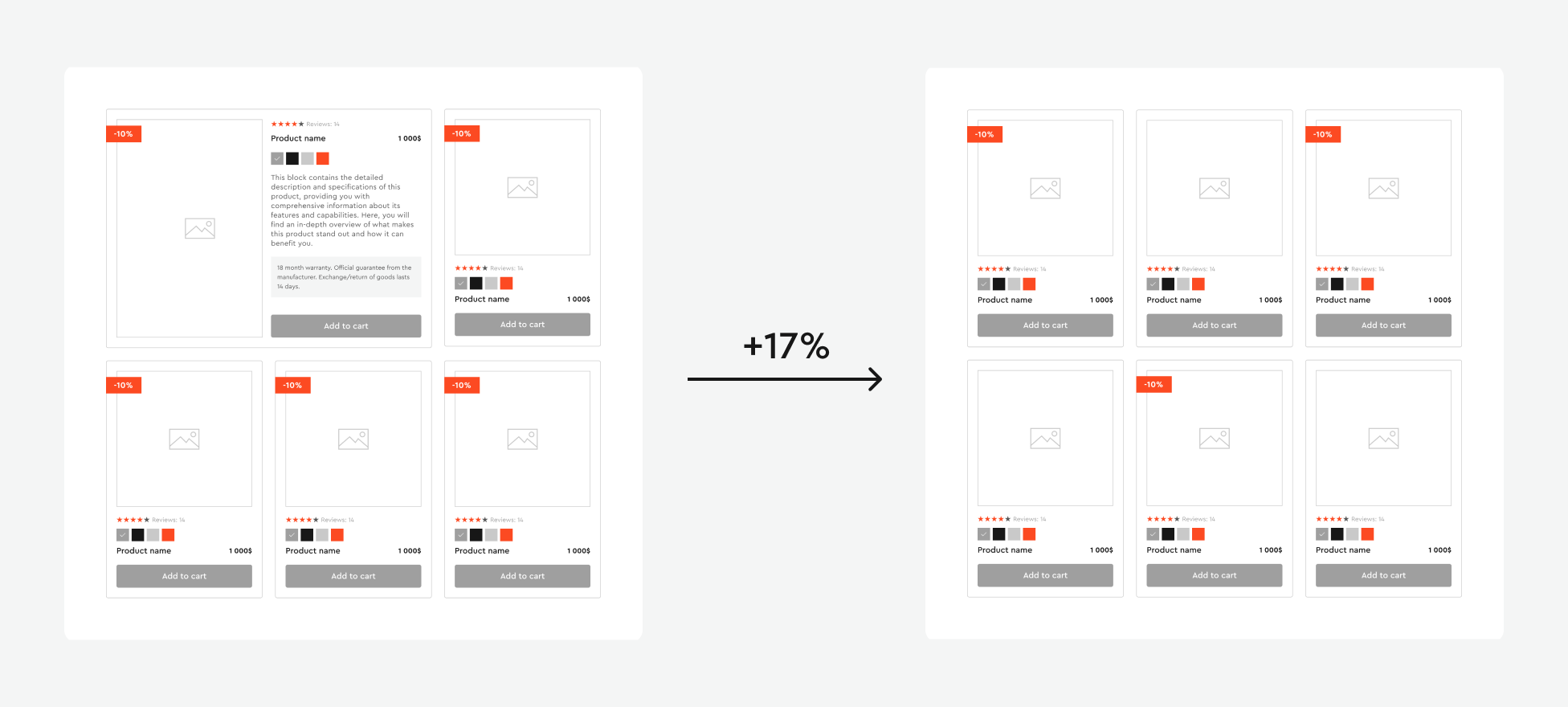
Consistent element sizes in a grid play a crucial role in design as they help create a harmonious and organized user experience. This approach simplifies hierarchy determination, provides structure to the design, and facilitates quick information absorption. Moreover, it ensures consistency and simplifies development and adaptation for various devices and resolutions. Consistent sizes are an important component of successful design, promoting convenience and accessibility for different audiences.
Availability Notifications
When products are out of stock, don’t consider removing its from the store. Replace the “Add to Cart” button with an email registration option for “Receive Availability Notification”. Then, send transactional email notifications to inform visitors when the product is available. This strategy resulted in a 22.45% increase in email conversion rates.
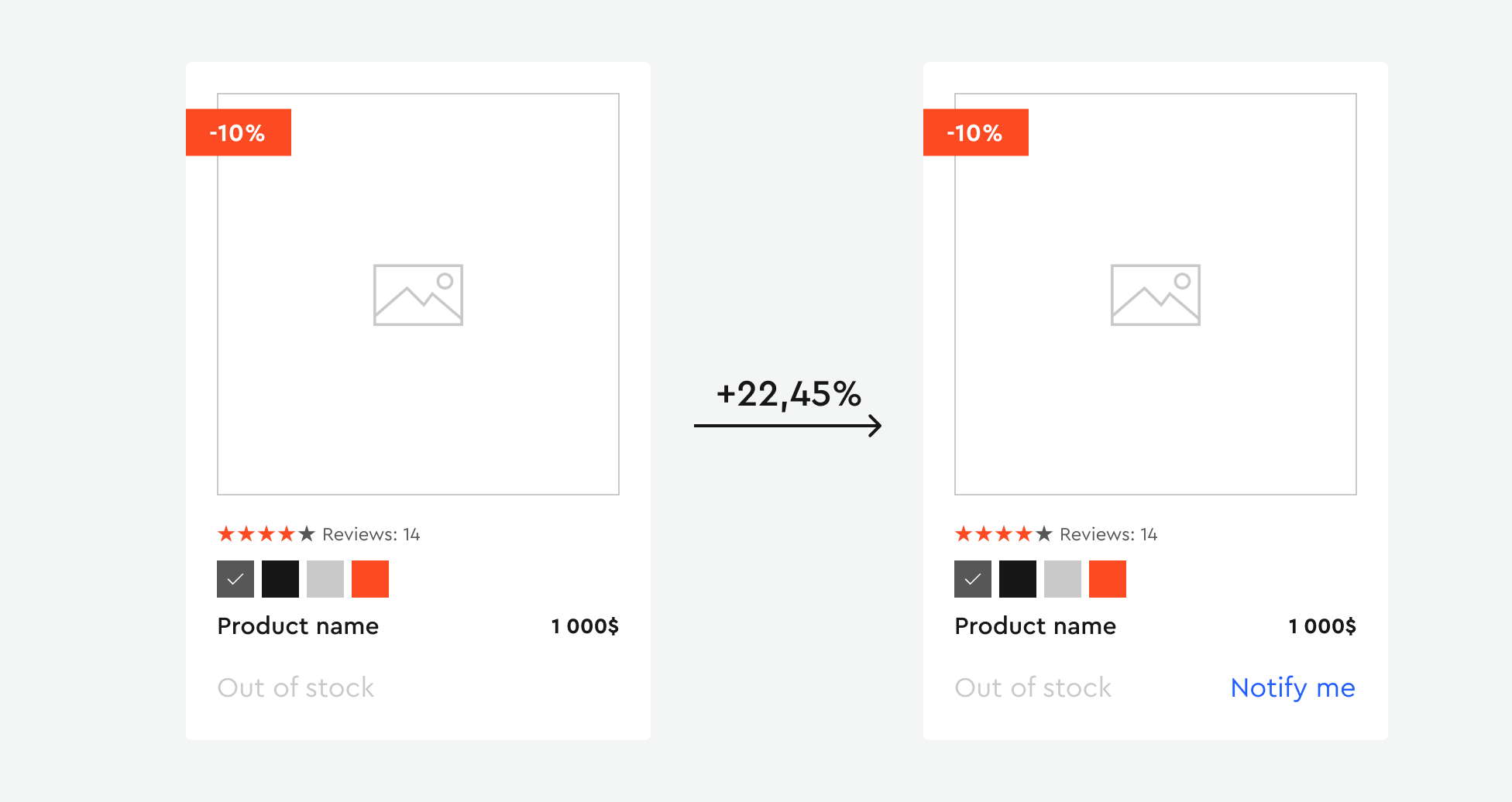
Active inventory management and restocking efforts can be powerful tools for increasing e-commerce conversion. Offering email notifications for product availability instead of removing the products that are out of stock is an effective way to attract and retain customers, as evidenced by positive changes in conversion metrics.
Final Thoughts
The examples we’ve explored show how UI/UX design conversions can be significantly improved through thoughtful design decisions. From the proper placement of buttons and color schemes to image selection and page structure, all these aspects matter in achieving a desired outcome. However, achieving significant changes in conversion doesn’t always require complex solutions. Sometimes, even small design changes can lead to substantial growth in performance metrics. Remember that the key is tracking results, experimenting, and analyzing audience reactions.


