Crush: Dating App Redesign Successful App Store Launch

9 min reading May 20, 2025
Overview

When Crush walked into our inbox, it was love at first touch. Crush – a location-based dating app designed to spark genuine connections in real-time. In a world where digital interactions often lack authenticity, Crush plays matchmaker between people and places, fostering both romantic and platonic relationships at events and popular spots across New York City.
While other dating apps leave users swiping in solitude, Crush believes in the chemistry of physical presence. By suggesting nearby venues and revealing others at the same location, Crush transforms everyday outings into potential “how we met” stories. It’s not just about finding someone – it’s about finding someone right now, in the same rhythm of life as you.
LocationNew York market
Duration1 month
IndustrySocial Networking
What was doneUI/UX Redesign
Our First Date: Discovery & Concept Stage
There wasn’t much time for “getting to know each other” – Client, Dishant Ponugoti, already had a prototype, and we were jumping straight into the makeover phase.
We began by speed-dating the competition (Tinder, Bumble, Hinge, and Happn) to identify what makes hearts flutter in the market and what could set Crush apart.
Through heartfelt conversations with Dishant, we pinpointed areas ready for relationship upgrades: UI aesthetics that needed refreshing, user flows that weren’t flowing smoothly, and engagement strategies that weren’t quite sealing the deal. Armed with these insights, we didn’t waste time playing hard to get – we jumped straight into developing three distinct UI variations for the main screen.
Each concept embodied Crush’s core philosophy – effortless, real-time connections in vibrant social settings – while ensuring the app would stand out in the crowded dating marketplace. After all, in love and in apps, first impressions matter.
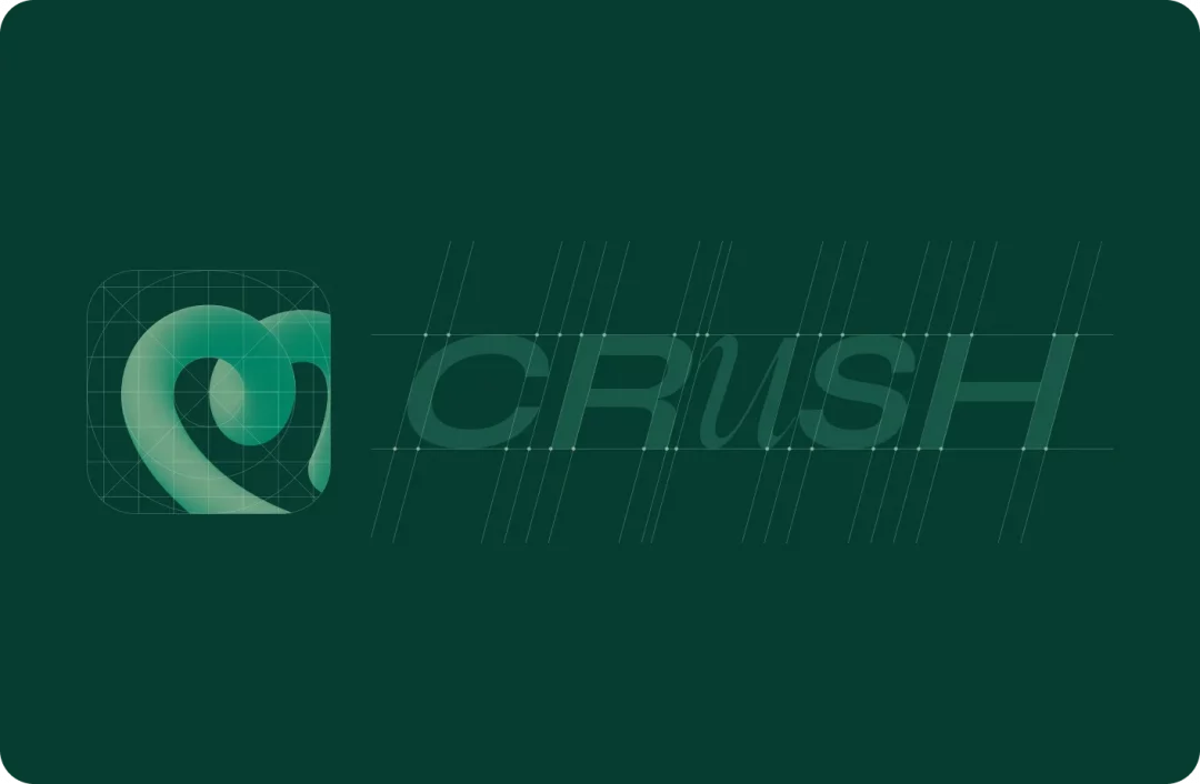
Falling in Love: Logo Creation
The perfect logo, like the perfect partner, needs to represent authentic values while catching the eye. Dishant had specific requirements for Crush’s visual identity: they wanted an unconventional, lightweight design solution that would immediately convey the app’s purpose and benefits.
Despite initial direction to avoid hearts, during our exploration of the app’s interface, we discovered 3D lines used as background elements on several screens. This insight inspired us to integrate a similar technique into the logo design, with a heart shape ultimately becoming the central form. This approach created visual cohesion, reinforced the overall product style, and strengthened brand recognition.
Dishant also shared several conceptual metaphors they were drawn to. One particularly compelling idea involved two sparks representing the beginning of something new – either coming together to ignite each other or already formed into a single unified spark. This metaphor beautifully captured the essence of new connections forming through the app.
Another Dishant’s suggestion explored the symbolism of healthy relationship development, potentially combining elements of leaves and plants with fire as a symbol of passion and love. This creative tension between growth (plants) and chemistry (fire) reflected the app’s balanced approach to fostering meaningful relationships.
With these inspirations guiding our process, we explored various typographic and symbolic representations of human connection. Dishant chosen green color scheme became our foundation –symbolizing freshness, vibrancy, and growth, the essential ingredients for any blossoming relationship.
We experimented with different font pairings (some were perfect matches, others not so compatible), shapes that spoke of connection without being obvious, and styles that felt contemporary yet timeless. After several iterations – like carefully crafted love letters – we presented variations that captured Crush’s unique personality: fresh, inviting, and distinctly memorable.
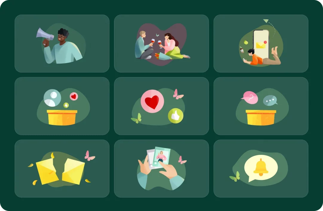
Deep Connection: Creating Illustrations
We selected and adapted a pack of illustrations that aligned well with Crush’s mood – tender, intimate, and trustworthy. One recurring visual element is the butterfly, which was deliberately chosen as a metaphor.
Butterflies appear throughout the app to symbolize more than just aesthetic softness – they reflect the euphoria and fluttering excitement people often feel at the beginning of romantic attraction, commonly referred to as “butterflies in the stomach.” These visuals subtly enhance the emotional experience of the user, connecting visual storytelling with the internal sensations of connection, curiosity, and anticipation. Dishant was thrilled with the results.
Some visual effects were created using artificial intelligence tools. This allowed us to quickly experiment with scenes before polishing them to perfection. The tool we used was Adobe Firefly, which ensured a strong stylistic consistency with the selected base illustrations.
Getting Serious: Core UX Flows & Features
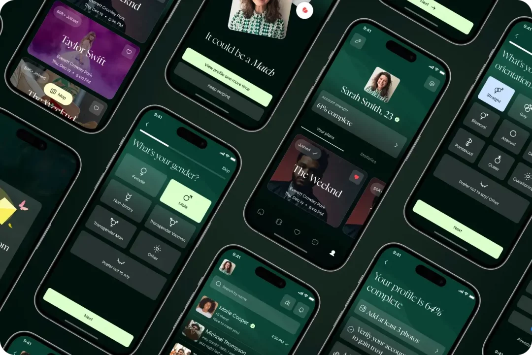
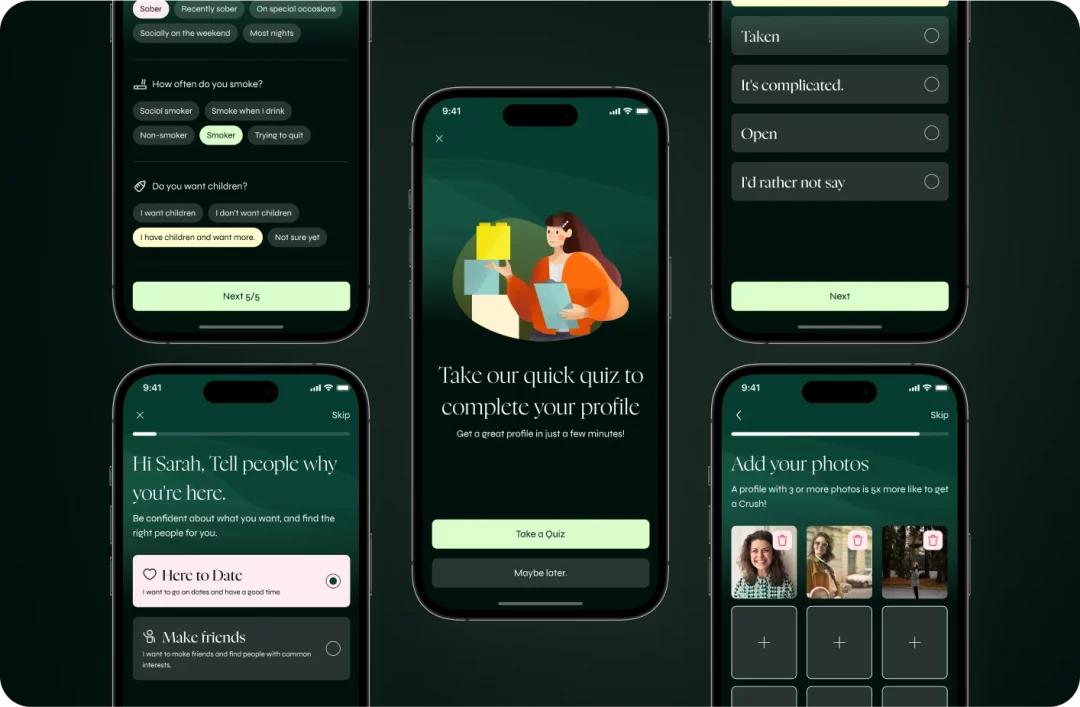
The Perfect Profile: Onboarding and Home Screen
Just as you wouldn’t reveal your entire life story on a first date, Crush introduces itself gradually through a thoughtful onboarding process. Users begin by defining their intentions – seeking romance or friendship – setting the stage for a personalized experience that leads to more meaningful matches.
Onboarding Flow:
- Intent Selection – Romance or friendship? Users decide which path they’re on.
The Getting-to-Know-You Phase:
- Personal Preferences – From sexual orientation to favorite movie genres, these details help the algorithm play cupid more effectively.
- Profile Setup – Users showcase their best selves through photos and complete verification to prove they’re real (because catfishing is so last decade).
- Location Access – Crush asks for permission to suggest nearby hotspots, the digital equivalent of “Come here often?”
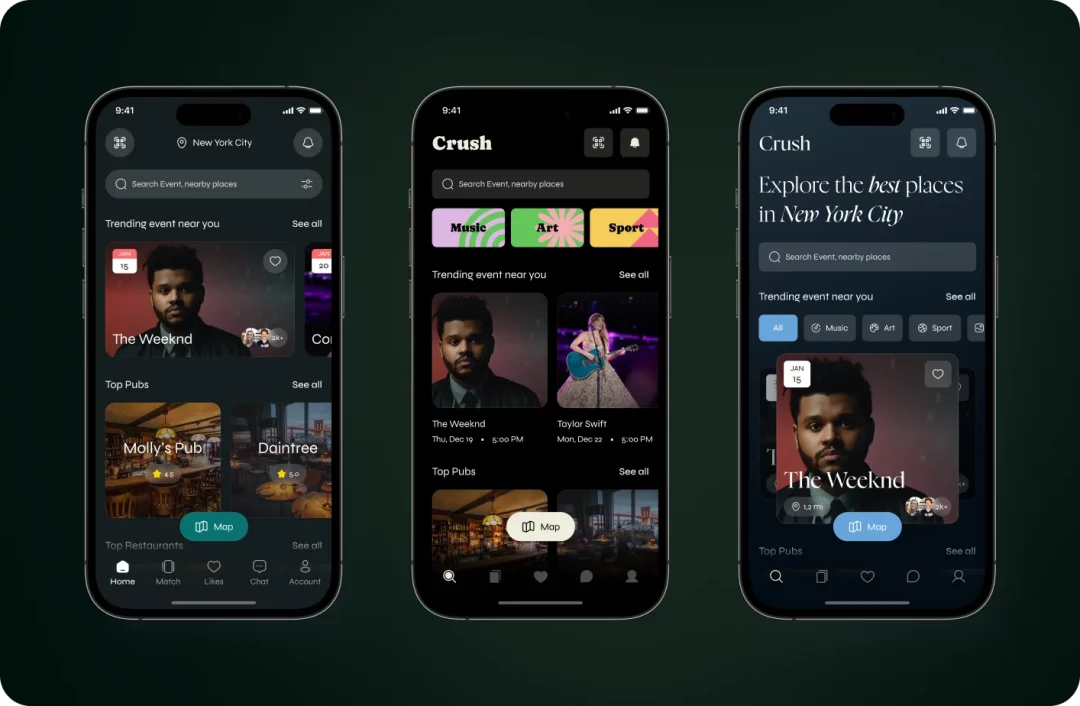
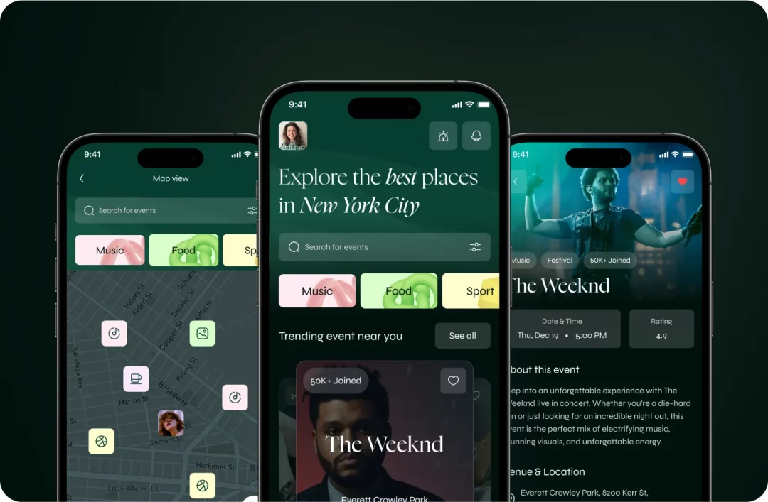
Post-onboarding, users arrive at the home screen – their gateway to real-world connections. This dynamic hub is designed to inspire spontaneous decisions and create opportunities for serendipitous meetings.
Key Features:
- Personalized Event Suggestions – From concerts to exhibitions, Crush curates trending events that align with user interests, because shared experiences make the best conversation starters.
- Interactive Map Mode – The app’s digital wingman helps users visually explore event locations and venues based on real-time location, perfect for the “right place, right time” philosophy of modern dating.
- Detailed Event & Venue Pages – Each location gets its moment in the spotlight with descriptions, images, and reviews.
- Join & See Who’s There – Users can RSVP to events and preview who else will be attending, creating anticipation before they even arrive.
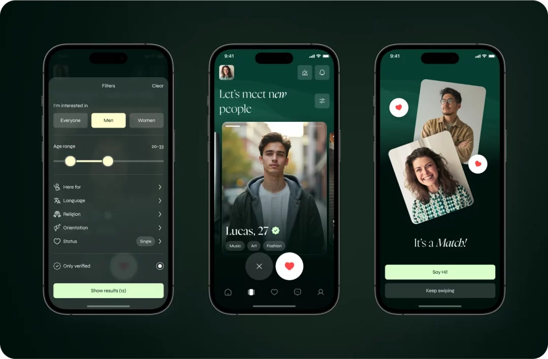
The Courtship: Matches Page UX
The Matches page is where digital chemistry meets real-world opportunity. When a user enters a venue, Crush detects their presence – like noticing someone across a crowded room – and suggests nearby events they might enjoy. Once they check in, the magic begins: they can see others at the same location and start the time-honored tradition of showing interest (swipe right) or passing (swipe left).
To find their perfect match, users can filter based on intention (dating or friendship) and shared interests, from hiking to horror movies. Clicking on a profile reveals more about the person – their photos, bio, and preferences – giving users a sense of who they might be meeting. When both swipe right, it’s a match! Users then have the option to start chatting or continue exploring other possibilities, all while enjoying the event they came for.
Playing Hard to Get: Likes Page
The Likes page offers a tantalizing glimpse behind the curtain, showing users who’s already swiped right on them. But like any exclusive club, this feature comes with VIP access only – users need either a subscription or in-app credits to unlock this insight.
This strategic tease serves as one of Crush’s monetization approaches, offering two paths:
- Buy a subscription for unlimited access to your secret admirers
- Purchase credits to reveal admirers one by one, perfect for the commitment-phobic
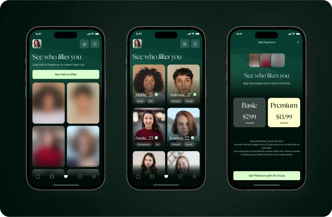
By making this feature premium, Crush creates an element of exclusivity while giving users the power to accelerate their connections. After all, knowing someone already likes you is the ultimate confidence booster.
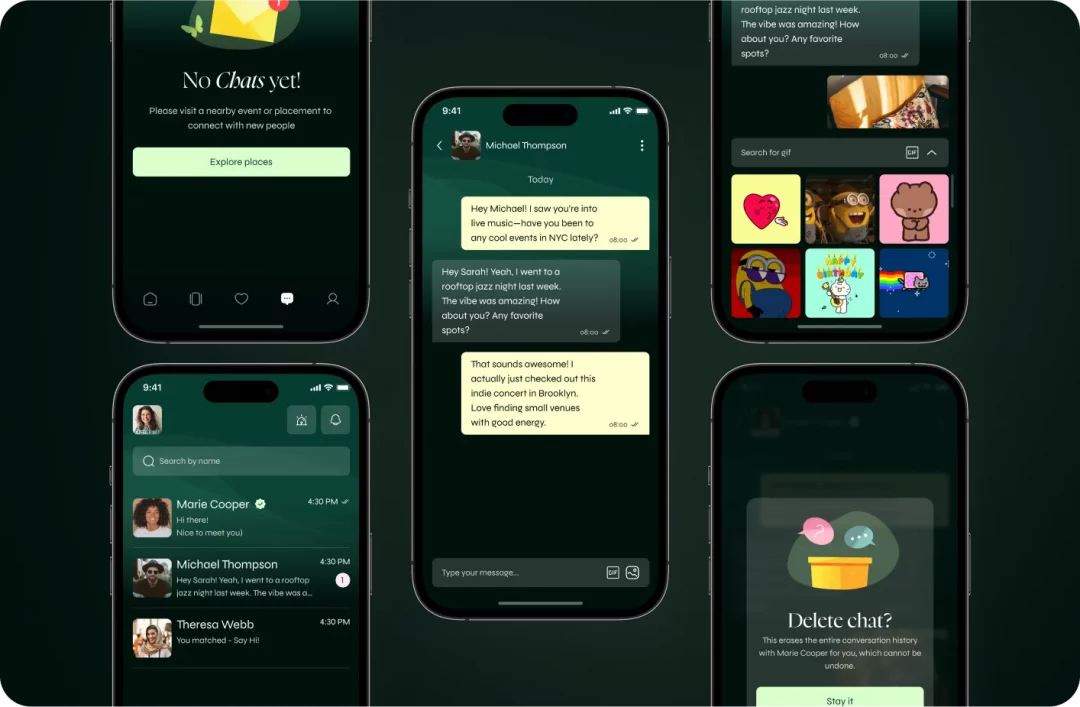
Sweet Talk: Chat Page
Once the mutual interest is established, users move to the Chat page – the digital equivalent of exchanging numbers. This space allows matched users to start conversations, send text messages, share GIFs, and exchange photos.
More than just a messaging platform, this is where connections deepen, where plans are made, and where “just chatting” can transform into “let’s meet for coffee.” The interface is designed to be intuitive and engaging, keeping conversations flowing as smoothly as good date night banter.
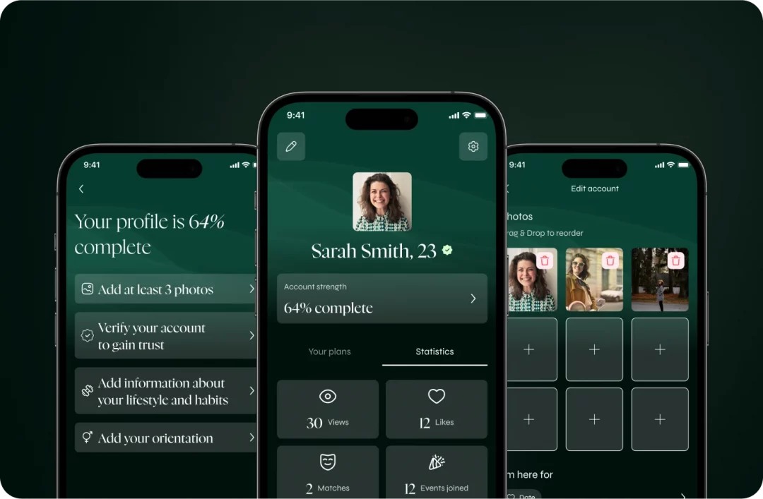
The Full Package: User Profile Page
The User Profile page serves as each user’s personal brand center – a curated presentation of who they are and what they’ve experienced on Crush. This hub offers both personalization options and insights into their journey on the app.
- Event Subscriptions – Users can view events they’ve committed to, ensuring they never ghost an opportunity to connect.
- Match & Like Stats – The profile displays engagement metrics, including matches made, likes received, and events attended – because everyone loves positive reinforcement.
- Profile Editing – Users can refresh their digital persona whenever inspiration strikes, ensuring their profile remains as current as their dating status.
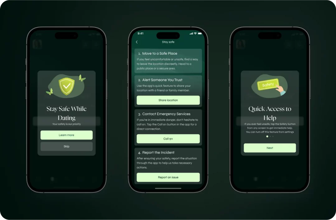
The Wingman: Safety Alert Feature
Even the most exciting connections need boundaries, which is why Crush’s Safety Alert system is the app’s most valuable feature. Like a loyal friend who always has your back, this system provides peace of mind while users explore new connections and locations.
How it works:
The app presents a detailed safety guide with practical advice for meeting new people, from choosing public places to recognizing potential red flags.
- Location Sharing – Users can share their whereabouts with trusted contacts, ensuring someone always knows where they are (the digital equivalent of “text me when you get home”).
- Emergency Call Button – A quick-access option to call 911 or local emergency services if a situation feels unsafe.
- Report & Support – If an interaction crosses boundaries, users can report directly to Crush’s support team for swift action.
This comprehensive safety net reinforces Crush’s commitment to making safe connections – because the best relationships start with respect.
Happily Ever After: Results
The Crush redesign was completed in record time – just one month from concept to handoff, proving that sometimes the most passionate relationships move quickly. Despite tight deadlines, we delivered a polished, intuitive interface that perfectly balances user needs with business objectives.
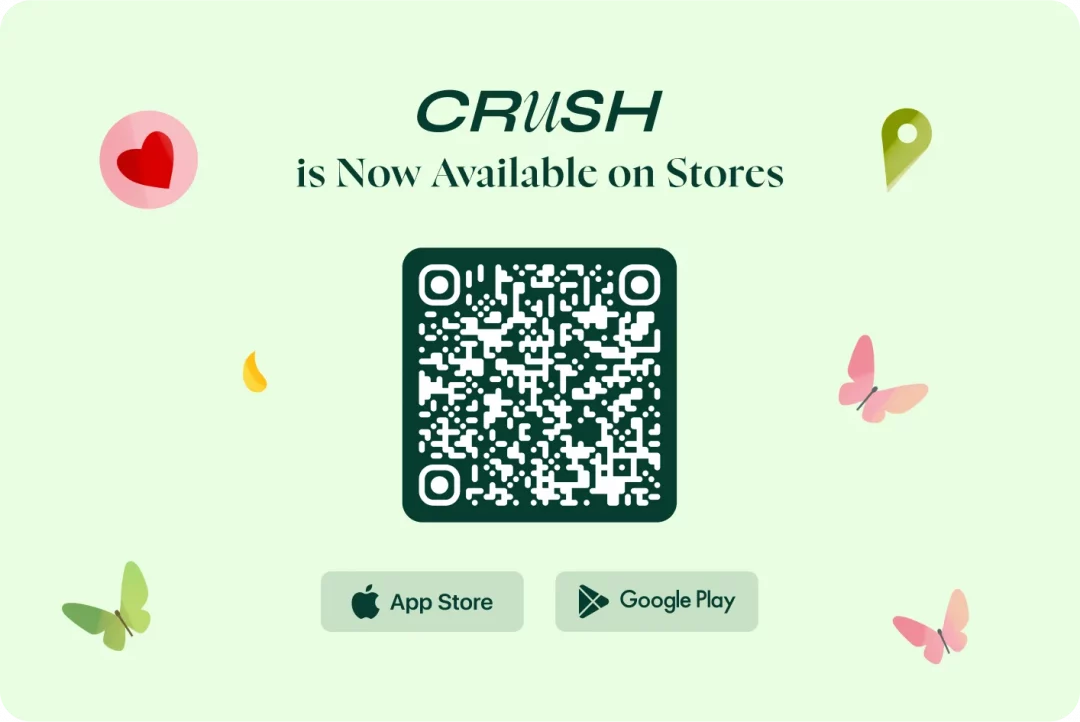
The greatest achievement? Crush is now live in the App Store, transforming from a concept to a fully functioning matchmaker for New Yorkers. This milestone represents the app’s evolution from “single and searching” to “actively dating” in the competitive app marketplace.
This project showcased our ability to work under tight deadline without compromising quality. By streamlining our process, prioritizing essential UX elements, and maintaining open communication with Dishant, we created a refreshed, modern, and user-friendly platform that’s now connecting people across New York City.
With Crush now live and making matches, we’re excited to see how users embrace this new experience and how the app continues to evolve – because the best relationships only get better with time.
We’ve got butterflies reading our client’s enthusiastic review, where he praised how we accurately captured his design vision, hit the mark with the app concept, and connected perfectly with the target audience.