CadmosPay App Redesign Backed by a 5★ client review and expanded design system adoption

9 min reading Jul 2, 2025
Overview

CadmosPay is a DeFi platform built on Arbitrum that approached us with a clear vision: to redesign their existing mobile application while preserving UX and features and to design a website from scratch that would highlight the application’s core functionalities.
We had the privilege of working directly with CadmosPay’s founder, Nassib Boueri, in a close collaborative partnership that ensured every design decision reflected his strategic vision for the platform.
LocationEurope
Duration1 month
IndustryDeFi
The challenge
We knew this project would require a deep understanding of both user needs and the decentralized finance market. In our experience with financial applications, especially in DeFi, we’ve found that users need to navigate easily without worrying about transaction security. We also recognized that the DeFi market can be intimidating for newcomers, so we set out to design a simple, intuitive interface that would be comfortable even for those without technical expertise.
As with any project, we started with competitor and market analysis, examining both direct and indirect products in the decentralized finance sector and adjacent areas. We analyzed leading financial services like Revolut and Wise, using them as benchmarks for their innovative fintech solutions and inclusive, visually engaging design – crucial qualities for building user trust and accessibility.
By combining user research with our experience, market trends, and insights from online feedback, we’ve identified several core user needs for UI:
- Intuitive Navigation — Users need to understand where they are and where to go — without a manual
- Quick Access to Core Features — Top actions (like sending money or tracking progress) should be front and center
- Clear Visual Hierarchy — Design should naturally guide attention — what matters most is visually dominant
- Consistency Across Screens — Typography, buttons, and spacing should feel familiar from screen to screen
- Accessibility & Inclusivity — Support for dark mode, font scaling, and color contrast ensures everyone can engage
Through our research, we discovered that younger, tech-savvy audiences prefer bright, interactive designs that capture attention and simplify interaction. This insight became a cornerstone of our design approach.
How We Transformed UI
We believe that thoughtful design details make all the difference. For CadmosPay, we chose rounded and filled icons to harmonize with the frames, adding softness and modernity to the design. These elements enhance visibility and user-friendliness while contributing to the project’s overall aesthetics.
We selected Montserrat as our font for its modern, clean lines and excellent readability. This font ensures clarity and elegance, complementing our overall design approach.
Based on our research findings, we developed several visual concepts for CadmosPay. Sky themes inspired the ideas that resonated most with both our team and the client.
We created a light theme resembling a clear, sunny day that evokes a sense of lightness and freedom and a dark theme that conveys a night sky atmosphere, providing depth and contrast. Nassib loved both concepts so much that we decided to implement both options, allowing users to choose based on their mood or time of day.
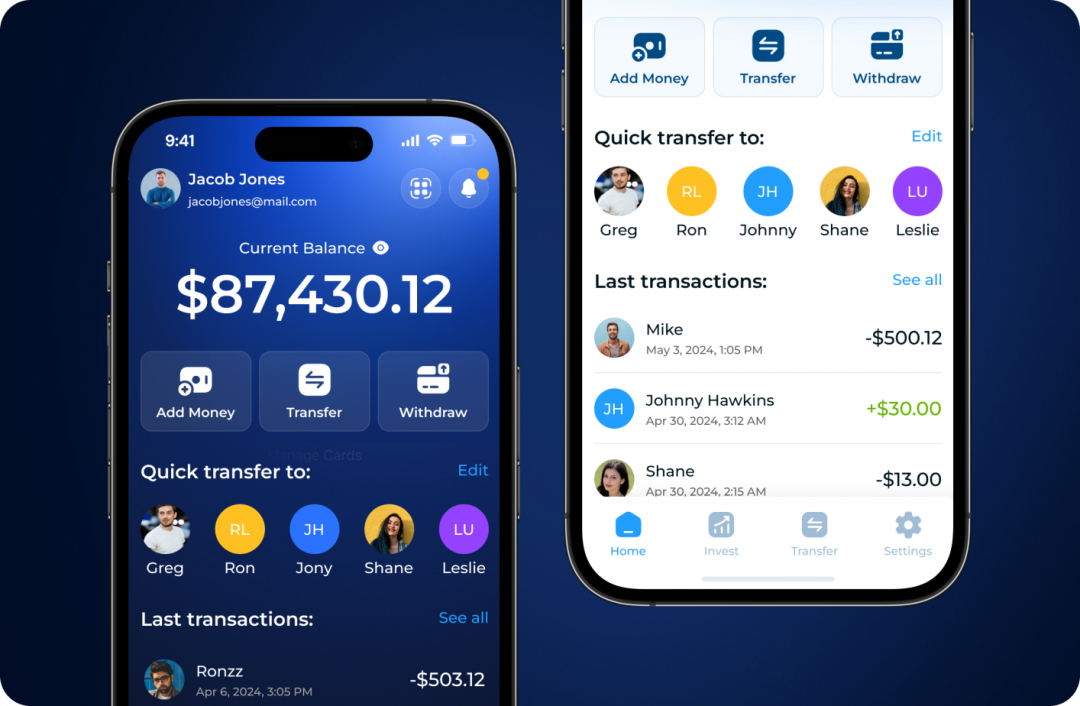
During the redesign process, our main focus at Spaceberry was ensuring intuitive navigation that would allow users to quickly find necessary functions and easily perform operations.
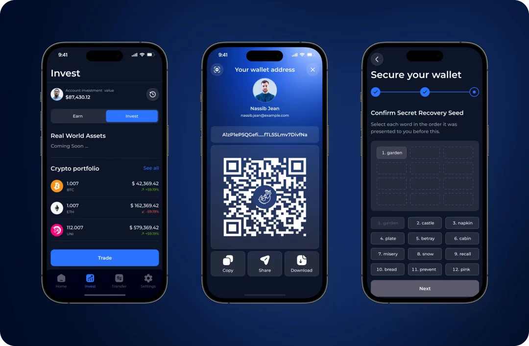
One of our key achievements was simplifying the core user scenarios. In the previous version of CadmosPay, the recipient selection process was somewhat complex and created friction. We improved this by studying how competitors like Revolut, Wise, and Monobank handled similar workflows.
The result? A significantly simplified recipient selection flow where users can easily choose from an existing list or invite a new member to the app. This made the process much faster and more convenient, reducing the number of steps needed to complete transfers.
When developing the flows for Earn and Invest features, we focused on creating designs that would be understandable for both experienced users and beginners. We made each step intuitive so that users could easily understand where and how they are investing their funds, and clearly see the potential benefits.
We also made sure all risk information was accessible and comprehensible. Details about market changes or price fluctuations were clearly marked in the interface so that users could make informed decisions.
During app development, we actively collaborated with developers to ensure a maximally comfortable and efficient development process. We focused on making the design structured and logical, allowing developers to navigate the project and effectively implement it. Considering potential development issues, we carefully considered each interface element to avoid an excessive system load.
We paid special attention to animations as well. We experimented with different animation formats to determine which best suited the app. The goal was for animations to be smooth and performance-safe without slowing down the app. This approach allowed us to find the ideal balance between high-quality visual effects and app performance speed, ensuring a comfortable user experience without any technical complications.
Additional Features That Drive Engagement
Our successful collaboration with CadmosPay didn’t end with the initial redesign and website development. Impressed with our work, Nassib approached us for additional features that would further enhance user engagement and platform functionality. This follow-up project highlights the strong long-term relationship we’ve built with CadmosPay and their trust in our expertise.
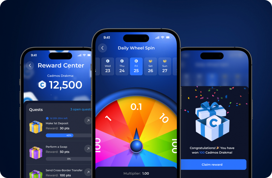
Reward Center: Gamification for Enhanced Engagement
We developed a Reward Center — a dedicated section of the application that motivates users toward referral actions and daily platform usage.
We created:
- A bright, dynamic Cadmos Drakma coin to strengthen the platform’s brand identity
- A custom «wheel of fortune» that gives users a daily chance to win tokens, encouraging repeated app openings through this gamified approach
- A clearly structured quests/tasks block that organizes user objectives (like «Complete KYC» or «Send transfer») and ensures quick goal achievement
- A visually distinct referral block that not only informs but also encourages users to share the application
Marketing impact:
- Gamification increases daily user activity by making interactions more engaging
- Simple sharing through referral codes contributes to organic audience growth
- The vibrant visual language makes the product recognizable and easily associated with positive experiences
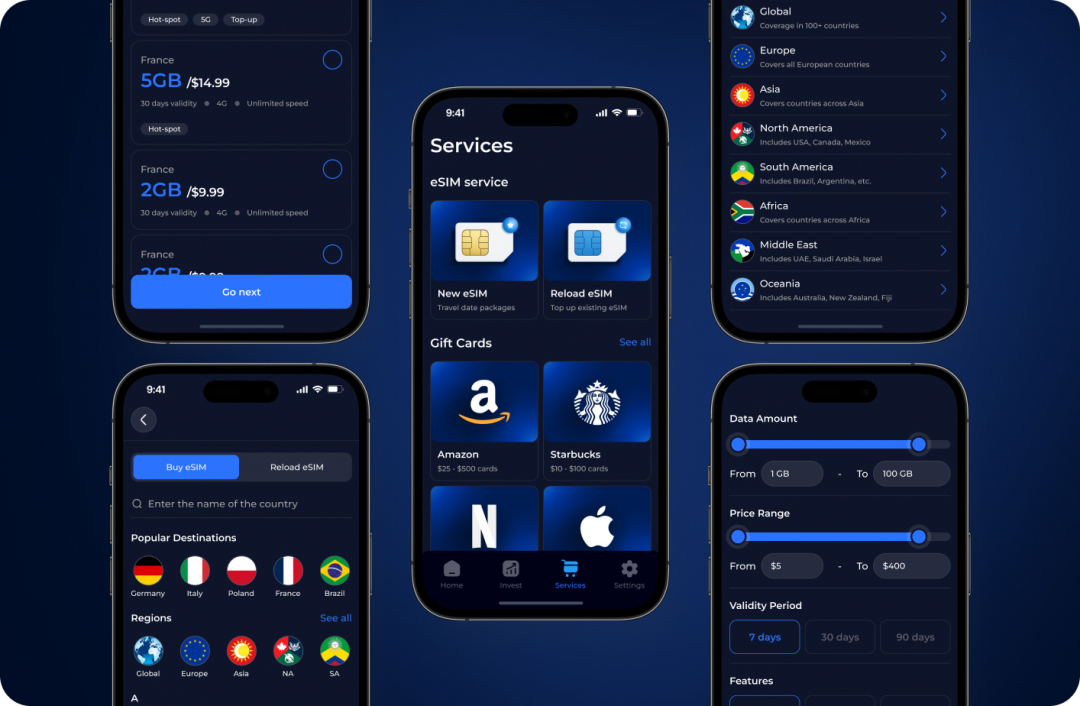
Services Integration: Expanding Functionality
We integrated a Services section into the app’s main navigation, allowing users to quickly purchase or update eSIMs and obtain gift cards for services like Amazon, Netflix, Apple, and more.
Features:
- Intuitive flow for selecting country, region, plan, and payment method
- Ability to compare tariffs and filter by data volume, price, and popularity
- Clear order summary allowing users to verify all details before purchase
Marketing impact:
- Additional functionality transforms the app from a fintech product into a universal digital hub
- eSIM purchases represent a high-frequency need that can ensure user retention
- Partner gift cards (such as Amazon) offer opportunities for cross-promotion and monetization
Visual Consistency with a Personal Touch
To support the emotional clarity and trust-centric experience of Cadmos, we handpicked and carefully adapted a set of illustrations that match the platform’s values — clarity, professionalism, and subtle warmth. Each image was refined to speak directly to users who might be navigating complex financial processes for the first time.
This helped us balance consistency with creative exploration — ensuring the final visuals felt part of a coherent story, yet tailored to specific moments in the app. These illustrations now serve not only as decorative elements but also as soft visual cues that reinforce Cadmos’ reliability and user-first mindset.

Videoexplainers
Also Nassib approached us with a request to create video explainers showcasing their product and highlighting its advantages. Since we’ve recently expanded our services to include animation, this task was truly exciting for us. We crafted customized videos with interactive subtitles that elevate the viewing experience to a whole new level. But don’t just take our word for it — check out the samples below to see our work in action!
Extending the Experience to the Web
For the CadmosPay website, we knew that user engagement would be a top priority in today’s rapidly changing digital environment. Our goal was to create a site that would feel light, airy, and unburdensome, making visitors interested in exploring the platform.
We developed the website with an emphasis on highlighting the app’s main functions. Each element was carefully positioned to make the user journey both informative and pleasant. Through our signature minimalist approach, we ensured that users could easily perceive key product points without feeling overwhelmed by information.
One of our favorite features was the strategic use of animation to draw attention to important sections, creating an interactive experience that engages users. These animations help visitors navigate the site while ensuring that key app elements don’t go unnoticed.
For us at Spaceberry, the task wasn’t just about creating a functional website but providing a dynamic, captivating experience that would retain users. By creating a visually appealing and intuitive website design, we helped CadmosPay reflect its core values of efficiency, transparency, and innovation — the same values that guide our work every day.
The Impact of Our Work
After launching the updated CadmosPay app, we were delighted to see how positively users responded to the new design. The updated visual appearance attracted attention and created a unique user experience that left a lasting impression.
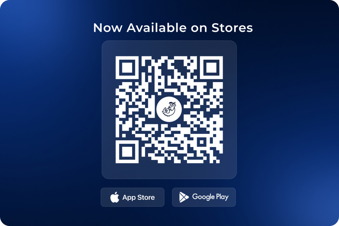
Cadmos is now available online; you can check it out in stores.
The success of the new style was so evident that the client asked us to extend this visual approach to their company website, recognizing its potential to attract new clients.
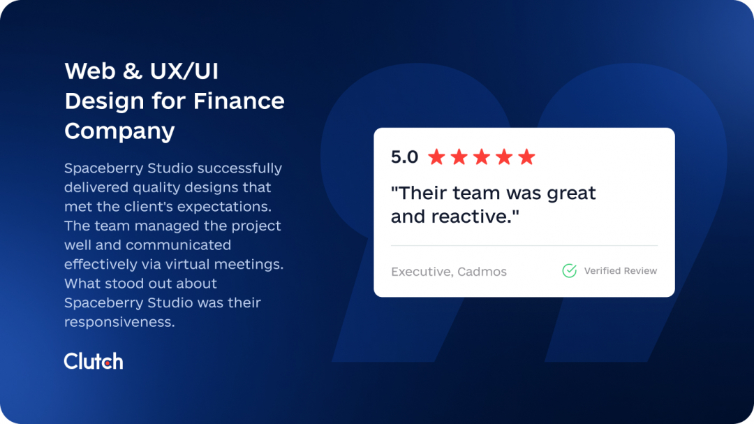
Client’s feedback
Boom! Another dazzling 5-star review just landed on our Clutch profile! This perfect score joins our flawless collection of all 5-star ratings. Nassib don’t just speak — he shout his satisfaction from the digital rooftops. Quality that demands recognition. Excellence that can’t be ignored. This is how we roll.