5 tips to improve Data Visualization

Data visualization aids decisions. There are many ways to represent data, such as isometric 3D graphics, bar charts, or diagrams. But, chasing aesthetics, designers may forget that its primary role is to inform.
Let’s go through common mistakes and explore how to optimize data visualization for various scenarios.
Tip #1 Choose the correct technique
Choosing the correct data visualization technique is crucial because it impacts the effectiveness of conveying information. Pie charts, for instance, present two main challenges:
Inaccurate Comparisons: Viewers may find it challenging to discern variations in slice sizes, making comparisons difficult. This issue is particularly pronounced when dealing with data that has minimal differences, where bar charts offer a more suitable alternative.
Misleading Representation: Pie charts excel at displaying components within a whole, like survey findings or budget breakdowns. However, when tasked with comparing distinct data sets, they can misinform the audience. For instance, using pie charts to assess the populations of various regions may lead to inaccurate data. Bar graphs prove to be a more suitable option as human perception primarily assesses distances rather than areas.
Solution: To address these challenges, it’s essential to align your data visualization technique with the nature of your data:
• Quantitative Data: Use charts or histograms for clarity in variations and trends.
• Qualitative Information: Opt for pie charts or bar graphs to present qualitative information, emphasizing the relationships between different components.
Additionally, when employing pie charts, ensure that the sum of the sectors equals 100%. It aligns with the pie chart’s purpose of illustrating the relationship of each slice to the whole, preventing viewer confusion.
Conclusion: Effective data visualization depends on carefully selecting the appropriate technique. Understanding the nuances of your data and its characteristics is vital in choosing between pie charts, bar charts, or other visualization methods. It will help your audience quickly grasp your insights without confusion.
Tip #2 Don’t use 3D charts for information purposes
The two-dimensional representation of three-dimensional space has captivated viewers for centuries, but three-dimensional graphics create serious problems for data visualization. For instance, occlusion, where one data element obscures another, can hide important information and create incorrect hierarchies, making it harder to comprehend.
Why is perspective a concern in business interfaces? In drawings, it can make objects seem like they exist in a 3D space, but in data visualization, it often leads to misleading hierarchies. It causes foreground elements to appear larger and background elements to seem smaller, distorting the relationships between data rows needlessly.
Alternative: Visualize this information using a pie chart or graph.
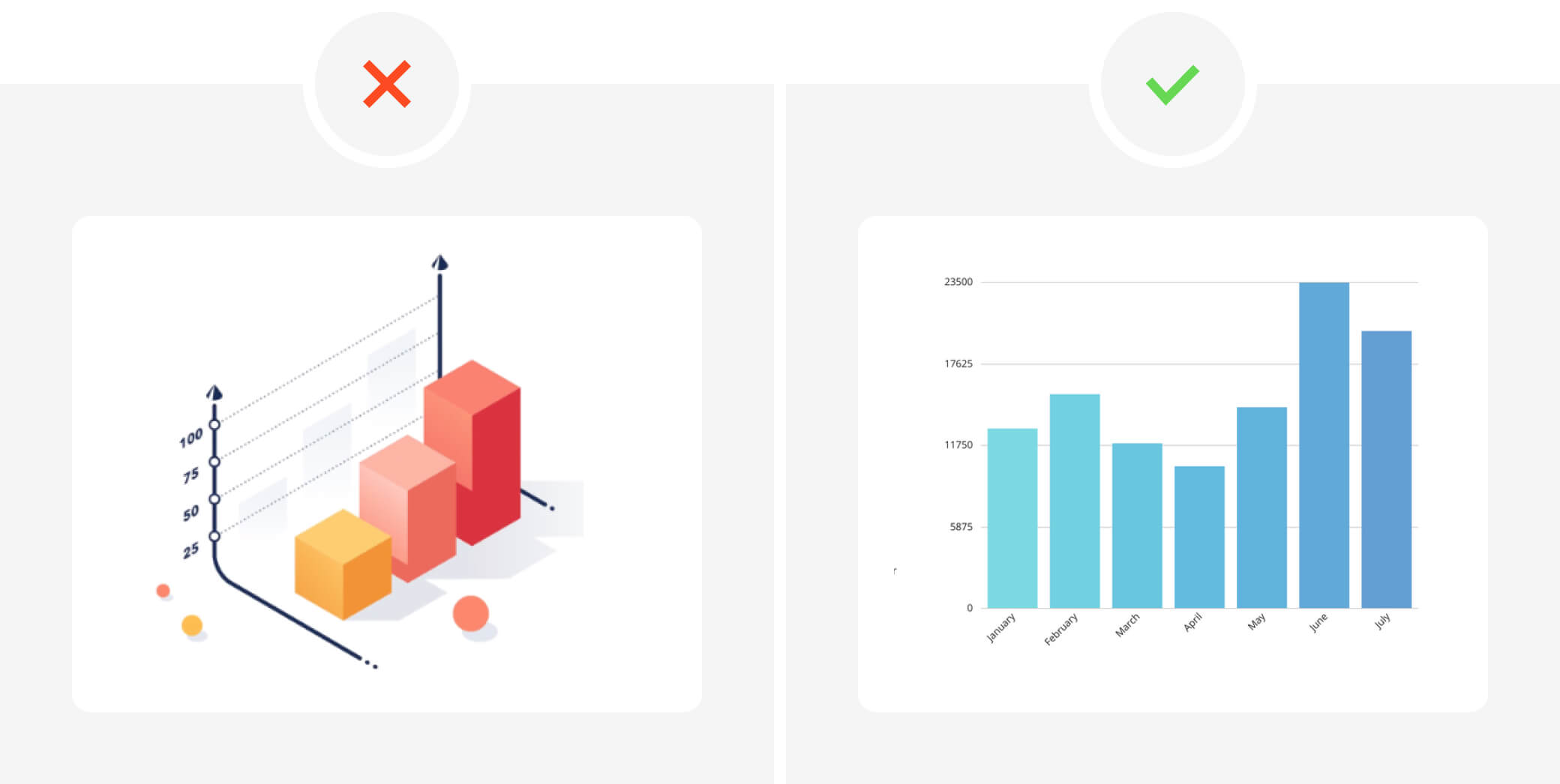
Conclusion: While three-dimensional graphics can be captivating, they can also obscure important information and distort the relationships between data rows. If 3D graphics are not necessary, consider visualizing the data in 2D.
Tip #3 Don’t Use the Radial Bar Chart
Radial bar charts, though visually captivating, introduce complexities that hinder data accuracy and ease of comprehension. Nested circles and rounded arch ends in such charts complicate comparisons and interpretation. Circular shapes inherently pose challenges, particularly when conveying percentages that fall between standard intervals.
Additionally, nested circles often necessitate the usage of legends or tooltips due to the impracticality of directly attaching labels to individual rings.
What to use instead: Instead of employing radial bar charts, opt for bar charts to accurately represent percentages. Bar charts provide a straightforward and efficient means of displaying data, offering improved clarity and reducing the need for additional elements like legends or tooltips. By using simple bars, you can enhance data communication, save space, and maintain data-driven interfaces without the distractions introduced by radial designs.
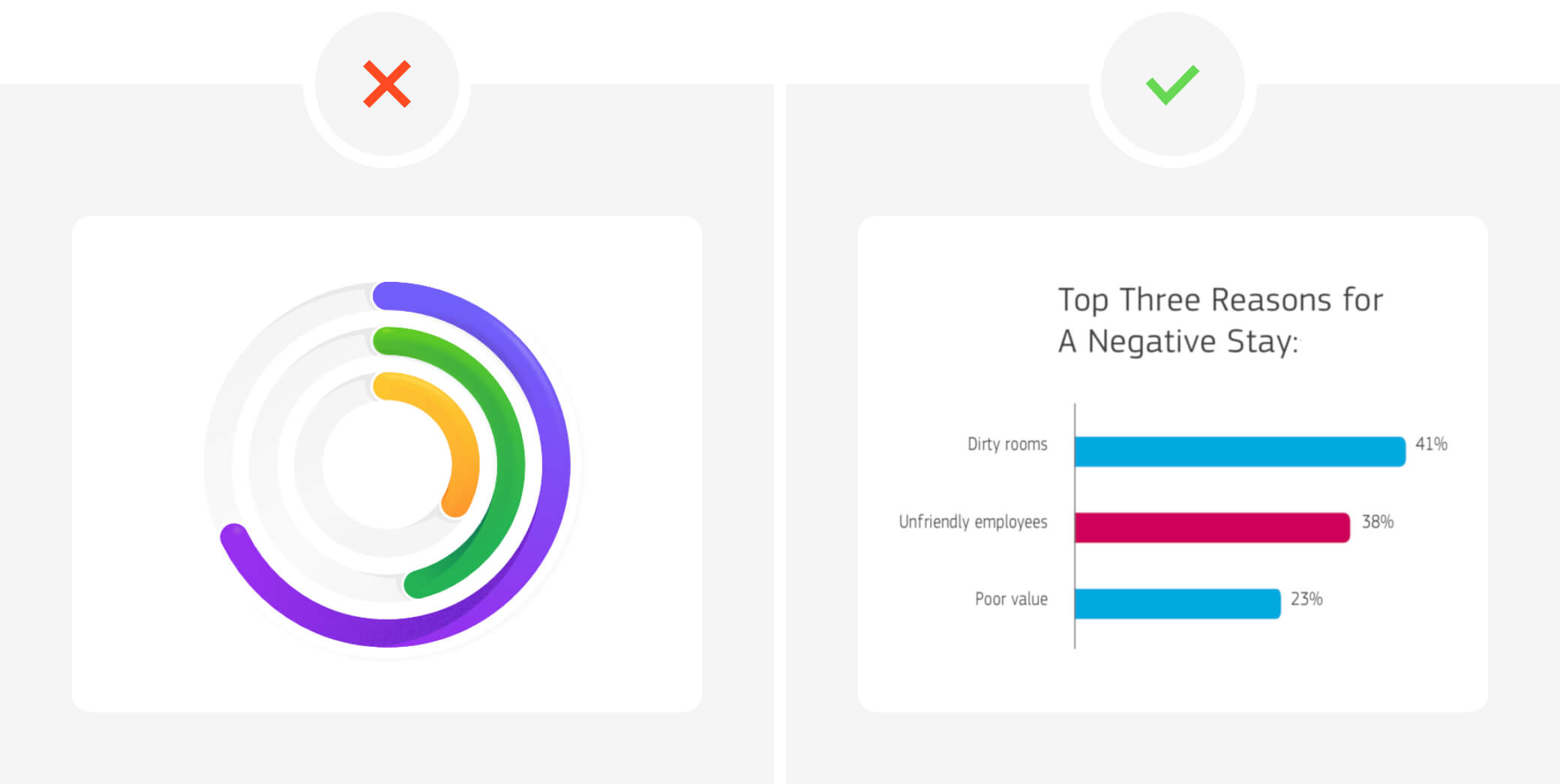
Conclusion: In data visualization, prioritize simplicity and clarity. While visually appealing, radial bar charts can complicate data interpretation and introduce unnecessary complexities. Embracing bar charts as an alternative empowers designers to convey information accurately, enhance user understanding, and streamline data-driven interfaces. Prioritizing effective communication over aesthetics leads to more efficient data visualization.
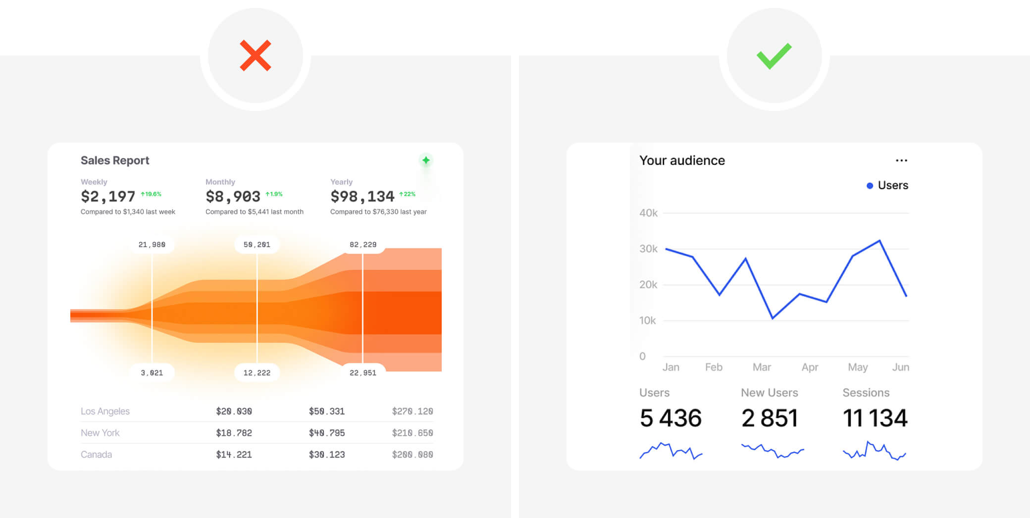
Tip #4: Avoid Using Excessive or Unnecessary Data
Balancing the essentials with what to omit is a constant design challenge in effective communication. This challenge is equally relevant in data visualization, especially when dealing with extensive and complex data sets.
What to use instead: Avoid the Temptation of Excess: The allure of conveying a profound message through a single visualization is strong. The solution: Strive for Clarity: Acknowledge that humans have limitations in deciphering complex visualized data. The common pitfall here is information overload. Utilize Multiple Visualizations: Instead of attempting to encapsulate all data within a single frame, opt for multiple visualizations. This approach allows you to present data in manageable segments, enhancing comprehension.
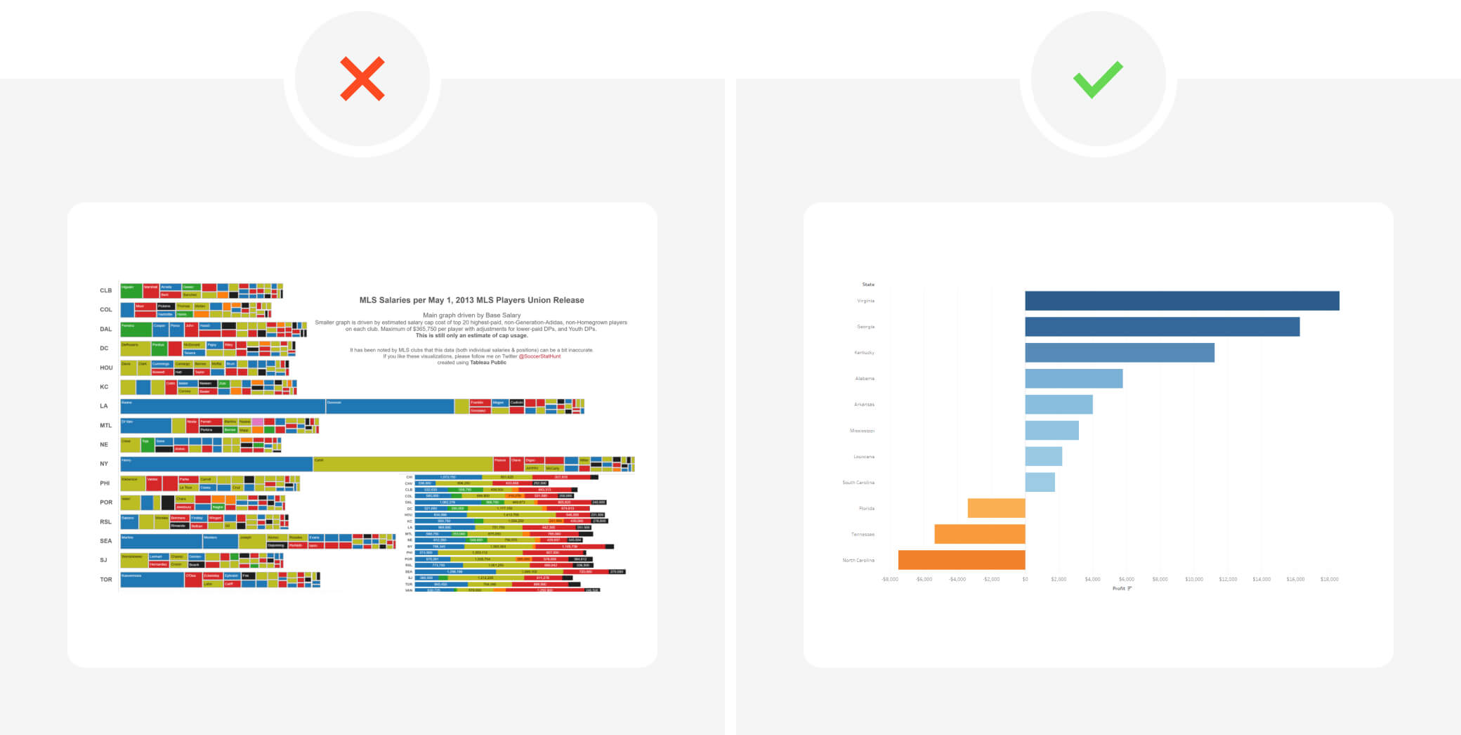
Conclusion: In the field of data visualization, the art lies in balancing clarity with comprehensiveness. Rather than bombarding your audience with an excessive amount of data, favor a more digestible approach using multiple visuals. By doing so, you can effectively communicate complex insights without overwhelming your viewers.
Tip #5 Opt for Traditional, Conventional Colors
Using absolute colors can oversimplify data, conveying misleading impressions. For instance, in election maps, red for Republican states and blue for Democratic states can oversimplify the results, ignoring variations within each state.
What to use instead: Consider employing relative coloring to provide a more detailed and accurate data representation. This approach allows viewers to understand the proportion of votes for each party within counties, offering a more nuanced perspective.
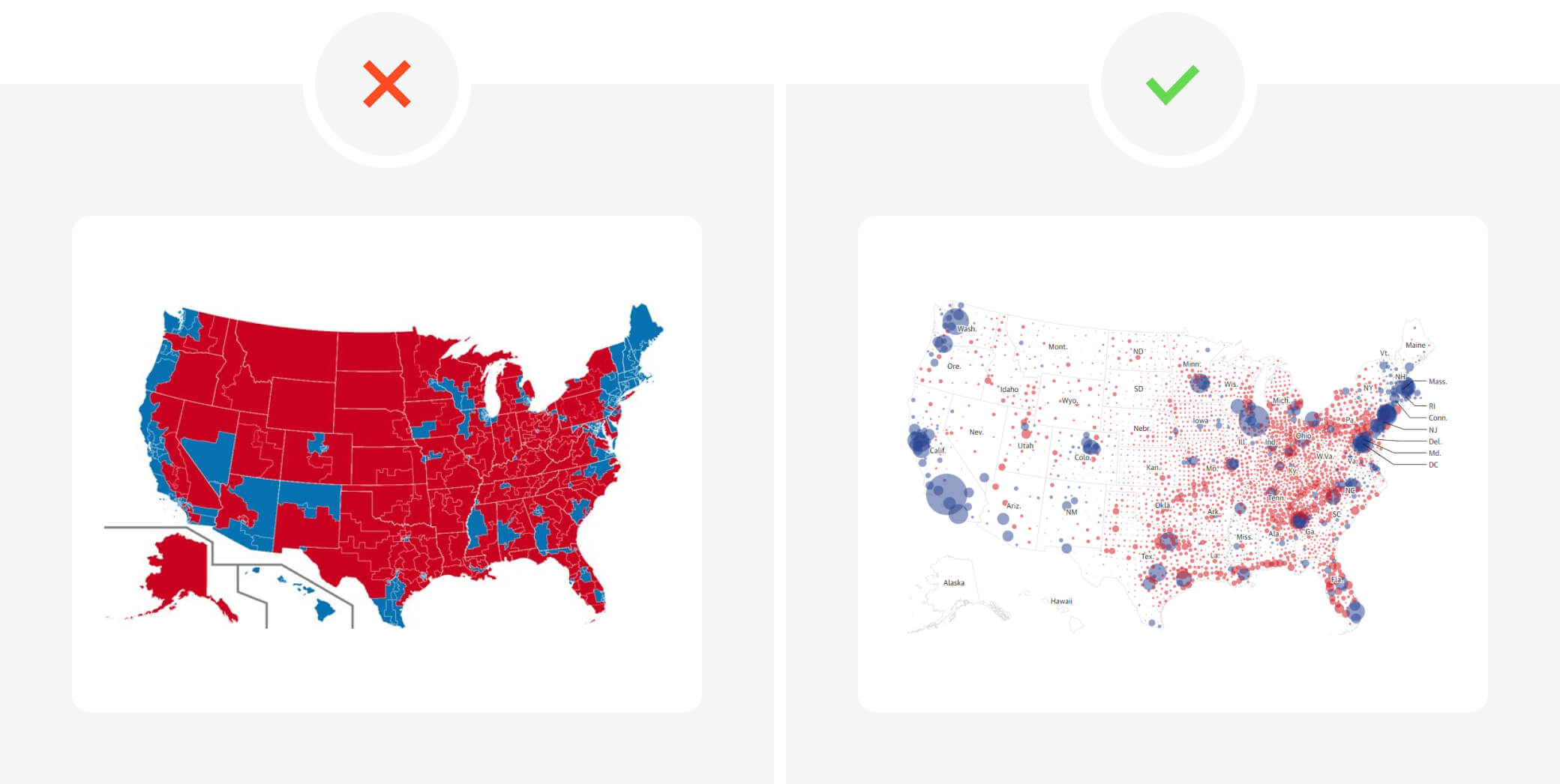
Conclusion: Careful color selection is vital in data visualization to ensure accurate and insightful representations. Opting for relative coloring can enhance the clarity and depth of information presented to viewers, promoting a better understanding of complex datasets.
Conclusion
Effective data visualization is a blend of aesthetics and clarity. While an attractive design can attract an audience, the essence lies in presenting data accurately and understandably. Designers should be cautious about common pitfalls and prioritize the audience’s comprehension over design details. By employing appropriate techniques, colors, and avoiding information overload, designers can effectively convey insights, striking a balance between beauty and clarity.
To get inspired and learn more about our data visualization implementation, we invite you to visit the page with a case study – Option Tracker which has been awarded the prestigious RedDot Award.


