ELLE: UI/UX Design for the Top Fashion Media Brand
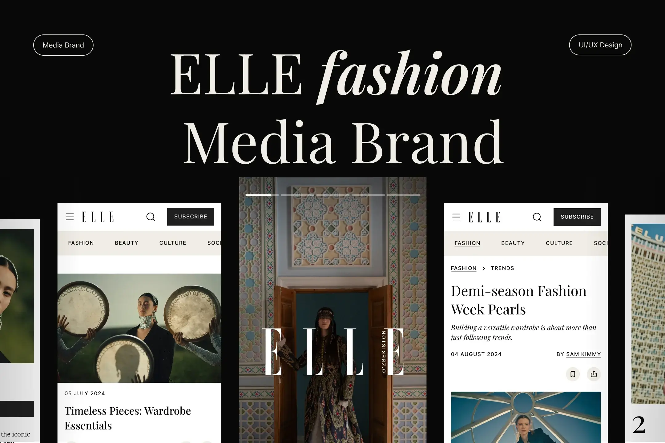
In March 2024, our client, Oleg Drobot, approached us to launch the media brand ELLE in Uzbekistan. This wasn’t our first collaboration; we’ve partnered on various initiatives for over five years, so we had no doubt even for a second.
Gemina Publishing secured an agreement with ELLE’s headquarters to bring their brand to a new market. Oleg took on the challenge of becoming the CEO of ELLE Oʻzbekiston, with a commitment to launch the project by June 1, 2024, with just over two months to prepare and start entirely from scratch. Our mission was clear: to help him launch and hit the deadline perfectly.
LocationUzbekistan
DurationOngoing
IndustryMedia Brand
What was doneFull launch
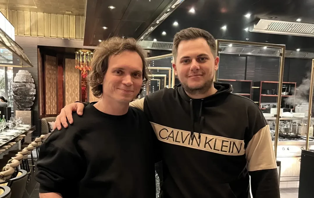
This project went beyond digital. ELLE Oʻzbekiston includes a website, printed magazine, events, photoshoots, and collaborations with models and fashion industry figures.
While the client side managed the broader scope of the project, our team was tasked with launching a website of the same caliber as ELLE’s other markets in three languages. This was an atypical task for our studio, as we specialize in UI/UX design, graphic design, branding, 3D motion, etc.
However, Oleg knew our founders had experience with development, testing, marketing, and other skills needed to launch a website from start to finish. With this experience, we couldn’t refuse to assist our long-term client with this exciting challenge. The journey ahead included everything from choosing the right domain to creating video tutorials for using the admin panel. But let’s take it step by step in our fashion design case study.
Initial Steps
To effectively manage the ELLE Oʻzbekiston project, we tailored our approach to meet the client’s needs, ensuring seamless collaboration and efficient progress:
Management Environment
We organized a management environment that included the client, his team, our CEO, and our team members: designers and managers. This ensured all stakeholders were aligned and communication was clear from the start.
Task Management
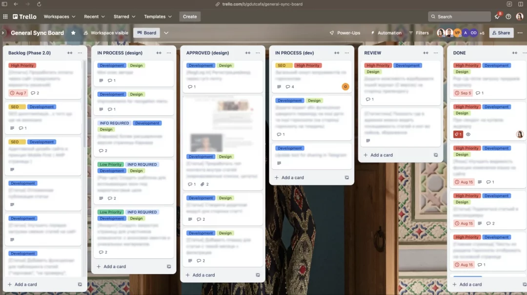
We opted to use Trello with a Kanban board for task management, even though our typical tool is Jira. The switch was made to simplify processes and accommodate the client’s team, who were less familiar with complex tools like Jira.
Communication Channel
We used Telegram for communication, as it is widely used in Uzbekistan. Although we usually rely on Slack, using Telegram ensured greater convenience and faster communication for the client’s team.
Meeting Schedule
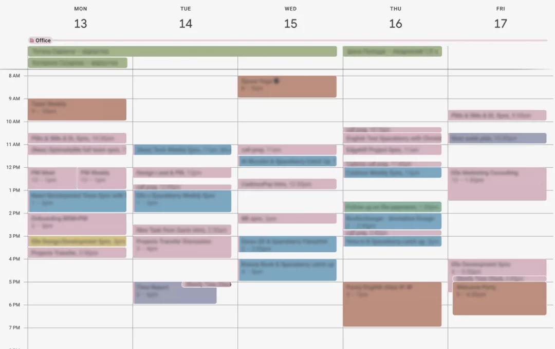
We scheduled one regular weekly meeting with all team members to discuss overall progress. To maintain close coordination, we added two more daily meetings – one with the development team and one with the marketing team – and provided daily updates via Telegram to keep everyone synchronized.
Contractors Search
We kicked off with deep research and design development, focusing on a UI/UX that truly embodied ELLE’s brand identity. At the same time, we utilized our network to find contractors for development and SEO optimization quickly.
These steps allowed us to move quickly and ensured excellent process synchronization. We defined clear responsibilities for each team member while staying perfectly aligned in our efforts.
Design Development
At this stage, we’d like to take a moment to focus and dive deeper, as this is our core expertise, and we have plenty to talk about.
Our primary objective was to create a modern, elegant interface that embodies ELLE’s style while ensuring user-friendliness and easy access to fashion, beauty, lifestyle, and culture content. Up next, you can read about the steps we took in our approach.
Market and Target Audience Analysis
Special attention was given to studying the specifics of Uzbekistan. We began by thoroughly analyzing the target audience and direct and indirect competitors. Our analysis covered functional features, visual communication, user experience, and audience interaction. During our research, we discovered that Uzbekistan’s market has primarily bypassed the web browser phase and moved directly to mobile devices, so we decided to prioritize developing a mobile-first design.
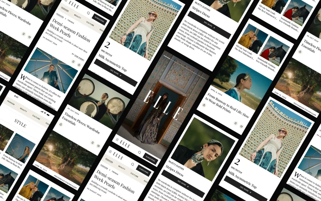
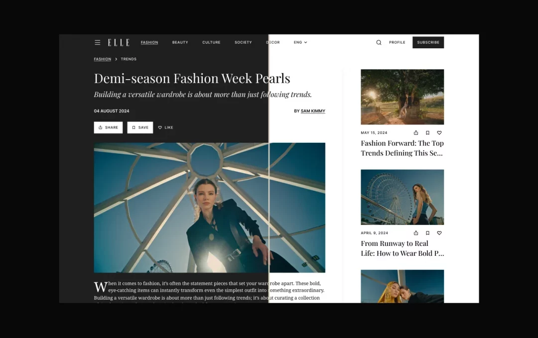
Next, it’s worth mentioning that we decided to add a dark mode. This addition enhances user experience by aligning the website with the theme of their phone, eliminating the jarring transition from the interface to the website that reduces eye strain in low-light conditions and adds a visual style that enhances the contrast and expressiveness of the design elements.
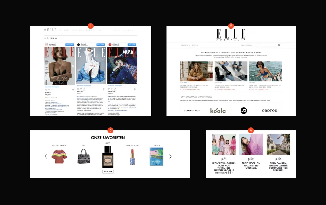
Additionally, we analyzed ELLE’s websites in other countries to identify best practices and successful design elements. We adjusted the design according to our findings and aligned it with the unique preferences and behaviors of users in Uzbekistan. Integrating these insights allowed us to enhance navigation, multimedia elements, and overall visual aesthetics.
Key Principles in Design Development
- Elegance: Upholding a high level of aesthetics in line with the ELLE brand.
- Usability: Ensuring intuitive navigation and easy access to content.
- Multimedia: Incorporating high-quality images and videos for an enriched visual experience.
- Interactivity: Integrating social media functionality to boost user engagement.
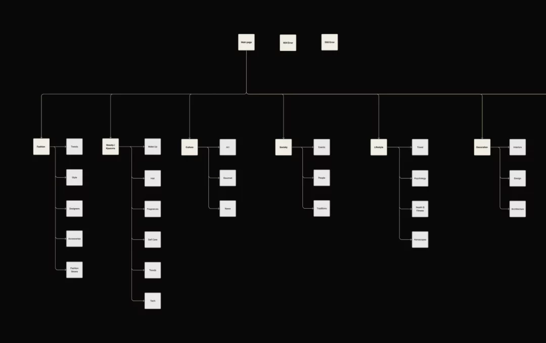
With this direction in mind, we began developing the creative concepts. At this stage, we decided that the main focus should be on visual clarity and modernity. We created several design options that highlighted different aspects of the brand: minimalist, visually rich with interactive elements, and one emphasizing multimedia features.
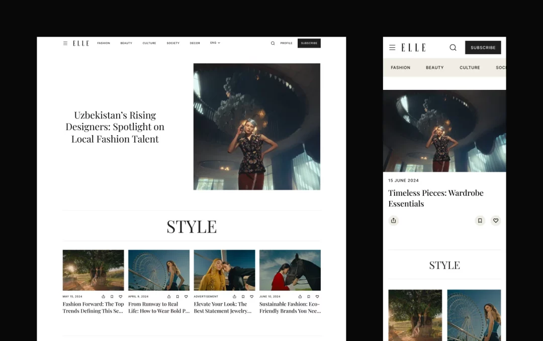
Creative Concept Development
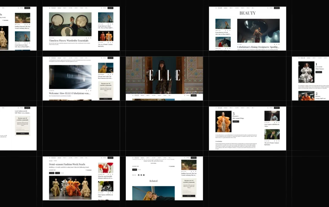
We developed several design options, each highlighting different aspects of the brand. These ranged from minimalist designs to more visually rich options with interactive and multimedia elements.
After the first iteration of concepts, we chose the direction that most accurately reflected the brand while helping us stand out among competitors. We developed a visual language that includes a modern and elegant design, easy navigation, and adaptability across various devices.
These carefully considered design decisions allowed us to create a unique and modern site that met ELLE’s high standards and catered specifically to the Uzbekistan market.
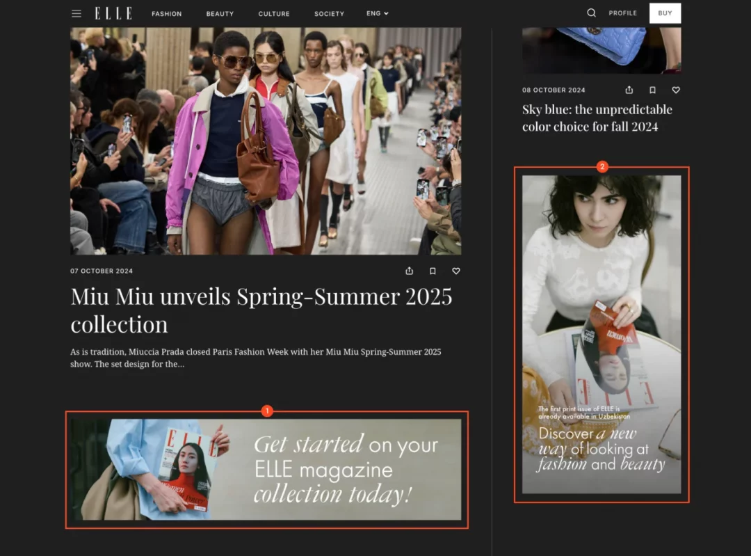
Monetization on the website
From the very beginning, we decided on the monetization format – media banner ads. It was crucial to maintain the visual appeal while avoiding an overload of ads that could distract from the main content. We identified key placement areas and then focused on designing the banners. Overall, by adhering to the priorities outlined above, we achieved the cohesiveness we were aiming for.
Be sure to check out our detailed visual case on Behance to dive into our design approach with all the finer details.
Next, we’ll dive deeper into our approach to working with contractors and share the challenges we faced along the way – yes, there were quite a few. And if you’re curious to learn more about our design methods, check out the OptimallyMe case study. There, we explain how we worked on a revolutionary AI-powered healthcare product for the UK market.
Close collaboration with contractors
As you may recall, we already mentioned that we would be looking for contractors within our own networks. Leveraging our team’s extensive experience in the IT field, we efficiently assembled a group of reliable contractors for the web and mobile product development of ELLE Oʻzbekiston. Here’s how we approached this critical phase:
Development Collaboration
- Quick Assembly: We leveraged our existing network of reliable contractors, selecting those with the best capacity to immerse themselves in the project quickly. This expedited the contractor selection process, which took less than a week.
- Introduction and Onboarding: Once the contractors were selected, we facilitated their introduction to the client and began the onboarding process without delay.
Selecting the Development Platform
We determined that WordPress was the most effective and widespread solution for a quick site launch and content management. This decision ensured the project could move forward swiftly without compromising quality.
SEO Collaboration
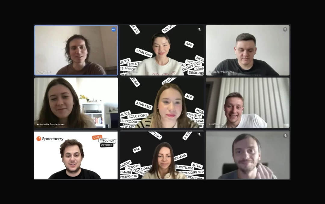
For SEO, we engaged a trusted contractor with whom we have collaborated on our own projects. This longstanding relationship allowed us to streamline negotiations, and by the second meeting with the client, both developers and the SEO specialist were fully onboard.
Marketing Team Composition
We formed a marketing team that combined members from the client’s team, who were directly involved in social media and content, with Spaceberry’s internal marketer. This collaboration ensured that analytics, connections, and data analysis were effectively set up and managed.
The speed and efficiency of team assembly were significantly enhanced by Oleg and his team’s trust in our capabilities and the involvement of our C-level and Head of BD. Their leadership ensured smooth coordination and the resolution of any challenges that arose during the contractor engagement process.
Main Challenges of the Project
Going Beyond the Scope (Not Just Design)
We successfully managed this by involving our CEO, Paul Makarenko, who has experience in launching digital products and managing large teams in design, development, marketing, and product management. Together with Oleg, they had already implemented several successful projects before, and thanks to his energy and experience, teams on all sides were able to be inspired and confidently go through this journey.
Tight Deadlines (2 Months for an International Brand website)
We overcame this by optimizing all processes as much as possible. If something could be done after June 1 and didn’t affect the core functionality, we postponed it. This would have been impossible without our experience in launching other digital products on the market. Therefore, experience became the key strength in overcoming the deadline.
Lack of a Complete Team at the Start
We solved this issue by leveraging Spaceberry’s extensive network of specialists in many areas and the good relationships maintained by our Head of BD.
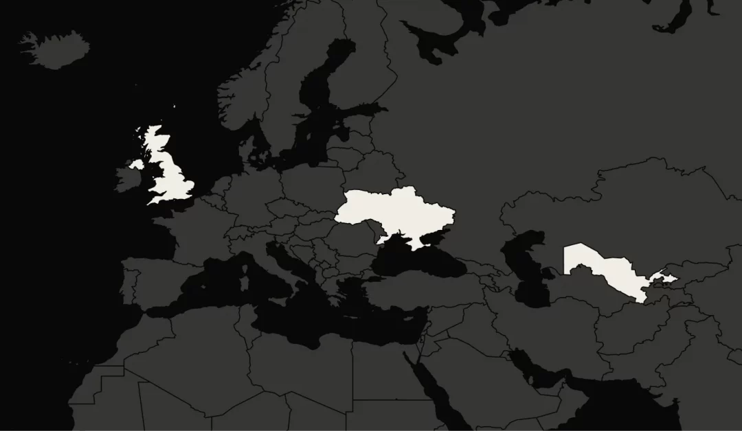
Time Zones and Different Mentalities (London / Kyiv / Tashkent)
This challenge was overcome by two key factors – trust from Oleg in our team, which translated to trust from his team to ours. Trust was felt in everything we did during these two months. Additionally, our team regularly collaborates with clients from the US, so we are accustomed to flexibly communicating regardless of time zones.
Meeting International Standards
The client’s side took full responsibility for communicating with ELLE’s headquarters and providing us with clear guidelines on what was required in design, advertising, banners, videos, etc. Our role was to execute our part of the work professionally.
Project Launch
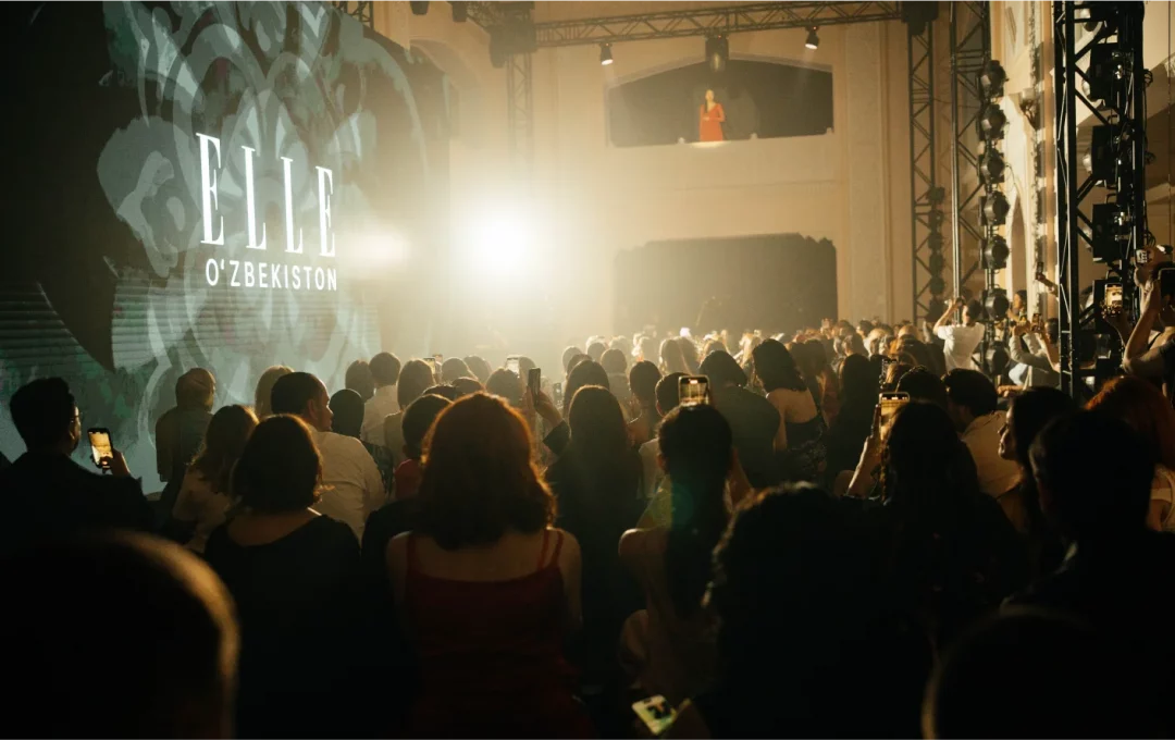
As a result, we met the deadline. ELLE Oʻzbekiston website was ready by June 1, and a few days later, the entire project was launched on a grand scale. You can find more details on Instagram, where the site became a crucial component. The printed magazine has been released as well, so the latest news and articles are now available to read on its pages. You will find exclusive interviews with local and global designers, the latest trends in the world of fashion and beauty, and the stories of heroines about their careers and the paths they have taken.
We received many positive reviews and warm words from the audience in Uzbekistan. Many even noted that our website turned out better than the ELLE’s sites in other markets, and we are very, very proud of this.
Client’s Feedback
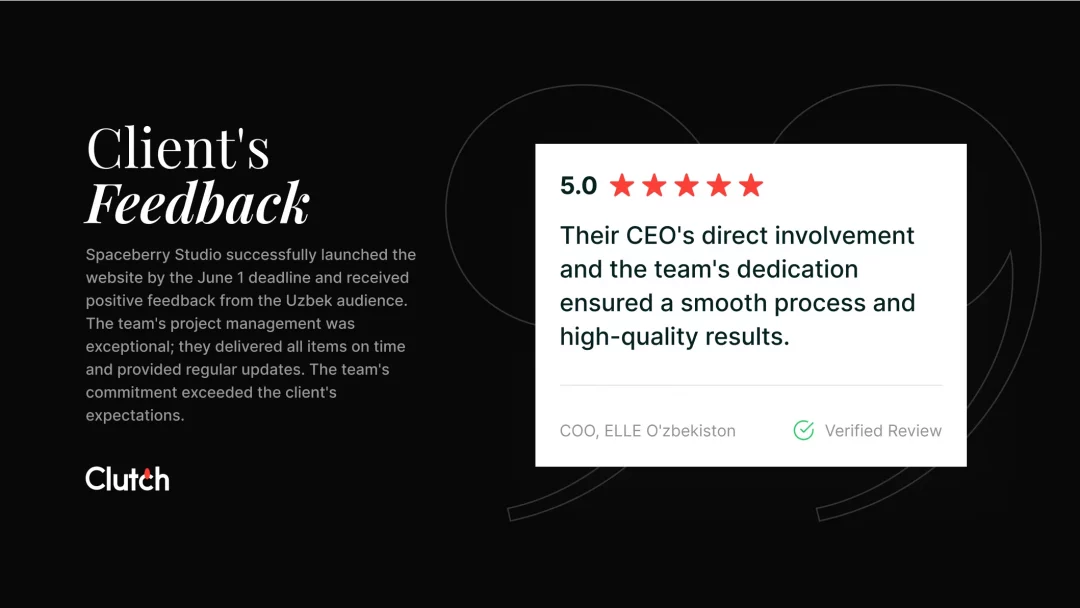
To sum up, we decided not to write a lengthy conclusion this time but instead end with a review we are proud of. If you’re curious, you can find the full version on Clutch. But here’s a small part that truly warms our hearts:
This story doesn’t end here – it’s just beginning to gain momentum. We continue to collaborate and enhance the existing website, and we believe in the success of our client and ELLE Oʻzbekiston. The best is yet to come!