Why Most Paywalls Fail: A Paywall UX Monetization Problem
By Spaceberry Studio 5 min reading Jan 23, 2026

For product teams in fintech and healthcare, monetization UX is often perceived as the moment of monetization.
In many fintech and healthcare products, monetization UX is viewed as the moment of monetization. In reality, it is only a symptom.
When users never reach the pricing screen, the problem is almost never the price itself. It happens much earlier — in how the product communicates value, risk, and the moment when it asks for commitment.
Across many fintech, SaaS, and healthcare projects, we have repeatedly observed the same pattern: teams optimize the paywall while ignoring the broader monetization UX that guides users toward (or away from) the moment of pricing.
We most often observe these monetization issues when working on complex, regulated products, especially in healthcare UX and fintech UX, where trust, clarity, and perceived risk play a much greater role than pricing mechanics.
Healthcare UX → https://spaceberry.studio/industries/healthcare/
Fintech UX → https://spaceberry.studio/industries/fintech/
This article is not about pricing tables or call-to-action buttons. It is about why monetization UX breaks down long before prices become visible.
The core problem: monetization UX starts earlier than pricing
In regulated products, monetization is not a transaction. It is a trust agreement.
And if this agreement is not established before the price appears, the paywall is perceived not so much as an offer, but as a barrier.
Across different projects, several patterns keep repeating.
1. Users don’t reject pricing — they reject uncertainty.
A common scenario in fintech products: users smoothly go through onboarding, verify their email, provide basic data — and then disappear right before the paywall. It’s easy to conclude that “users aren’t willing to pay.”
In practice, they’re not willing to take a risk.
In financial and healthcare products, users silently ask:
- What happens to my data?
- What limitations will I face after paying?
- What exactly stops working if I don’t?
In several fintech cases, we saw paywalls appear before the product had answered even one of these questions. Pricing felt premature — out of context. Users left without even looking at the numbers.
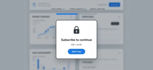
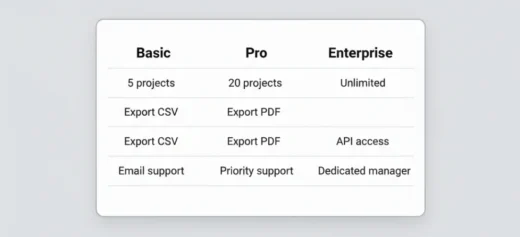
An example below how it should be:
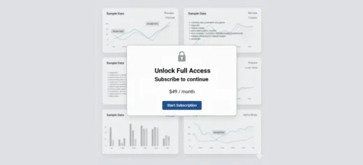
2. Monetization UX breaks when value is still abstract.
This is even more pronounced in Healthcare products. When a product sells not a feature but an outcome — better decisions, safer data, more efficient processes — users need to experience that value first.
We worked with platforms where the paywall appeared right after a short demo or a generic value description. Structurally correct. Experientially wrong.
Users hadn’t yet understood:
- how the product fits into their real workflow
- where it saves time, reduces risk, or removes complexity
In these cases, the paywall doesn’t convert because value hasn’t become concrete yet. The price feels like a prepayment for an unclear result.
As a result, the business may quickly generate revenue from a small group of loyal users, while simultaneously losing a large share of potential users at the very beginning of their journey.
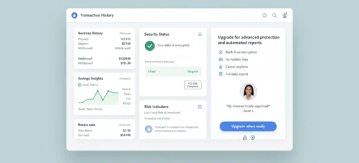
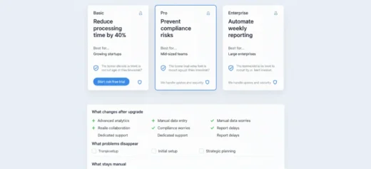
In contrast, our example demonstrates an outcome-oriented monetization approach, where monetization appears only after users have already experienced clear product value.
First, people explore the content, understand how it helps them, and build trust in the platform. Only then are they introduced to the paywall.
This model increases long-term engagement, reduces churn, and improves conversion — not through pressure, but through perceived value and genuine user motivation.
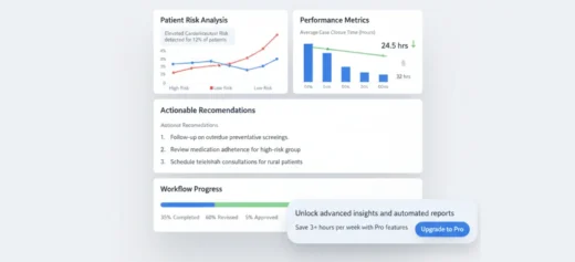
3. Paywalls fail when they interrupt the user’s mental flow
In SaaS and Fintech products, there’s a thin line between a natural next step and a hard stop.
We’ve seen paywalls that:
- interrupt an active task
- appear at moments of perceived progress
- fail to explain why now

As a result, they feel like punishment for engagement:
“You’ve done enough. Now pay.”
Instead of:
“You’ve reached the point where real value begins.”
In regulated domains, where cognitive load is already high, this interruption is especially damaging.
4. Pricing screens often answer the wrong question
A recurring paradox: pricing screens explain plans in detail — but barely address the decision.
At this moment, users are not thinking:
“Which plan should I choose?”
They’re thinking:
“Should I commit at all?”
If the product hasn’t clearly shown:
- what changes after payment
- what risk is reduced
- what responsibility the product takes on
— no pricing structure will save the conversion.
The answers: what actually makes paywalls work.
After working with fintech, SaaS, and healthcare products, we’ve seen what works:
Safety first. Users don’t pay where they don’t feel safe.
Experience before explanation. “We’ll improve your life” < letting someone feel it even once.
Continuation, not interruption. The paywall should feel like a logical next step, not a sudden stop.
Optimizing the pricing screen separately from everything else is like fixing the roof when the foundation is cracking.
Key takeaway
Users don’t leave because of the price. They leave because the product asks for commitment before earning trust — and that is a monetization UX problem, not a pricing problem.
In fintech, SaaS, and healthcare, monetization is not a moment. It’s a journey. And the paywall is only the final step on a path that started much earlier.
Wondering how many users actually reach your paywall?

Bohdan Ostafiiv


